The Argument
When the Eiffel Tower—the daring centerpiece of the centenary celebration of the French Revolution, the 1889 Exposition Universelle—was new, it was widely disparaged for its impertinent mechanical appearance. The distinctive 300-meter iron structure still looms over western Paris from the Champ de Mars close to the Seine, but it is now admired, even adored.1 The history of the Tower thus contains a two-fold surprise: it was the odd World’s Fair edifice to survive, and, though once reviled, it is now loved. Not only has the old derrick-shaped monument become endearing, its thrusting gigantism, surprising shape, and unapologetically industrial materials, along with its attention-grabbing nocturnal lighting and mesmerizing daytime transparency, make it inescapable in many districts of the French capital city.2 And not only there: owing to its nonstop reproduction and circulation, its familiarity exceeds the spaces of Paris.3 On account of its global popularity, it is called an urban icon. According to leading image historians, the Tower is “a reference-point for urban signification,” “the iconic object of Paris,” and “the archetype for all urban icons to follow.”4 The parent of this outlook was literary critic Roland Barthes. In 1964, he argued influentially that the bases of the Tower’s clout are its widespread fame and its emptiness: it is both “a pure signifier” and “an utterly useless monument” meaning that wherever the Tower is known, it absorbs any claim whatsoever about its identity and significance.5
I take my distance from Barthes’s perspective in what follows. My aim is to complicate the conspicuousness of the contemporary Tower by historicizing it and its representations. The fundamental fact about the appearance of the Tower is that it is not today what it was at the start. Of course, its lighting has been altered repeatedly, but more importantly the silhouette and overall visual personality of the 1889 iron titan were fundamentally changed in 1937, forty-eight years after its construction. The highly ornamental scalloped arcades of its first platform (fig. 1), at the center of my analysis, were torn off and discarded.6 The modification was a stylistic update; the Tower was to appear less old-fashioned in the context of that year’s self-consciously modern Exposition Internationale des Arts et Techniques dans la Vie Moderne.7 Its stripped-down appearance was meant to fall in line with, even mirror, the reductive style of the new structure across the Seine on the Hill of Chaillot. The aerodynamically sleek Art Déco Palais de Chaillot, still in place, arose to camouflage and largely replace the elegant Palais de Trocadéro. Designed by Gabriel Davioud and Jules Bourdais, the earlier building had been the centerpiece of the 1878 Exposition Universelle, and the only structure to survive the fair, if not forever.
1964 was another benchmark year in the history of the now celebrated monument.8 The French government recognized La Tour Eiffel as a noteworthy part of the French patrimoine, securing the survival of the seventy-five-year old Tower in its rather recently modernized form. André Malraux, Ministre d’État des affaires culturelles from 1959 to 1969, declared it a historical monument (monument historique), a sign of its accelerating popularity, insuring that it would not be altered again in any consequential way without authorization at the highest level.9 Another accolade from 1964, also the date of Barthes’s essay, belongs to the history of the Tower’s enhanced postwar reputation. During his first trip to the French capital, the young English novelist Julian Barnes captured the 1960s celebrity of the Tower by calling it “absurd and absurdly popular.”10
That the almost 130-year-old Tower has been a monument sacréfor fifty-five years has clouded both popular and specialist awareness of its transformation. Because we are familiar with Barthes’s, Malraux’s and Barnes’s Tower, the stripped-down post-1937 structure, which features a ruthlessly geometricized horizontal construction as its first platform (fig. 2), key aspects of its initial lacey ornament have not figured in histories of the structure, its reception, and representation. Answering the questions—who noticed the ornament when the Tower was new? and so what?—is a goal of this essay. Ignorance or disavowal of its ornament enabled many of the protests hurled in its direction.11
I argue that many of the attacks on the Tower that were oblivious to its flowery ironwork mirrored disquiet about the specter of heavy smoke-belching industry in or very close to the French capital city. Napoléon III and Haussmann discouraged the presence of coal-based industry mid-century by raising the tax on coal, resulting in the migration of factories to Saint-Denis, for example.12 My point is that the denunciation of the Tower as a despised factory chimney could have indexed anxiety about the return of industry; the return of the repressed. Also germane are the passionate and anxious discussions about the expansion of industry into the banlieue, begun during the third quarter of the century, and its polluting effects.13 Small wonder then that the sight of the Tower could foster what I shall call Pylon Vision, inasmuch as it was called a “factory chimney,” the essential industrial form, by some of its detractors, including J.-K. Huysmans, or reckoned to herald, in the words of another period voice, “the triumphant return of industry to Paris.”14
Origins of the 1889 Tower
Known almost from the very start as La Tour Eiffel after Gustave Eiffel, the astute engineer who spearheaded the project, the renowned tour de trois cents mètreswas the winning entry (out of 107) in a French government competition for a 300-meter tower.15 It was created as the clouof the French capital’s fourth World’s Fair since mid-century. As the tallest structure on earth in 1889, it outdid its nearest competitor, a 169-meter stone obelisk across the Atlantic, the Washington Monument (on the National Mall in Washington, DC), completed in 1884 but not dedicated until 1888.16
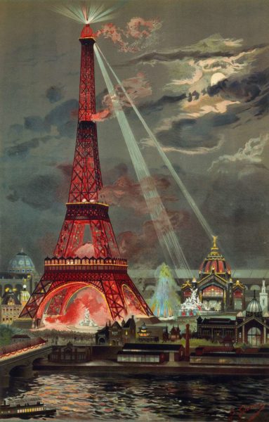
The enormous open-work four-footed structure, made of seven thousand tons of iron and erected in less than two years, was richly decorated overall but especially, as already noted, across the first platform.17 It bore a dazzlingly bright red painted surface (changed to brown in 1899 in preparation of the next Exposition Universelle; fig. 3).18 Georges Garen’s gravure(fig. 4) highlights the dazzling nighttime effects of the Tower’s éclairage: 10,000 gas lit globes glowed brightly, and ferociously intense electric searchlights streamed from the campanile(as its crest was called) at the summit.
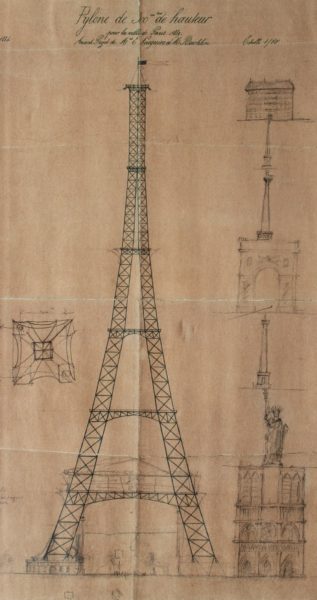
Two aspects of the Tower’s inaugural aesthetic remain little studied: its radical initial conception (1884) and its original adornments (1889). On the former, it began conceptual life in 1884 as a rigorously stripped-down metal pylône (fig. 5) designed by two chief engineers in Eiffel’s office, the Compagnie des Établissements Eiffel, Maurice Koechlin and Émile Nouguier. The word “pylon” is Koechlin’s own: describing his sketch of 6 June 1884 he called it “a large pylon consisting of four trellised beams separated at the base and narrowing toward the summit, joined together by metal girders placed at regular intervals.”19 It was in other words a large pylon with four columns of lattice-work girders, separated at the base and joined at the top. They would be joined together by more girders spaced at regular intervals. Acting on the basis of the Koechlin-Nouguier plan, on 18 September 1884 Eiffel registered a patent under his and the two engineers’ names “for a new configuration allowing the construction of metal supports and pylons capable of exceeding a height of 300 meters.”20
Pylons, standard metal bridge components, were familiar structures in the engineering world thanks in large part to Eiffel’s earlier specialization in bridges. Koechlin’s use of the word “pylône” in 1884 is clear proof of that terminological fluency. For example, Eiffel’s 162-meter span Garabit Viaduct (1880–1884), a railway bridge over the Truyère River in southern France, the highest bridge in the world at the time, consisted of a long horizontal bed supported by a broad iron arch and two pylons. Another apposite high-profile metal structure, albeit eventually concealed, was the one designed by Eiffel for the interior of Auguste Bartholdi’s Statue of Liberty, completed in 1883. A twenty-eight-meter pylon was the central attachment point for the network of girders that formed the statue’s body. Koechlin’s 1884 design emulated such functional structures by imagining the 300-meter Tower as a free-standing, oversized, brashly exposed, and functionless pylon. Despite the lacey ornamentation that festooned the completed Tower, many observers could only see it as a pylon. As a consequence, numerous opinions of the Tower were hostage to the limitations of what I call “Pylon Vision.”
Apropos of the scalloped arcades added to Koechlin’s naked pylon, Frédéric Seitz’s understated description is apt: “the construction lines were embellished with some decorations characteristic of the end of the nineteenth century.”21 Did Gustave Eiffel dream up the ornamented promenade? No. The engineers Koechlin and Nouguier, originators of the metal pylon, were joined by the architect Stephen Sauvestre.22 As Michel Lyonnet du Moutier observed, “it is true that the first working drawing was not very attractive,” and it was Sauvestre that gave the tower an aesthetic form.23 Sauvestre’s scalloped promenoir, ignored by many onlookers, was however found extraordinary by some, as in this vivid description, whose author was smitten by the effects of gas light on the arches of the first level:
Below, all around, the gallery or promenoir presents itself facing out as a succession of loggias, of gracious arcades. The tympana of the arcades are gilt latticework in the shape of fans, of which the lines start from a light colonnette. The vertical separations between the loggias are up to date with cabochons in carnelian crystal. Behind the cabochons are gas flames. They are many sparkling columns on the days of illumination. On those days when the lines of fire follow the major lines of the monument, one is very aware of the artistic value of this cyclopean conception.24
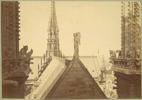
It was, then, the trio of Nouguier, Koechlin and Sauvestre that drew up the project that was submitted to and won the competition. It was an elaboration of the uncompromisingly minimalist pylon of 1884. Daniel Le Comte emphasizes the importance of the decoration, but overstates Eiffel’s role: “he had to add decoration to get it accepted. Thanks to the ornament, Eiffel eliminated his competitors.”25 Apparently the stonework pedestals out of which the Tower’s legs emerge with staggering torsion, the monumental arches that link the columns and the first level, a bulb-shaped campanile for the top, and the lacework of the first platform were all attributable to Stephen Sauvestre. Insisting on the singularity of the Eiffel Tower, as many have done, conceals the fact that Sauvestre’s ornament synched up with the vocabulary of many stone and metal structures of the era. The scalloped iron mini portals of the original first platform (fig. 1), the work of Sauvestre, were akin to architectural ornament fashioned by Jacques-Ignace Hittorf (e.g. on the interior of St. Vincent de Paul, Paris, 1844). They also echoed the stylized floral metal ornament that bestrides the crest of the rooftops of Notre Dame de Paris (fig. 6) designed by Eugène Emmanuel Viollet-le-Duc between 1845 and 1868.
As Eiffel himself pointed out in 1900, the arches that linked the uprights were purely decorative, performing no functional work whatsoever.26 Assuming (wrongly), like everyone else, that the most surprising aspects of the Tower’s form were Eiffel’s exclusively, T. J. Clark was actually paying tribute to the extraordinary Sauvestre when he observed in a 1975 classroom lecture I heard and never forgot: “The moment of torsion, of maximum stress, is displayed above ground. No trained architect of the nineteenth century before this would ever have dared to show the stress and strain in his work in quite such a graphic way.”27
With Sauvestre’s elegant and intricate ironwork in mind, we confront a puzzling aspect of the Tower’s reception. Why were its jewel-like enhancements ignored by so many observers and artists? Why did a Pylon Gestalt or Pylon Vision shape and deform the perception of so many onlookers?
Condemnations of the Tower
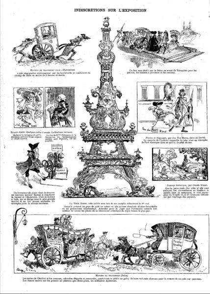
The Tower needed state sanction because Eiffel’s daring structure was condemned more than lionized until the post-World War II era.28 While twenty-first-century tourist literature spins the sight and the experience of the Tower as sources of joy, artists and writers protested plans for the Tower even as it was being built. The most prominent condemnation was the 1887 “Protestation des artistes,” which ran in Le Temps (14 February) as a petition to Jean-Charles Adolphe Alphand, the Director of Public Works and Commissioner of the 1889 Exposition. It was signed by luminaries of the art establishment including Charles Gounod, Charles Garnier, Albert Wolff, Guy de Maupassant, Alexander Dumas fils, and the painters William-Adolphe Bouguereau and Ernest Meissonier.29 Xenophobia certainly ungirded their attack; among their stinging accusations was this barb: “…the Eiffel tower, which even the commercial America itself would not want, is, do not doubt it, the dishonor of Paris.”30 But the governing trope of their brief against Eiffel’s structure is often forgotten. Their vision of the Tower’s eventual appearance was that it would be a “gigantic and black factory chimney.”31 The naysayers selected a poor metaphor in view of the iron structure’s eventual manifold ornamental flourishes not to mention the monument’s transparency.32 But its function as the return of the repressed in the sphere of banished smoky industry cannot be undervalued. An unidentified humorous illustrator moved against the deeply entrenched factory chimney trope in a hilarious fashion (fig. 7). “Indiscrétions sur l’Exposition,” imagines the Tower as a Rococo candelabrum. The caption reads: “Until now tasteful folks saw in it only a formidable factory chimney or a pretentious scaffolding. Wait for the judge: the current structure is covered with morsels of artistic decoration of the purest Rococo style.” Indeed Sauvestre’s decorations, while not Rococo per se, were elaborate versions of familiar and widespread late nineteenth-century architectural decoration and highly visible as a result. Except to those determined not to see it: those blinded by Pylon Vision.
Some signatories of the protest letter later recanted, but others continued to resist the completed Tower, among them Maupassant, who hated it so much that he often ate lunch in the Tower’s second floor restaurant, the only point in the city where he couldn’t see “this tall skinny pyramid of iron ladders, this giant and disgraceful skeleton.”33 His disdain grew apace. In 1890, reflecting an economy already awash in souvenir reproductions, he averred: “I left Paris and even France, because the Eiffel Tour bored me too much. Not only does one see it everywhere, but one finds it everywhere, made of all known materials, exposed in all the windows, inevitable and torturing nightmare.”34 The 1887 artists’ protest had predicted that the Tower would overshadow Notre-Dame, the Sainte-Chapelle, the Tour Saint-Jacques, the Louvre, the Dôme of the Invalides, and the Arc de Triomphe: “all our monuments humiliated, all our architecture dwarfed, that will disappear in this stupefying dream.”35 Composer Erik Satie snidely indicted worries of this sort: “Our personal information permits us to affirm that there will be a Universal Exhibition in the middle of the year 1889. But you will not see it, because of the Eiffel Tower.”36
Edmond de Goncourt, sharp-tongued wit, was pointed and cruel: “you couldn’t dream of anything more ugly to the eye of an old civilized onlooker (or an old civilization).”37 J.-K. Huysmans also disdained the Tower. In his essay, “Le Fer (Iron),” he used the imagery of rebarbative industry when he wrote: “its tower resembles a factory chimney under construction.”38 Those who were smitten by the Tower in the immediate aftermath of its opening (31 May), also deployed the descriptive and metaphorical language of industry but with positive connotations. Louis Gonse, editor-in-chief of the Gazette des Beaux Arts, for example, wrote a paean to the new structure calling it “the industrial masterpiece of this century of iron.”39 And besotted by its interaction with the elements, he opined: “Its aerial figure dominates Paris without crushing it; one sees it from everywhere, with its looks varying with the clouds and the hours of the day, sometimes light, grey and faded, like a lighthouse drowning in the fog, or manly and hard when the wind blows and its summit is plunged into a cloud, sometimes flushed by the rays of the setting sun, or rose and transparent under the caresses of the light of dawn.”40
Visitors liked mounting the Tower right from the start. They voted loudly in favor with their feet. Over the seven-month duration of the exhibition—15 May to 6 November—1,953,122 people visited the Tower; an average of 11,800 per day.41 Whether it remained visitable between 1889 and 1900 and on what terms remain open questions—the subject of another essay—but it lost popularity in 1900 vis-à-vis its debut season. In 1900 (compared to 1889) there were 51 percent fewer visitors to the Tower. And there were other signs of a lessening of interest: fewer Tower shaped souvenirs were sold. Moreover, its unconcealed metal, all that ornament notwithstanding, made it an anachronism in 1900. According to Henri Loyrette, it compared badly to the high-profile masonry building of the moment including the classicizing stone and glass of the Gare d’Orsay and the Grand Palais.42 Between 1901 and 1914, attendance figures declined precipitously with no more than 120,000 to 260,000 visitors per year.43
Artists and the Tower
After the “Protest” of 1887, no “official” painter nor any members of the young Impressionist school drew inspiration from the Eiffel Tower.
Frédéric Seitz, 200144
Seitz was right to note the Tower’s absence from the artwork of the Impressionist vanguard, which was not however a “young” school in Paris in 1889. Period graphic images—both commercial prints and photographs—often however examined the structural complexity of the Tower’s crisscrossing iron members on the interior (fig. 8, for example). And some aesthetically progressive painters and printmakers were interested in the monument’s exterior.45 The history of painting prior to 1910 has not yielded a parallel to figure 8, but the words of Paul Gauguin, lithographs by Henri Rivière (figs. 9 through 12), and a small painting by Georges Seurat (fig. 13) as glossed by Meyer Schapiro engaged with related formal issues.46 Henri Loyrette was nonetheless justified in observing, presumably with Robert Delaunay’s Tower-centric paintings in mind, that the eventual “pictorial glory” of the Tower coincided with the decline of its fortune; when it was neither an object of controversy nor yet a mythic symbol.47

Paul Gauguin paid close attention to Eiffel’s decorative use of iron. In his very first published writing, “Notes on Art at the Universal Exhibition” of July 1889, the artist recognized that the exhibition was “the triumph of iron, not only with regard to machines, but also with regard to architecture. And yet architecture is at its beginnings, in that, as an art, it lacks a style of decoration consistent with the material which architecture uses.”48 Only in the Eiffel Tower “to some extent” did he find some examples of the “ornamental bolts, iron cornices extending beyond the main line, a sort of Gothic lacework of iron.”49 Gauguin’s response is notable in light of my effort to demonstrate that an acknowledgement of the Tower’s Gothic lacework of iron was rare indeed.
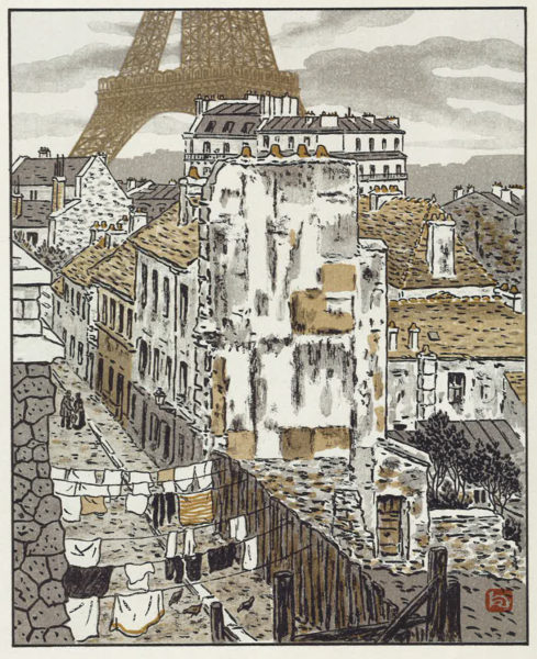
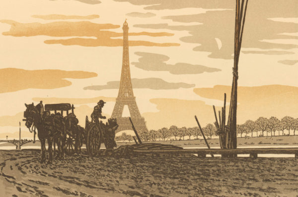
Henri Rivière, shadow-theater artist at the Chat Noir cabaret in Montmartre and innovative photographer of the Tower under construction, deserves the spotlight because his art struggled complexly to capture the improbability and novelty of the structure designed by Eiffel and his associates. A number of his lithographs seem to have explicitly sought to figure uneasiness at the sight of the Tower, or at least a strong sense of the monument’s impertinent clash with its surroundings. His japoniste prints, Trente-Six Vues de la Tour Eiffel, published in 1902, were based on the work of Utagawa Hiroshige plus his own visit to and photographs of the Tower under construction in 1888.50
In Vue 5 (fig. 9), “Rue Beethoven,” a looming background cross-section of the lacy volumetric structure, sliced just above and below the first platform, contrasts sharply and uncomfortably with the scale and forms of a consummate example of “Vieux Paris” in the foreground: a street in the sixteenth arrondissement inhabited by the poor.51 (Because the lithographs are inked uniformly in monochrome plus some brown-yellows, there was no way to show the red color of the painted Tower.) The lithograph conjures the appearance of Old Paris via old-fashioned partially ruined buildings on a modest stone thoroughfare (albeit separated from the Tower by a Haussmannian apartment building), and defines its provincial social life by the quotidian timelessness and modesty of laundry strung across the street, chickens pecking the ground, and one conversation between a modestly dressed woman and man on the old pavement.52 Vue 31 (fig. 10), “Du Quai de Passy – Charbonniers,” makes the case for visual incommensurability in even stronger terms by staging a clash between the pale silhouette of the flattened symmetrical metal structure at center, avatar of technical modernity, and a dark silhouette of traditional labor, worker plus horse and cart collecting wood to burn into charcoal. It is hard to ignore the violence of the black diagonal tool at the very center of the sheet that slices up into the decorated promenade of the first floor of the Tower. More striking still is the alert standing pose of the hyper legible worker on the cart which seems meant to register his feeling threatened as he looks at and recoils from the iron giant in the near distance.
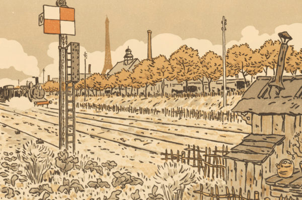
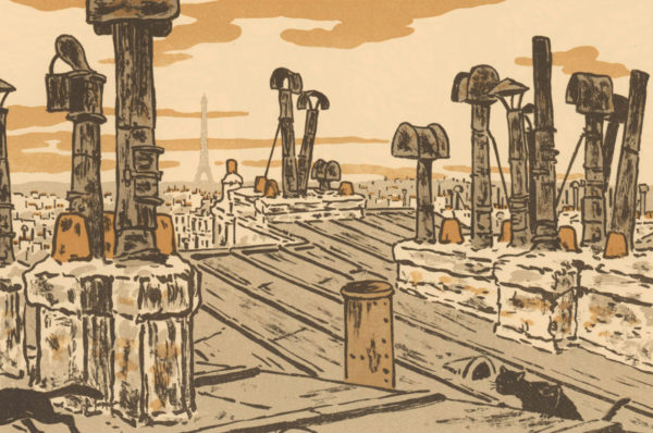
Two of Rivière’s lithographs, the railway-centric “Du Quai de Javel (baraque d’aiguilleur),” (Vue 28, fig. 11) and his symphony of chimneys, “Vue des toits,” (Vue 21, fig. 12) exemplify what I have named “Pylon Vision.” Vue 28 cleverly aligns the Tower with a cluster of cognate vertical instrumental forms, chimneys and a railway signal, endeavoring cheekily to assimilate the Tower to a world of pure industrial shape and utility. Vue 21 is a bit more complicated: its choreographed forest of wobbling and angular black-grey chimneys serves to stress the regularity of the surface of Eiffel’s distant faded tower. Eiffel himself shared this vision of the industrial non-decorative character of the Tower when he wrote, “It is only the progress of science and the art of the engineer, and that of metallurgic industry that distinguishes the end of our century, through which we have been able to overcome the path trod by older generations by the construction of this Tower which will be one of the characteristics of modern industry, because it [modern industry] alone rendered it possible.”53
Meyer Schapiro responded fluently to color in art. His eloquent 1955 discussion of Georges Seurat’s small 1889 oil painting (fig. 13) argues for a close bond between the forms of the Tower and Seurat’s divided strokes:
In painting the Tower in 1889, even before it was completed, Seurat took a stand on an object of intense dispute among artists at the time. The enemies of the Tower included writers like Huysmans who saw in it only the Notre Dame de la Brocante—a vulgar assertion of the power of industry and trade. For Seurat the tower was a congenial work of art of which he had anticipated the forms in his own painting. Its clean, graceful silhouette has an unmistakable affinity with the lines of the trombonist in his Side Show and the central nude in the Models. Besides, the construction of this immense monument out of small exposed parts, each designed for its place, and forming together out of the visible crisscross and multiplicity of elements a single airy whole of striking simplicity and elegance of shape, was not unlike his own art with its summation of innumerable tiny units into a large clear form which retained the aspect of immaterial lightness evident in the smaller parts. In its original state the Tower was closer to Seurat’s art than it is today; for the iron structure was coated with several shades of iridescent enamel paint—the poet Tailhade called it the “speculum-Eiffel.” If the identity of the painter of Seurat’s pictures were unknown, we could call him appropriately the Master of the Eiffel Tower.54
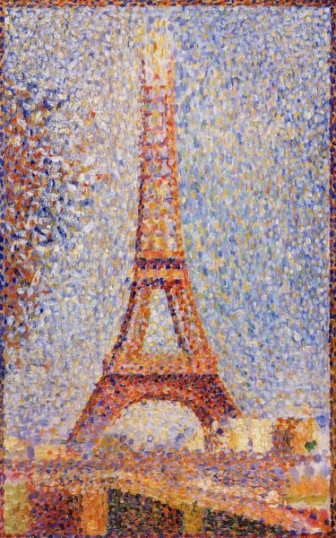
While Schapiro did not see the Tower’s Gothic lacework of iron in the canvas, though he did acknowledge the orange-red of the original structure, I would argue that Seurat did. There is an unmistakable delineation of the scallops that comprised Sauvestre’s first platform, but the strokes are begrudging in their acknowledgement of volume and depth. His use of royal blue and saturated rose creates the illusion of a cast shadow, but the promenoir scallops themselves are flattened and generalized. The fact remains, following Schapiro’s argument, that there was an undeniable synchronicity between the fashioning of the Tower out of so many identical prefabricated iron parts riveted together and Seurat’s painstaking fashioning of the structure out of many separate orange, red and complementary blue-mauve strokes.55
If we do not attend to Seurat’s response to the Tower’s horizontal tier of ornament, albeit delicate and very slight, it would seem that Seurat seen through the lens of Schapiro anticipated the extremely certain assessment of contemporary German art historian Hubertus Kohle, who has very recently written this about the Tower with specific interest in arguing that it was openly democratic and egalitarian: “The monument is formed from myriad prefabricated elements that are more or less identical; an edifice is borne from this accumulation that, in the eyes of classicism, is a simple collection of elements. There is no structural hierarchy in the tower subordinating elements as a function of their location whether at the center or the periphery.”56
Fascinatingly for our purposes, Kohle’s text exemplifies Pylon Vision and resonates importantly with Schapiro’s admiring characterization of Seurat’s multi-partite construction in paint. Pylon Vision has unfortunately dominated the discussion and the perception of the Eiffel Tower for generations. While Sauvestre’s elegant ornament was removed and discarded by those in charge in 1937 in order to enhance the modernism and modernity of its profile, contemporary students of the Tower’s reputation need to put it back.
Coda: Factories and the Eiffel Tower in 1900
Paul Signac, erstwhile comrade of Seurat, represented the Tower from a distance repeatedly in the 1890s (fig. 14). Rather than grappling with the specificities of the iron forms of the monument itself, he drew back to emphasize the environmental and visual impact of the industrialization of the district across the river from the Champ de Mars. Signac straightforwardly depicted the area surrounding the Pont de Grenelle as chock-a-block with factory chimneys producing dark smoke. The next year, Félix Thiollier photographed belching smokestacks on the very grounds of the World’s Fair (fig. 15). An unintended but vivid consequence of this pattern of representation, ca. 1900, is to lay to rest once and for all the old late 1880s metaphor that endlessly likened the impertinent new Eiffel Tower to a factory chimney. Once industry and its smoking factory chimneys dug in and proliferated not far from the river across from the Champ de Mars, the Eiffel Tower must have looked lacey, crisp, fastidiously adorned, intricately crafted, trim, and transparent as never before.


The Argument
When the Eiffel Tower—the daring centerpiece of the centenary celebration of the French Revolution, the 1889 Exposition Universelle—was new, it was widely disparaged for its impertinent mechanical appearance. The distinctive 300-meter iron structure still looms over western Paris from the Champ de Mars close to the Seine, but it is now admired, even adored.1 The history of the Tower thus contains a two-fold surprise: it was the odd World’s Fair edifice to survive, and, though once reviled, it is now loved. Not only has the old derrick-shaped monument become endearing, its thrusting gigantism, surprising shape, and unapologetically industrial materials, along with its attention-grabbing nocturnal lighting and mesmerizing daytime transparency, make it inescapable in many districts of the French capital city.2 And not only there: owing to its nonstop reproduction and circulation, its familiarity exceeds the spaces of Paris.3 On account of its global popularity, it is called an urban icon. According to leading image historians, the Tower is “a reference-point for urban signification,” “the iconic object of Paris,” and “the archetype for all urban icons to follow.”4 The parent of this outlook was literary critic Roland Barthes. In 1964, he argued influentially that the bases of the Tower’s clout are its widespread fame and its emptiness: it is both “a pure signifier” and “an utterly useless monument” meaning that wherever the Tower is known, it absorbs any claim whatsoever about its identity and significance.5
I take my distance from Barthes’s perspective in what follows. My aim is to complicate the conspicuousness of the contemporary Tower by historicizing it and its representations. The fundamental fact about the appearance of the Tower is that it is not today what it was at the start. Of course, its lighting has been altered repeatedly, but more importantly the silhouette and overall visual personality of the 1889 iron titan were fundamentally changed in 1937, forty-eight years after its construction. The highly ornamental scalloped arcades of its first platform (fig. 1), at the center of my analysis, were torn off and discarded.6 The modification was a stylistic update; the Tower was to appear less old-fashioned in the context of that year’s self-consciously modern Exposition Internationale des Arts et Techniques dans la Vie Moderne.7 Its stripped-down appearance was meant to fall in line with, even mirror, the reductive style of the new structure across the Seine on the Hill of Chaillot. The aerodynamically sleek Art Déco Palais de Chaillot, still in place, arose to camouflage and largely replace the elegant Palais de Trocadéro. Designed by Gabriel Davioud and Jules Bourdais, the earlier building had been the centerpiece of the 1878 Exposition Universelle, and the only structure to survive the fair, if not forever.
1964 was another benchmark year in the history of the now celebrated monument.8 The French government recognized La Tour Eiffel as a noteworthy part of the French patrimoine, securing the survival of the seventy-five-year old Tower in its rather recently modernized form. André Malraux, Ministre d’État des affaires culturelles from 1959 to 1969, declared it a historical monument (monument historique), a sign of its accelerating popularity, insuring that it would not be altered again in any consequential way without authorization at the highest level.9 Another accolade from 1964, also the date of Barthes’s essay, belongs to the history of the Tower’s enhanced postwar reputation. During his first trip to the French capital, the young English novelist Julian Barnes captured the 1960s celebrity of the Tower by calling it “absurd and absurdly popular.”10
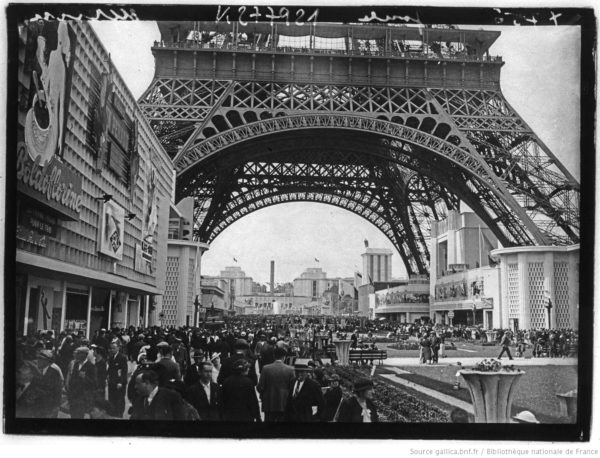
That the almost 130-year-old Tower has been a monument sacréfor fifty-five years has clouded both popular and specialist awareness of its transformation. Because we are familiar with Barthes’s, Malraux’s and Barnes’s Tower, the stripped-down post-1937 structure, which features a ruthlessly geometricized horizontal construction as its first platform (fig. 2), key aspects of its initial lacey ornament have not figured in histories of the structure, its reception, and representation. Answering the questions—who noticed the ornament when the Tower was new? and so what?—is a goal of this essay. Ignorance or disavowal of its ornament enabled many of the protests hurled in its direction.11

I argue that many of the attacks on the Tower that were oblivious to its flowery ironwork mirrored disquiet about the specter of heavy smoke-belching industry in or very close to the French capital city. Napoléon III and Haussmann discouraged the presence of coal-based industry mid-century by raising the tax on coal, resulting in the migration of factories to Saint-Denis, for example.12 My point is that the denunciation of the Tower as a despised factory chimney could have indexed anxiety about the return of industry; the return of the repressed. Also germane are the passionate and anxious discussions about the expansion of industry into the banlieue, begun during the third quarter of the century, and its polluting effects.13 Small wonder then that the sight of the Tower could foster what I shall call Pylon Vision, inasmuch as it was called a “factory chimney,” the essential industrial form, by some of its detractors, including J.-K. Huysmans, or reckoned to herald, in the words of another period voice, “the triumphant return of industry to Paris.”14
Origins of the 1889 Tower
Known almost from the very start as La Tour Eiffel after Gustave Eiffel, the astute engineer who spearheaded the project, the renowned tour de trois cents mètreswas the winning entry (out of 107) in a French government competition for a 300-meter tower.15 It was created as the clouof the French capital’s fourth World’s Fair since mid-century. As the tallest structure on earth in 1889, it outdid its nearest competitor, a 169-meter stone obelisk across the Atlantic, the Washington Monument (on the National Mall in Washington, DC), completed in 1884 but not dedicated until 1888.16
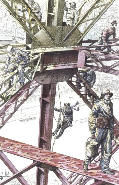
The enormous open-work four-footed structure, made of seven thousand tons of iron and erected in less than two years, was richly decorated overall but especially, as already noted, across the first platform.17 It bore a dazzlingly bright red painted surface (changed to brown in 1899 in preparation of the next Exposition Universelle; fig. 3).18 Georges Garen’s gravure(fig. 4) highlights the dazzling nighttime effects of the Tower’s éclairage: 10,000 gas lit globes glowed brightly, and ferociously intense electric searchlights streamed from the campanile(as its crest was called) at the summit.


Two aspects of the Tower’s inaugural aesthetic remain little studied: its radical initial conception (1884) and its original adornments (1889). On the former, it began conceptual life in 1884 as a rigorously stripped-down metal pylône (fig. 5) designed by two chief engineers in Eiffel’s office, the Compagnie des Établissements Eiffel, Maurice Koechlin and Émile Nouguier. The word “pylon” is Koechlin’s own: describing his sketch of 6 June 1884 he called it “a large pylon consisting of four trellised beams separated at the base and narrowing toward the summit, joined together by metal girders placed at regular intervals.”19 It was in other words a large pylon with four columns of lattice-work girders, separated at the base and joined at the top. They would be joined together by more girders spaced at regular intervals. Acting on the basis of the Koechlin-Nouguier plan, on 18 September 1884 Eiffel registered a patent under his and the two engineers’ names “for a new configuration allowing the construction of metal supports and pylons capable of exceeding a height of 300 meters.”20

Pylons, standard metal bridge components, were familiar structures in the engineering world thanks in large part to Eiffel’s earlier specialization in bridges. Koechlin’s use of the word “pylône” in 1884 is clear proof of that terminological fluency. For example, Eiffel’s 162-meter span Garabit Viaduct (1880–1884), a railway bridge over the Truyère River in southern France, the highest bridge in the world at the time, consisted of a long horizontal bed supported by a broad iron arch and two pylons. Another apposite high-profile metal structure, albeit eventually concealed, was the one designed by Eiffel for the interior of Auguste Bartholdi’s Statue of Liberty, completed in 1883. A twenty-eight-meter pylon was the central attachment point for the network of girders that formed the statue’s body. Koechlin’s 1884 design emulated such functional structures by imagining the 300-meter Tower as a free-standing, oversized, brashly exposed, and functionless pylon. Despite the lacey ornamentation that festooned the completed Tower, many observers could only see it as a pylon. As a consequence, numerous opinions of the Tower were hostage to the limitations of what I call “Pylon Vision.”
Apropos of the scalloped arcades added to Koechlin’s naked pylon, Frédéric Seitz’s understated description is apt: “the construction lines were embellished with some decorations characteristic of the end of the nineteenth century.”21 Did Gustave Eiffel dream up the ornamented promenade? No. The engineers Koechlin and Nouguier, originators of the metal pylon, were joined by the architect Stephen Sauvestre.22 As Michel Lyonnet du Moutier observed, “it is true that the first working drawing was not very attractive,” and it was Sauvestre that gave the tower an aesthetic form.23 Sauvestre’s scalloped promenoir, ignored by many onlookers, was however found extraordinary by some, as in this vivid description, whose author was smitten by the effects of gas light on the arches of the first level:
Below, all around, the gallery or promenoir presents itself facing out as a succession of loggias, of gracious arcades. The tympana of the arcades are gilt latticework in the shape of fans, of which the lines start from a light colonnette. The vertical separations between the loggias are up to date with cabochons in carnelian crystal. Behind the cabochons are gas flames. They are many sparkling columns on the days of illumination. On those days when the lines of fire follow the major lines of the monument, one is very aware of the artistic value of this cyclopean conception.24
It was, then, the trio of Nouguier, Koechlin and Sauvestre that drew up the project that was submitted to and won the competition. It was an elaboration of the uncompromisingly minimalist pylon of 1884. Daniel Le Comte emphasizes the importance of the decoration, but overstates Eiffel’s role: “he had to add decoration to get it accepted. Thanks to the ornament, Eiffel eliminated his competitors.”25 Apparently the stonework pedestals out of which the Tower’s legs emerge with staggering torsion, the monumental arches that link the columns and the first level, a bulb-shaped campanile for the top, and the lacework of the first platform were all attributable to Stephen Sauvestre. Insisting on the singularity of the Eiffel Tower, as many have done, conceals the fact that Sauvestre’s ornament synched up with the vocabulary of many stone and metal structures of the era. The scalloped iron mini portals of the original first platform (fig. 1), the work of Sauvestre, were akin to architectural ornament fashioned by Jacques-Ignace Hittorf (e.g. on the interior of St. Vincent de Paul, Paris, 1844). They also echoed the stylized floral metal ornament that bestrides the crest of the rooftops of Notre Dame de Paris (fig. 6) designed by Eugène Emmanuel Viollet-le-Duc between 1845 and 1868.

As Eiffel himself pointed out in 1900, the arches that linked the uprights were purely decorative, performing no functional work whatsoever.26 Assuming (wrongly), like everyone else, that the most surprising aspects of the Tower’s form were Eiffel’s exclusively, T. J. Clark was actually paying tribute to the extraordinary Sauvestre when he observed in a 1975 classroom lecture I heard and never forgot: “The moment of torsion, of maximum stress, is displayed above ground. No trained architect of the nineteenth century before this would ever have dared to show the stress and strain in his work in quite such a graphic way.”27
With Sauvestre’s elegant and intricate ironwork in mind, we confront a puzzling aspect of the Tower’s reception. Why were its jewel-like enhancements ignored by so many observers and artists? Why did a Pylon Gestalt or Pylon Vision shape and deform the perception of so many onlookers?
Condemnations of the Tower
The Tower needed state sanction because Eiffel’s daring structure was condemned more than lionized until the post-World War II era.28 While twenty-first-century tourist literature spins the sight and the experience of the Tower as sources of joy, artists and writers protested plans for the Tower even as it was being built. The most prominent condemnation was the 1887 “Protestation des artistes,” which ran in Le Temps (14 February) as a petition to Jean-Charles Adolphe Alphand, the Director of Public Works and Commissioner of the 1889 Exposition. It was signed by luminaries of the art establishment including Charles Gounod, Charles Garnier, Albert Wolff, Guy de Maupassant, Alexander Dumas fils, and the painters William-Adolphe Bouguereau and Ernest Meissonier.29 Xenophobia certainly ungirded their attack; among their stinging accusations was this barb: “…the Eiffel tower, which even the commercial America itself would not want, is, do not doubt it, the dishonor of Paris.”30 But the governing trope of their brief against Eiffel’s structure is often forgotten. Their vision of the Tower’s eventual appearance was that it would be a “gigantic and black factory chimney.”31 The naysayers selected a poor metaphor in view of the iron structure’s eventual manifold ornamental flourishes not to mention the monument’s transparency.32 But its function as the return of the repressed in the sphere of banished smoky industry cannot be undervalued. An unidentified humorous illustrator moved against the deeply entrenched factory chimney trope in a hilarious fashion (fig. 7). “Indiscrétions sur l’Exposition,” imagines the Tower as a Rococo candelabrum. The caption reads: “Until now tasteful folks saw in it only a formidable factory chimney or a pretentious scaffolding. Wait for the judge: the current structure is covered with morsels of artistic decoration of the purest Rococo style.” Indeed Sauvestre’s decorations, while not Rococo per se, were elaborate versions of familiar and widespread late nineteenth-century architectural decoration and highly visible as a result. Except to those determined not to see it: those blinded by Pylon Vision.

Some signatories of the protest letter later recanted, but others continued to resist the completed Tower, among them Maupassant, who hated it so much that he often ate lunch in the Tower’s second floor restaurant, the only point in the city where he couldn’t see “this tall skinny pyramid of iron ladders, this giant and disgraceful skeleton.”33 His disdain grew apace. In 1890, reflecting an economy already awash in souvenir reproductions, he averred: “I left Paris and even France, because the Eiffel Tour bored me too much. Not only does one see it everywhere, but one finds it everywhere, made of all known materials, exposed in all the windows, inevitable and torturing nightmare.”34 The 1887 artists’ protest had predicted that the Tower would overshadow Notre-Dame, the Sainte-Chapelle, the Tour Saint-Jacques, the Louvre, the Dôme of the Invalides, and the Arc de Triomphe: “all our monuments humiliated, all our architecture dwarfed, that will disappear in this stupefying dream.”35 Composer Erik Satie snidely indicted worries of this sort: “Our personal information permits us to affirm that there will be a Universal Exhibition in the middle of the year 1889. But you will not see it, because of the Eiffel Tower.”36
Edmond de Goncourt, sharp-tongued wit, was pointed and cruel: “you couldn’t dream of anything more ugly to the eye of an old civilized onlooker (or an old civilization).”37 J.-K. Huysmans also disdained the Tower. In his essay, “Le Fer (Iron),” he used the imagery of rebarbative industry when he wrote: “its tower resembles a factory chimney under construction.”38 Those who were smitten by the Tower in the immediate aftermath of its opening (31 May), also deployed the descriptive and metaphorical language of industry but with positive connotations. Louis Gonse, editor-in-chief of the Gazette des Beaux Arts, for example, wrote a paean to the new structure calling it “the industrial masterpiece of this century of iron.”39 And besotted by its interaction with the elements, he opined: “Its aerial figure dominates Paris without crushing it; one sees it from everywhere, with its looks varying with the clouds and the hours of the day, sometimes light, grey and faded, like a lighthouse drowning in the fog, or manly and hard when the wind blows and its summit is plunged into a cloud, sometimes flushed by the rays of the setting sun, or rose and transparent under the caresses of the light of dawn.”40
Visitors liked mounting the Tower right from the start. They voted loudly in favor with their feet. Over the seven-month duration of the exhibition—15 May to 6 November—1,953,122 people visited the Tower; an average of 11,800 per day.41 Whether it remained visitable between 1889 and 1900 and on what terms remain open questions—the subject of another essay—but it lost popularity in 1900 vis-à-vis its debut season. In 1900 (compared to 1889) there were 51 percent fewer visitors to the Tower. And there were other signs of a lessening of interest: fewer Tower shaped souvenirs were sold. Moreover, its unconcealed metal, all that ornament notwithstanding, made it an anachronism in 1900. According to Henri Loyrette, it compared badly to the high-profile masonry building of the moment including the classicizing stone and glass of the Gare d’Orsay and the Grand Palais.42 Between 1901 and 1914, attendance figures declined precipitously with no more than 120,000 to 260,000 visitors per year.43
Artists and the Tower
After the “Protest” of 1887, no “official” painter nor any members of the young Impressionist school drew inspiration from the Eiffel Tower.
Frédéric Seitz, 200144
Seitz was right to note the Tower’s absence from the artwork of the Impressionist vanguard, which was not however a “young” school in Paris in 1889. Period graphic images—both commercial prints and photographs—often however examined the structural complexity of the Tower’s crisscrossing iron members on the interior (fig. 8, for example). And some aesthetically progressive painters and printmakers were interested in the monument’s exterior.45 The history of painting prior to 1910 has not yielded a parallel to figure 8, but the words of Paul Gauguin, lithographs by Henri Rivière (figs. 9 through 12), and a small painting by Georges Seurat (fig. 13) as glossed by Meyer Schapiro engaged with related formal issues.46 Henri Loyrette was nonetheless justified in observing, presumably with Robert Delaunay’s Tower-centric paintings in mind, that the eventual “pictorial glory” of the Tower coincided with the decline of its fortune; when it was neither an object of controversy nor yet a mythic symbol.47

Paul Gauguin paid close attention to Eiffel’s decorative use of iron. In his very first published writing, “Notes on Art at the Universal Exhibition” of July 1889, the artist recognized that the exhibition was “the triumph of iron, not only with regard to machines, but also with regard to architecture. And yet architecture is at its beginnings, in that, as an art, it lacks a style of decoration consistent with the material which architecture uses.”48 Only in the Eiffel Tower “to some extent” did he find some examples of the “ornamental bolts, iron cornices extending beyond the main line, a sort of Gothic lacework of iron.”49 Gauguin’s response is notable in light of my effort to demonstrate that an acknowledgement of the Tower’s Gothic lacework of iron was rare indeed.
Henri Rivière, shadow-theater artist at the Chat Noir cabaret in Montmartre and innovative photographer of the Tower under construction, deserves the spotlight because his art struggled complexly to capture the improbability and novelty of the structure designed by Eiffel and his associates. A number of his lithographs seem to have explicitly sought to figure uneasiness at the sight of the Tower, or at least a strong sense of the monument’s impertinent clash with its surroundings. His japoniste prints, Trente-Six Vues de la Tour Eiffel, published in 1902, were based on the work of Utagawa Hiroshige plus his own visit to and photographs of the Tower under construction in 1888.50
In Vue 5 (fig. 9), “Rue Beethoven,” a looming background cross-section of the lacy volumetric structure, sliced just above and below the first platform, contrasts sharply and uncomfortably with the scale and forms of a consummate example of “Vieux Paris” in the foreground: a street in the sixteenth arrondissement inhabited by the poor.51 (Because the lithographs are inked uniformly in monochrome plus some brown-yellows, there was no way to show the red color of the painted Tower.) The lithograph conjures the appearance of Old Paris via old-fashioned partially ruined buildings on a modest stone thoroughfare (albeit separated from the Tower by a Haussmannian apartment building), and defines its provincial social life by the quotidian timelessness and modesty of laundry strung across the street, chickens pecking the ground, and one conversation between a modestly dressed woman and man on the old pavement.52 Vue 31 (fig. 10), “Du Quai de Passy – Charbonniers,” makes the case for visual incommensurability in even stronger terms by staging a clash between the pale silhouette of the flattened symmetrical metal structure at center, avatar of technical modernity, and a dark silhouette of traditional labor, worker plus horse and cart collecting wood to burn into charcoal. It is hard to ignore the violence of the black diagonal tool at the very center of the sheet that slices up into the decorated promenade of the first floor of the Tower. More striking still is the alert standing pose of the hyper legible worker on the cart which seems meant to register his feeling threatened as he looks at and recoils from the iron giant in the near distance.


Two of Rivière’s lithographs, the railway-centric “Du Quai de Javel (baraque d’aiguilleur),” (Vue 28, fig. 11) and his symphony of chimneys, “Vue des toits,” (Vue 21, fig. 12) exemplify what I have named “Pylon Vision.” Vue 28 cleverly aligns the Tower with a cluster of cognate vertical instrumental forms, chimneys and a railway signal, endeavoring cheekily to assimilate the Tower to a world of pure industrial shape and utility. Vue 21 is a bit more complicated: its choreographed forest of wobbling and angular black-grey chimneys serves to stress the regularity of the surface of Eiffel’s distant faded tower. Eiffel himself shared this vision of the industrial non-decorative character of the Tower when he wrote, “It is only the progress of science and the art of the engineer, and that of metallurgic industry that distinguishes the end of our century, through which we have been able to overcome the path trod by older generations by the construction of this Tower which will be one of the characteristics of modern industry, because it [modern industry] alone rendered it possible.”53


Meyer Schapiro responded fluently to color in art. His eloquent 1955 discussion of Georges Seurat’s small 1889 oil painting (fig. 13) argues for a close bond between the forms of the Tower and Seurat’s divided strokes:
In painting the Tower in 1889, even before it was completed, Seurat took a stand on an object of intense dispute among artists at the time. The enemies of the Tower included writers like Huysmans who saw in it only the Notre Dame de la Brocante—a vulgar assertion of the power of industry and trade. For Seurat the tower was a congenial work of art of which he had anticipated the forms in his own painting. Its clean, graceful silhouette has an unmistakable affinity with the lines of the trombonist in his Side Show and the central nude in the Models. Besides, the construction of this immense monument out of small exposed parts, each designed for its place, and forming together out of the visible crisscross and multiplicity of elements a single airy whole of striking simplicity and elegance of shape, was not unlike his own art with its summation of innumerable tiny units into a large clear form which retained the aspect of immaterial lightness evident in the smaller parts. In its original state the Tower was closer to Seurat’s art than it is today; for the iron structure was coated with several shades of iridescent enamel paint—the poet Tailhade called it the “speculum-Eiffel.” If the identity of the painter of Seurat’s pictures were unknown, we could call him appropriately the Master of the Eiffel Tower.54

While Schapiro did not see the Tower’s Gothic lacework of iron in the canvas, though he did acknowledge the orange-red of the original structure, I would argue that Seurat did. There is an unmistakable delineation of the scallops that comprised Sauvestre’s first platform, but the strokes are begrudging in their acknowledgement of volume and depth. His use of royal blue and saturated rose creates the illusion of a cast shadow, but the promenoir scallops themselves are flattened and generalized. The fact remains, following Schapiro’s argument, that there was an undeniable synchronicity between the fashioning of the Tower out of so many identical prefabricated iron parts riveted together and Seurat’s painstaking fashioning of the structure out of many separate orange, red and complementary blue-mauve strokes.55
If we do not attend to Seurat’s response to the Tower’s horizontal tier of ornament, albeit delicate and very slight, it would seem that Seurat seen through the lens of Schapiro anticipated the extremely certain assessment of contemporary German art historian Hubertus Kohle, who has very recently written this about the Tower with specific interest in arguing that it was openly democratic and egalitarian: “The monument is formed from myriad prefabricated elements that are more or less identical; an edifice is borne from this accumulation that, in the eyes of classicism, is a simple collection of elements. There is no structural hierarchy in the tower subordinating elements as a function of their location whether at the center or the periphery.”56
Fascinatingly for our purposes, Kohle’s text exemplifies Pylon Vision and resonates importantly with Schapiro’s admiring characterization of Seurat’s multi-partite construction in paint. Pylon Vision has unfortunately dominated the discussion and the perception of the Eiffel Tower for generations. While Sauvestre’s elegant ornament was removed and discarded by those in charge in 1937 in order to enhance the modernism and modernity of its profile, contemporary students of the Tower’s reputation need to put it back.
Coda: Factories and the Eiffel Tower in 1900
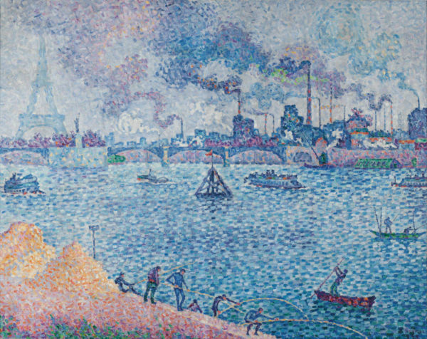
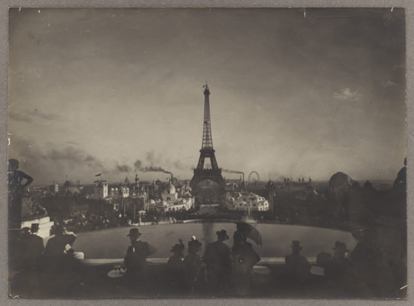
Paul Signac, erstwhile comrade of Seurat, represented the Tower from a distance repeatedly in the 1890s (fig. 14). Rather than grappling with the specificities of the iron forms of the monument itself, he drew back to emphasize the environmental and visual impact of the industrialization of the district across the river from the Champ de Mars. Signac straightforwardly depicted the area surrounding the Pont de Grenelle as chock-a-block with factory chimneys producing dark smoke. The next year, Félix Thiollier photographed belching smokestacks on the very grounds of the World’s Fair (fig. 15). An unintended but vivid consequence of this pattern of representation, ca. 1900, is to lay to rest once and for all the old late 1880s metaphor that endlessly likened the impertinent new Eiffel Tower to a factory chimney. Once industry and its smoking factory chimneys dug in and proliferated not far from the river across from the Champ de Mars, the Eiffel Tower must have looked lacey, crisp, fastidiously adorned, intricately crafted, trim, and transparent as never before.
