In 2014, while researching my book on Kem Weber, I was burrowing my way through one of innumerable closets in the house of Erika Plack, Weber’s youngest daughter. She had inherited the family archive, everything from the baby and holiday photos of several generations to myriad drawings, correspondence, images, and other ephemera related to her father’s career. It was all stored in boxes, file folders, and old suitcases spread throughout the house, a lovely, if time-worn, mid-century modern place in the hills above Santa Barbara, California. There was also, I discovered, a significant cache of material in several old steamer trunks, covered with a thin impasto of guano, in the former chicken coop.
Over time, I became adept at reading Weber’s scrawled handwriting—it was equally difficult whether he was writing in English or German—and at identifying his realized buildings and projects. One afternoon, however, I pulled a photograph out of a small suitcase from one of the bedroom closets, an image of a work I had not seen before (fig. 1). It was a tiny structure, mostly open, with a pitched roof and what appeared to be drawers on the lower portion, which opened to one side. Two little girls were seated before it, each holding a doll. Nothing was written on the back.
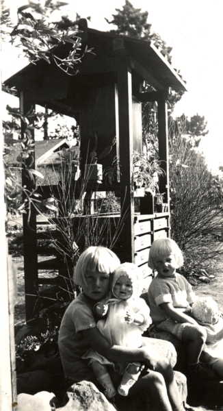
I took the photo to Erika, who was out pruning in her rose garden, and asked her what it was. She identified the two girls as her sister Ursula and herself (left and right, respectively). The structure, she explained, was the “Seed Shrine.” Weber had designed it for his wife, also named Erika, an avid gardener, after he had moved the family from Los Angeles to Santa Barbara in the early 1930s.
With the onset of the Great Depression, Weber, like most of the Southern California modernists, was having difficulty turning up new—or any—commissions. In those days, the cost of living in Santa Barbara was markedly lower than in the city; Weber made the move to save money. Erika and the four children lived in a small, wooden clapboard house on Alamar Avenue; he lived and worked in Los Angeles during the week, sometimes sleeping in his office or on a couch at a friend’s apartment. Each weekend, he would commute home. Erika (the wife) was growing much of the family’s food; she asked him to build a workstation where she could sort and save vegetable and flower seeds. The drawers, each of which had a fine mesh bottom, were used to dry the seeds.1
Weber, I guessed, had taken the structure’s form from Japanese Shinto shrines, likely the type one might find on a roadside. For some time, I looked for sources but found no direct ones. Recently, I shared the photograph with Daichi Shigemoto, one of my doctoral students, who is working on the history of modern Japanese architecture. His response was that the Seed Shrine’s flat working surface, with the cacti and flowers, and the drawers below suggested something else: Japanese Buddhist funerary monuments.2 It seems that Weber must have drawn inspiration from various traditional forms and adapted them to his purposes.
But this raises a rather interesting question. There are few, if any, other direct Asian borrowings in Weber’s designs. Born and educated in Berlin, he was a notably (better, resolutely) German architect and designer, and to the extent that he derived forms from others, it was invariably from contemporary German modernists—above all, his beloved teacher Bruno Paul.
I have pondered this issue for a long time. Why, at this moment of crisis in Weber’s life and career, when he sometimes had to borrow a few dollars from friends just so he could put gas in his car or have a cheap meal, was he ruminating on Japanese architectural forms?
There is a larger question here, of course. It has to do with the symbiosis between East Asian forms and the rise of California Modern. Evidence of this influence of Asian design is everywhere: most of the leading Southern California modernists at one time or another made veiled or direct recourse to Japanese or Chinese tradition (more often the former); it is distinctly infused into a great deal of the new architecture.
Part of the answer as to why this happened is obvious: there was the extensive Pan-Pacific exchange of that time; the fact that there were many trading companies in California dealing directly with Japan and China; the cultural impact of the largish populations of Chinese and Japanese immigrants in the region; and the reality that Japanese architecture—especially—was admired by Western modernist architects.
There are, of course, various ways to get at this historical phenomenon. One could make a survey of the written or published influences, books like Ralph Adams Cram’s Impressions of Japanese Architecture, first published in 1905.3 One might also pursue other sources, from travel diaries and photographs to the then-popular penchant for collecting Asian antiquities. And one might also comb through the archives of the California modernists themselves, looking for direct, written clues.
The question I want to pose in this essay involves the specific role that this amalgam of Asian influences and modernist ideas had in forming the distinctive language of progressive California design. A definitive answer or even a topographic list is not possible here; that would require a far more extensive study—a book, really. Instead, I want to suggest a few corridors of seeing and understanding in the form of three short case studies.
1. M. Schindler’s Kings Road House
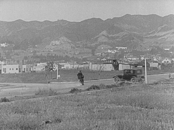
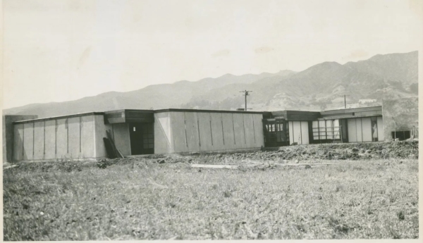
In one of the action scenes from Buster Keaton’s 1924 silent comedy film, Sherlock Jr., Keaton speeds on his motorcycle up a mostly empty Kings Road in Hollywood (fig. 2). Visible to the left, past several unbuilt lots, is R. M. Schindler’s 1922 house, one of the landmarks of early Southern California modernism. In this view—and even in the early images in the Schindler archive—the house at first appears fortress-like, with seemingly heavy battered walls and a few narrow slits for openings (fig. 3). But anyone who knows the house is aware that the impression from the inside—especially in the rear-facing unit (there were two, one for Schindler and his wife Pauline, the other for Clyde and Marian Chace)—is light, bright, and rather more “impermanent” in feel. Much of the structure is wood, with open ceiling joists, simple slatted walls, modular (rectangular) windows, and sliding doors. Some of the house’s formal language is lifted straight from Otto Wagner’s “school” at the Vienna Academy of Fine Arts (where Schindler had studied before leaving for the United States). But more of it is decidedly Japanese in appearance.
Some of the likely sources for Schindler’s interest in the traditional Japanese house are obvious: the popularity of Japonisme in fin-de-siècle Vienna and his time working for Wright at Taliesin and, later, in Los Angeles, just at the moment when Wright was engaged with the Imperial Hotel Project in Tokyo. A team of Spanish scholars, led by José Manuel Almodóvar Melendo, have pointed to Schindler’s relationship with Arata Endo, whom Wright had hired to serve as “chief draftsman for the Imperial Hotel Project and during his one-year stay in Taliesin (1917–1918) … worked with the team responsible for transforming Wright’s sketches into working plans for the Imperial Hotel and into drawings for five Japanese residences and a theatre.” Schindler met Endo during this period, and the two maintained a long friendship.4 Still, much of the evidence they cite for Schindler’s connections to Japanese architecture and architects comes after 1922, after the house was finished. They also speculate about whether Schindler had seen Edward Morse’s 1886 book, Japanese Homes and their Surroundings, which is a likely source for elements of Wright’s Prairie house aesthetic.5
Morse, one of the first Westerners to document Japanese domestic design in detail, spent three years in Japan studying and teaching zoology. His book, which he published after his return, features numerous drawings he made of Japanese houses, including construction details—a great deal of what one would need to build in the same way. There is no evidence that Schindler knew the work. But it makes little difference whether he did or not. Somewhere along the path of his early career, he had seen enough of traditional Japanese building to borrow from it and transform it in his own way.6
I emphasize this because Schindler’s Kings Road House, one of the most manifestly Japanese of the Asian-inspired houses of the early Los Angeles moderns, was no mere replica. As Almodóvar and his co-authors note, Schindler implemented a composite construction system. Their claim is that it is “clearly similar to that described by Morse,” but, of course, that does not necessarily mean that Morse was Schindler’s source.7
What one does see throughout the house is how Schindler adapted traditional Japanese woodwork to simpler joinery—mostly nails—and standard, industrially produced milled lumber (fig. 4). What is also evident is the way in which he opts for an open framing system, with spatial partitions arranged in such a manner that they are not load bearing—in keeping with Japanese tradition. In an article he published more than a decade later in T-Square, Schindler describes his approach: “all partitions and patio walls are non-supporting screens composed of a wooden skeleton filled in with glass or with removable canvas panels.”8
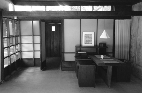
Schindler also followed the standard Japanese practice of leaving the materials—redwood, canvas, and glass—in their natural state, in no way embellishing them. Many of the other features of the house speak to traditional Japanese house forms—the imposition of multi-functional spaces, for example, or direct openings to the gardens, the use of screens in place of walls, and broad overhangs. There is also the house’s general sense of openness and the clear tensions between its geometric formality and the relaxed character of its rooms.
But it is not a Japanese house, any more than it is a Wrightian or a Wagnerian one. The overriding theme is Schindler’s attempt to devise a simple and light constructive fabric that could facilitate indoor-outdoor living, push new ideas of building logic (the lift-slab panels, above all), while granting the whole a decidedly modern cast. The Japanese element is a means to an end; it is not the aim. This becomes even more evident in Schindler’s subsequent house designs, beginning with the 1925 Howe House, which retain some of the spirit of Japanese construction while moving away from its specific forms. As Schindler came more and more to contrive his own distinctive architectonic language in the later 1920s, all that remained were a few abstracted bits of Japanese building logic. He adapted the Japanese forms not because he was seeking some type of verisimilitude—he was, in other words, not attempting to recreate a specific form-language in the mode of the historicists—but because he found the forms useful in his effort to devise an architectonic language suitable for the distinctive terrain and climate of Southern California.
2. Harwell Hamilton Harris’s Fellowship Park House
We can witness a similar process at work in one of the early designs of Harwell Hamilton Harris. Harris apprenticed with Richard Neutra in the late 1920s and early 1930s; he also learned informally from Schindler. He overlapped with Gregory Ain in Neutra’s office, and for a time the two assisted each other after they set out as independent architects.
In 1935, with his future wife Jean Murray Bangs, Harris bought a steeply sloping lot in the Fellowship Park neighborhood of Los Angeles. Soon afterward, he received a call from his client, Pauline Lowe (for whom he had designed a house in Altadena in 1933–1934), asking him to replace the Japanese sliding doors from her house, which she complained “rattled in the wind,” and install conventional hinged doors. Harris bought the sliding doors from the contractor for a dollar each and moved them to the lot in Fellowship Park.
Harris stored the doors in a small shed on site, but he soon noticed that they were beginning to warp. He knew he needed to act quickly, lest the doors become entirely unusable, so he removed the shed and built a rectangular platform on wooden columns extending out over the hillside. In the living room of the structure, which occupied fully two-thirds of it, Harris installed the sliding doors, inserting them into a modular frame. When he ran out of doors, he made a solid section that helped brace the structure. The resulting dwelling was little more than the frame, a hipped roof, and the sliding doors (fig. 5).9
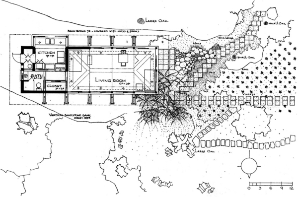
Harris asked noted local photographer Fred R. Dapprich to make images of the house while it was still mostly empty (fig. 6). He submitted the project to the 1936 House Beautiful Small House Competition. It won first prize, beating out two houses designed by Neutra. In 1938, it received an honor award from the Southern California chapter of the American Institute of Architects.10
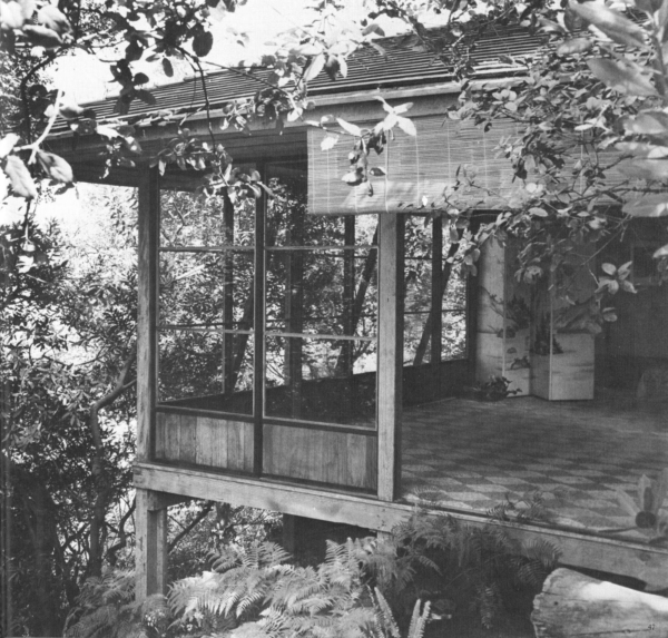
What Harris later said about the design underscores my thesis. He did not opt for Japanese forms because he sought to imitate them, he explained, but because they allowed him to explore an issue arising from the unique conditions of living in the region and his own formal predilections: “The Japanese house most satisfied my liking for immaterial form,—for space. It did not displace space; it marked space, it shaped space. And the materials of Japanese building—hardly more than thin lines and flat planes—were arranged to effect rhythm, rhythm without mass.”11
One could add that the mostly open house, very lightly constructed, was ideal for Southern California living. The house became fused with nature. It was man-made but entirely natural in terms of its materials and fully “connected” with its surroundings. Lisa Germany, who wrote the standard monograph on Harris, reveals that he “planted asparagus fern and mint he got from an aunt” around the house. “I would hose it off,” he recalled, “and so fill the air with mint odor (very fresh).”12
In his subsequent works, Harris would often reference Japanese forms—in the 1939 Blair House, for example—employing screens, a penchant for natural materials, and a pronounced formal modularity. What stands out even more is his interest in the play of light, which to my eye often has about it a Japanese sensibility. Harris was sensitive to fostering light patterns—or better, maybe, oppositions between light and dark, a long view and a truncated one, and the notion of pure subdued light versus shadow and patterning—all present, for example, in classic Japanese tea houses. Many of these mannerisms remained in his work, even in his later periods in Austin and Raleigh, where he spent his final years.
But Harris’s process was always about refinement and purification, about extracting effects from the forms rather than any sort of direct referencing. None of his later works appear directly Asian or Asian-inspired; they are instead the outcome of thinking about what Japanese traditions might yield in modernist terms.
3. Edward Durell Stone and Paul T. Frankl’s Coldwater Canyon House
Of the early Los Angeles moderns, the one who had the most direct contact with Asia was Paul T. Frankl. Frankl visited Japan twice, once in 1914 and again in 1936. He also made a hasty buying trip to China in 1939.13 Far more than Schindler or Harris, Frankl also made a concerted effort to learn about Japanese design philosophy. During his first sojourn in Japan, which took him to Tokyo (he stayed in a traditional inn, not far from the future site of Wright’s Imperial Hotel), then on to Nara, Osaka, and Kyoto, he was careful to observe all he could. And while in Kyoto, he had lessons in Japanese flower arranging, a skill he would use for the remainder of his career.
During his time in Japan, Frankl made note of even the most trivial details of living. He wrote of the “refinement” and “dignity” he saw everywhere; he was especially struck by the “art of elimination,” which he thought posed a potent alternative to Western taste. He described it as “the distilled essence of beauty.” And he took away from his experiences an especially strong love for the Japanese “simplicity of expression” and the “ability to use materials true to their nature.”14
In his later autobiography, he wrote about his love of traditional Japanese dwelling spaces: “The Japanese house always made me feel good and living in it takes me back to my early childhood in the nursery, where life was lived on the floor. The scrupulously clean, resilient tatami mats covering the floors … are pleasant to the touch. Seated on them or on a soft, comfortable silk pillow, you have the feeling of space and elbow room.”15
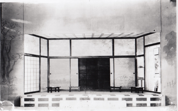
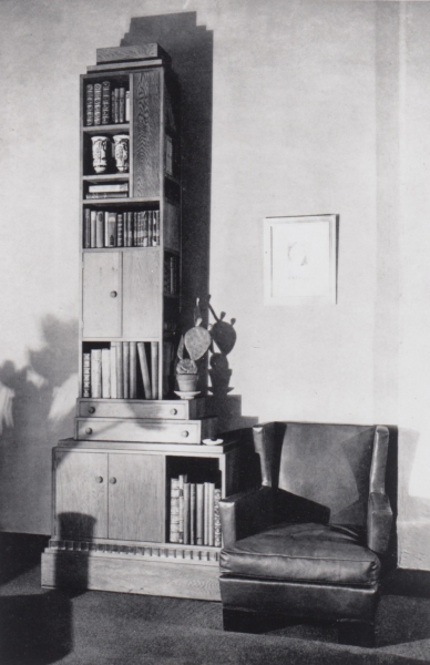
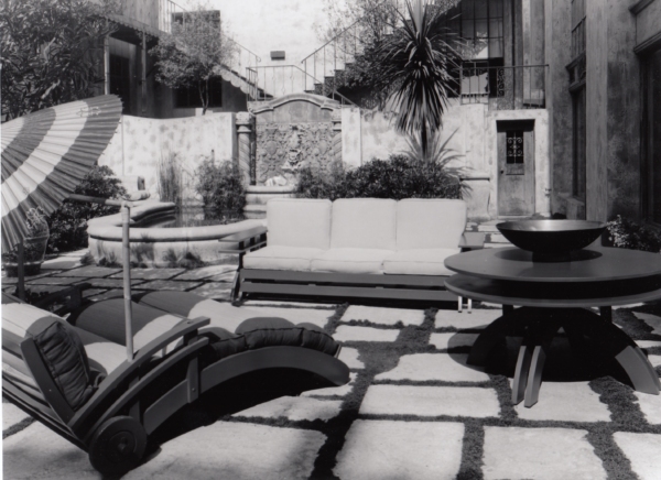
When Frankl first began to practice in New York in 1915 (he was unable to return to Vienna because of the outbreak of the First World War), he sometimes made distinctly Japanese references in his designs (fig. 7). And he recreated—quite faithfully given the circumstances—a Japanese interior for the play Bushido by Takeda Izumo, which was produced by the Washington Square Players at the Bandbox Theatre in New York in 1916 (fig. 8).16 Frankl’s later Skyscraper bookcases and desks, which catapulted him to fame in the mid-1920s, were based in part on Japanese Sendai chests, which he came to appreciate during his first Japan trip (fig. 9). Later, in his Los Angeles gallery, Frankl sold patio lounge chairs that seemingly borrowed their forms from the bridges in Chinese gardens (fig. 10).
It is hardly a surprise then that when Frankl decided to build his own house in Beverly Hills, he opted for a quasi-Asian “palette.” Frankl, who did not have an American architect’s license, asked Edward Durell Stone to design the house; Frankl would devise the interiors. Stone, who was not licensed in California, in turn worked with local architect Douglas Honnold.17 The house they created drew directly—or so it seemed—from traditional Japanese farmhouses, notably those with low, hip-and-gable roofs (fig. 11).
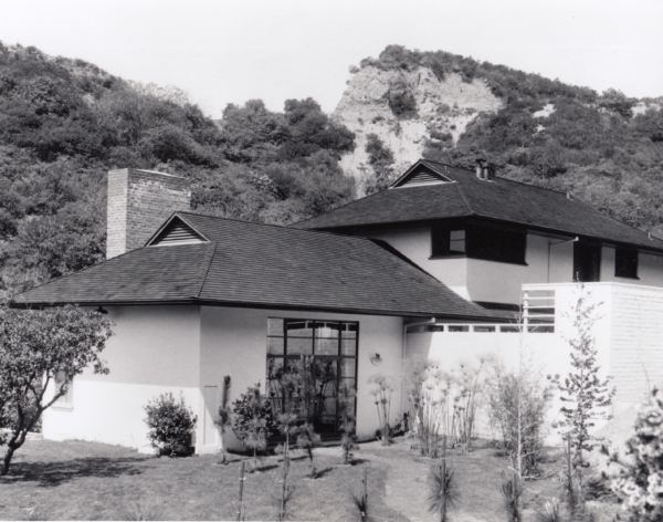
Frankl, however, explained that part of the house’s appearance was determined by the site, a long, narrow lot framed on one side by a stand of old walnut trees and on the other by the canyon walls. The rooms were arrayed in a nearly straight line, stair-stepped in two places to accommodate the sharply sloping terrain. An unnamed writer for California Arts and Architecture added that the house was “conceived in the modern spirit and kept simple and straightforward by the elimination of all things directly not necessary to the mode of life chosen by the owners.”18
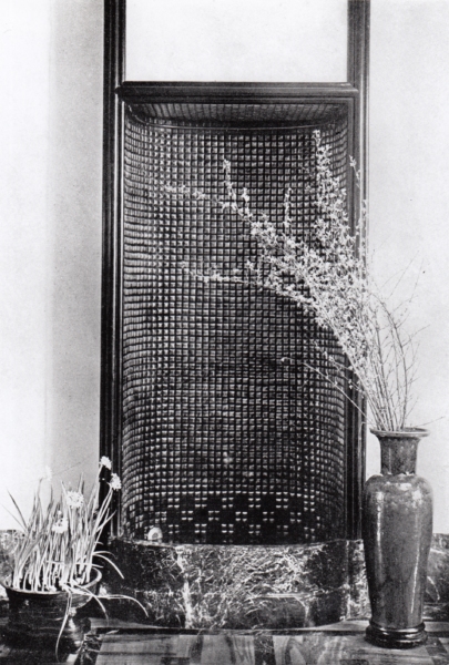
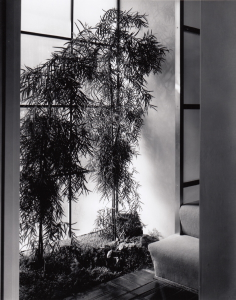
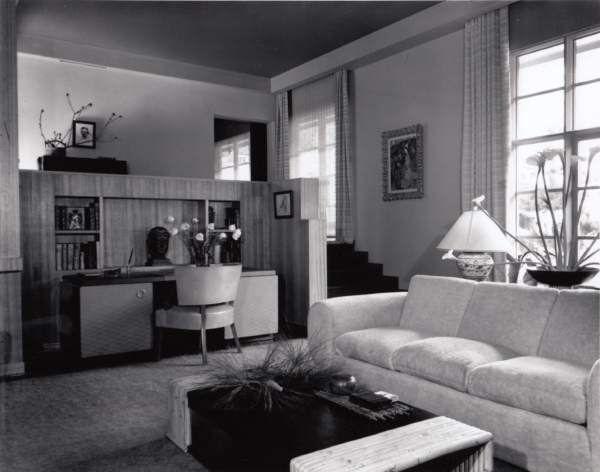
The house was thus, at best, Japanese “inspired.” The interiors bore this out. Frankl made a lovely interior garden arrangement by one of the stairways, lit from an exterior window (fig. 12). It appears to be much in the spirit of a Japanese formal garden—until one makes the direct comparison. Then the differences emerge. It is too condensed with too many elements. It is rather more an interpretation or an adaptation than an attempt at mimicry. The same may be said for the living room, with its pseudo-Japanese flower arrangements (fig. 13). But they are very nearly inconsequential. The cast of the room is Central European, almost Loosian with its changes in level and the deep, vaguely historically inspired veil of comfort. No one with any familiarity with Japanese design would mistake this space for a traditional house in Kyoto. And any good design historian in Vienna would recognize many, if not almost all, of its features.
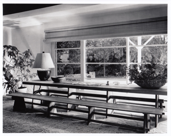
What Frankl excelled at instead was a clever sort of reworking. He would borrow elements—ofttimes, the essential features of a design—and through thoughtful fusion spawn something new—or almost new. My favorite example is the table and benches he made for the dining room of his house in Palos Verdes, where he moved his family after the American entry into World War II (theorizing that the Japanese were less likely to bomb that far away from Los Angeles proper). They are sandblasted ash with the grain left in high relief—and in that sense wonderfully Japanese in their material sensibilities (fig. 14). But the set is also something quite familiar—an adapted American picnic table, though exquisitely remade with X-supports and long, continuous dowels. It is straightforward, even spartan, but elegant and perfect in its simplicity.
Most of all, like the other examples I have discussed, the table and benches were—to borrow a familiar musical term—a riff on the originals. And to extend this metaphor, in each instance their makers were extracting a few bars from another tune, all the while singing their own song. Los Angeles modernism was never exactly “influenced by” Asian design so much as its makers mined bits and pieces and recast them. The essential features (mostly Japanese, again) are all there—space, light, thinness, lightness, and transparency, with a strong penchant for interacting directly with nature. But they are “re-shaped,” made new and original.
One might ask whether California Modernism would have arisen as we know it without the influence of these Asian forms or concepts. It is, of course, an impossible question to answer. I suspect the closest we can get to the truth is that it was “necessary but not sufficient,” meaning that many other influences and ideas came to have a part in the rise of this distinctive aesthetic. There is certainly research to be done, and with far greater specificity than what I have laid out here.
A Final Note
Weber’s “Seed Shrine” had a brief afterlife. After several of his friends, including Lloyd Wright, admired the design, Weber thought about producing and selling it. He approached one of his old acquaintances, Theodore W. Overlach, who owned a garden accessories shop in San Francisco. Overlach, too, was taken with the design and drew up a contract, agreeing to pay Weber $5.00 for each unit he sold. A few evidently were made, but the “Seed Shrine” was never a bestseller.19 It was, like much else that referenced Asian design in California, a one-off.
Notes
In 2014, while researching my book on Kem Weber, I was burrowing my way through one of innumerable closets in the house of Erika Plack, Weber’s youngest daughter. She had inherited the family archive, everything from the baby and holiday photos of several generations to myriad drawings, correspondence, images, and other ephemera related to her father’s career. It was all stored in boxes, file folders, and old suitcases spread throughout the house, a lovely, if time-worn, mid-century modern place in the hills above Santa Barbara, California. There was also, I discovered, a significant cache of material in several old steamer trunks, covered with a thin impasto of guano, in the former chicken coop.
Over time, I became adept at reading Weber’s scrawled handwriting—it was equally difficult whether he was writing in English or German—and at identifying his realized buildings and projects. One afternoon, however, I pulled a photograph out of a small suitcase from one of the bedroom closets, an image of a work I had not seen before (fig. 1). It was a tiny structure, mostly open, with a pitched roof and what appeared to be drawers on the lower portion, which opened to one side. Two little girls were seated before it, each holding a doll. Nothing was written on the back.

I took the photo to Erika, who was out pruning in her rose garden, and asked her what it was. She identified the two girls as her sister Ursula and herself (left and right, respectively). The structure, she explained, was the “Seed Shrine.” Weber had designed it for his wife, also named Erika, an avid gardener, after he had moved the family from Los Angeles to Santa Barbara in the early 1930s.
With the onset of the Great Depression, Weber, like most of the Southern California modernists, was having difficulty turning up new—or any—commissions. In those days, the cost of living in Santa Barbara was markedly lower than in the city; Weber made the move to save money. Erika and the four children lived in a small, wooden clapboard house on Alamar Avenue; he lived and worked in Los Angeles during the week, sometimes sleeping in his office or on a couch at a friend’s apartment. Each weekend, he would commute home. Erika (the wife) was growing much of the family’s food; she asked him to build a workstation where she could sort and save vegetable and flower seeds. The drawers, each of which had a fine mesh bottom, were used to dry the seeds.1
Weber, I guessed, had taken the structure’s form from Japanese Shinto shrines, likely the type one might find on a roadside. For some time, I looked for sources but found no direct ones. Recently, I shared the photograph with Daichi Shigemoto, one of my doctoral students, who is working on the history of modern Japanese architecture. His response was that the Seed Shrine’s flat working surface, with the cacti and flowers, and the drawers below suggested something else: Japanese Buddhist funerary monuments.2 It seems that Weber must have drawn inspiration from various traditional forms and adapted them to his purposes.
But this raises a rather interesting question. There are few, if any, other direct Asian borrowings in Weber’s designs. Born and educated in Berlin, he was a notably (better, resolutely) German architect and designer, and to the extent that he derived forms from others, it was invariably from contemporary German modernists—above all, his beloved teacher Bruno Paul.
I have pondered this issue for a long time. Why, at this moment of crisis in Weber’s life and career, when he sometimes had to borrow a few dollars from friends just so he could put gas in his car or have a cheap meal, was he ruminating on Japanese architectural forms?
There is a larger question here, of course. It has to do with the symbiosis between East Asian forms and the rise of California Modern. Evidence of this influence of Asian design is everywhere: most of the leading Southern California modernists at one time or another made veiled or direct recourse to Japanese or Chinese tradition (more often the former); it is distinctly infused into a great deal of the new architecture.
Part of the answer as to why this happened is obvious: there was the extensive Pan-Pacific exchange of that time; the fact that there were many trading companies in California dealing directly with Japan and China; the cultural impact of the largish populations of Chinese and Japanese immigrants in the region; and the reality that Japanese architecture—especially—was admired by Western modernist architects.
There are, of course, various ways to get at this historical phenomenon. One could make a survey of the written or published influences, books like Ralph Adams Cram’s Impressions of Japanese Architecture, first published in 1905.3 One might also pursue other sources, from travel diaries and photographs to the then-popular penchant for collecting Asian antiquities. And one might also comb through the archives of the California modernists themselves, looking for direct, written clues.
The question I want to pose in this essay involves the specific role that this amalgam of Asian influences and modernist ideas had in forming the distinctive language of progressive California design. A definitive answer or even a topographic list is not possible here; that would require a far more extensive study—a book, really. Instead, I want to suggest a few corridors of seeing and understanding in the form of three short case studies.
1. M. Schindler’s Kings Road House
In one of the action scenes from Buster Keaton’s 1924 silent comedy film, Sherlock Jr., Keaton speeds on his motorcycle up a mostly empty Kings Road in Hollywood (fig. 2). Visible to the left, past several unbuilt lots, is R. M. Schindler’s 1922 house, one of the landmarks of early Southern California modernism. In this view—and even in the early images in the Schindler archive—the house at first appears fortress-like, with seemingly heavy battered walls and a few narrow slits for openings (fig. 3). But anyone who knows the house is aware that the impression from the inside—especially in the rear-facing unit (there were two, one for Schindler and his wife Pauline, the other for Clyde and Marian Chace)—is light, bright, and rather more “impermanent” in feel. Much of the structure is wood, with open ceiling joists, simple slatted walls, modular (rectangular) windows, and sliding doors. Some of the house’s formal language is lifted straight from Otto Wagner’s “school” at the Vienna Academy of Fine Arts (where Schindler had studied before leaving for the United States). But more of it is decidedly Japanese in appearance.


Some of the likely sources for Schindler’s interest in the traditional Japanese house are obvious: the popularity of Japonisme in fin-de-siècle Vienna and his time working for Wright at Taliesin and, later, in Los Angeles, just at the moment when Wright was engaged with the Imperial Hotel Project in Tokyo. A team of Spanish scholars, led by José Manuel Almodóvar Melendo, have pointed to Schindler’s relationship with Arata Endo, whom Wright had hired to serve as “chief draftsman for the Imperial Hotel Project and during his one-year stay in Taliesin (1917–1918) … worked with the team responsible for transforming Wright’s sketches into working plans for the Imperial Hotel and into drawings for five Japanese residences and a theatre.” Schindler met Endo during this period, and the two maintained a long friendship.4 Still, much of the evidence they cite for Schindler’s connections to Japanese architecture and architects comes after 1922, after the house was finished. They also speculate about whether Schindler had seen Edward Morse’s 1886 book, Japanese Homes and their Surroundings, which is a likely source for elements of Wright’s Prairie house aesthetic.5
Morse, one of the first Westerners to document Japanese domestic design in detail, spent three years in Japan studying and teaching zoology. His book, which he published after his return, features numerous drawings he made of Japanese houses, including construction details—a great deal of what one would need to build in the same way. There is no evidence that Schindler knew the work. But it makes little difference whether he did or not. Somewhere along the path of his early career, he had seen enough of traditional Japanese building to borrow from it and transform it in his own way.6
I emphasize this because Schindler’s Kings Road House, one of the most manifestly Japanese of the Asian-inspired houses of the early Los Angeles moderns, was no mere replica. As Almodóvar and his co-authors note, Schindler implemented a composite construction system. Their claim is that it is “clearly similar to that described by Morse,” but, of course, that does not necessarily mean that Morse was Schindler’s source.7
What one does see throughout the house is how Schindler adapted traditional Japanese woodwork to simpler joinery—mostly nails—and standard, industrially produced milled lumber (fig. 4). What is also evident is the way in which he opts for an open framing system, with spatial partitions arranged in such a manner that they are not load bearing—in keeping with Japanese tradition. In an article he published more than a decade later in T-Square, Schindler describes his approach: “all partitions and patio walls are non-supporting screens composed of a wooden skeleton filled in with glass or with removable canvas panels.”8

Schindler also followed the standard Japanese practice of leaving the materials—redwood, canvas, and glass—in their natural state, in no way embellishing them. Many of the other features of the house speak to traditional Japanese house forms—the imposition of multi-functional spaces, for example, or direct openings to the gardens, the use of screens in place of walls, and broad overhangs. There is also the house’s general sense of openness and the clear tensions between its geometric formality and the relaxed character of its rooms.
But it is not a Japanese house, any more than it is a Wrightian or a Wagnerian one. The overriding theme is Schindler’s attempt to devise a simple and light constructive fabric that could facilitate indoor-outdoor living, push new ideas of building logic (the lift-slab panels, above all), while granting the whole a decidedly modern cast. The Japanese element is a means to an end; it is not the aim. This becomes even more evident in Schindler’s subsequent house designs, beginning with the 1925 Howe House, which retain some of the spirit of Japanese construction while moving away from its specific forms. As Schindler came more and more to contrive his own distinctive architectonic language in the later 1920s, all that remained were a few abstracted bits of Japanese building logic. He adapted the Japanese forms not because he was seeking some type of verisimilitude—he was, in other words, not attempting to recreate a specific form-language in the mode of the historicists—but because he found the forms useful in his effort to devise an architectonic language suitable for the distinctive terrain and climate of Southern California.
2. Harwell Hamilton Harris’s Fellowship Park House
We can witness a similar process at work in one of the early designs of Harwell Hamilton Harris. Harris apprenticed with Richard Neutra in the late 1920s and early 1930s; he also learned informally from Schindler. He overlapped with Gregory Ain in Neutra’s office, and for a time the two assisted each other after they set out as independent architects.
In 1935, with his future wife Jean Murray Bangs, Harris bought a steeply sloping lot in the Fellowship Park neighborhood of Los Angeles. Soon afterward, he received a call from his client, Pauline Lowe (for whom he had designed a house in Altadena in 1933–1934), asking him to replace the Japanese sliding doors from her house, which she complained “rattled in the wind,” and install conventional hinged doors. Harris bought the sliding doors from the contractor for a dollar each and moved them to the lot in Fellowship Park.
Harris stored the doors in a small shed on site, but he soon noticed that they were beginning to warp. He knew he needed to act quickly, lest the doors become entirely unusable, so he removed the shed and built a rectangular platform on wooden columns extending out over the hillside. In the living room of the structure, which occupied fully two-thirds of it, Harris installed the sliding doors, inserting them into a modular frame. When he ran out of doors, he made a solid section that helped brace the structure. The resulting dwelling was little more than the frame, a hipped roof, and the sliding doors (fig. 5).9

Harris asked noted local photographer Fred R. Dapprich to make images of the house while it was still mostly empty (fig. 6). He submitted the project to the 1936 House Beautiful Small House Competition. It won first prize, beating out two houses designed by Neutra. In 1938, it received an honor award from the Southern California chapter of the American Institute of Architects.10

What Harris later said about the design underscores my thesis. He did not opt for Japanese forms because he sought to imitate them, he explained, but because they allowed him to explore an issue arising from the unique conditions of living in the region and his own formal predilections: “The Japanese house most satisfied my liking for immaterial form,—for space. It did not displace space; it marked space, it shaped space. And the materials of Japanese building—hardly more than thin lines and flat planes—were arranged to effect rhythm, rhythm without mass.”11
One could add that the mostly open house, very lightly constructed, was ideal for Southern California living. The house became fused with nature. It was man-made but entirely natural in terms of its materials and fully “connected” with its surroundings. Lisa Germany, who wrote the standard monograph on Harris, reveals that he “planted asparagus fern and mint he got from an aunt” around the house. “I would hose it off,” he recalled, “and so fill the air with mint odor (very fresh).”12
In his subsequent works, Harris would often reference Japanese forms—in the 1939 Blair House, for example—employing screens, a penchant for natural materials, and a pronounced formal modularity. What stands out even more is his interest in the play of light, which to my eye often has about it a Japanese sensibility. Harris was sensitive to fostering light patterns—or better, maybe, oppositions between light and dark, a long view and a truncated one, and the notion of pure subdued light versus shadow and patterning—all present, for example, in classic Japanese tea houses. Many of these mannerisms remained in his work, even in his later periods in Austin and Raleigh, where he spent his final years.
But Harris’s process was always about refinement and purification, about extracting effects from the forms rather than any sort of direct referencing. None of his later works appear directly Asian or Asian-inspired; they are instead the outcome of thinking about what Japanese traditions might yield in modernist terms.
3. Edward Durell Stone and Paul T. Frankl’s Coldwater Canyon House
Of the early Los Angeles moderns, the one who had the most direct contact with Asia was Paul T. Frankl. Frankl visited Japan twice, once in 1914 and again in 1936. He also made a hasty buying trip to China in 1939.13 Far more than Schindler or Harris, Frankl also made a concerted effort to learn about Japanese design philosophy. During his first sojourn in Japan, which took him to Tokyo (he stayed in a traditional inn, not far from the future site of Wright’s Imperial Hotel), then on to Nara, Osaka, and Kyoto, he was careful to observe all he could. And while in Kyoto, he had lessons in Japanese flower arranging, a skill he would use for the remainder of his career.
During his time in Japan, Frankl made note of even the most trivial details of living. He wrote of the “refinement” and “dignity” he saw everywhere; he was especially struck by the “art of elimination,” which he thought posed a potent alternative to Western taste. He described it as “the distilled essence of beauty.” And he took away from his experiences an especially strong love for the Japanese “simplicity of expression” and the “ability to use materials true to their nature.”14
In his later autobiography, he wrote about his love of traditional Japanese dwelling spaces: “The Japanese house always made me feel good and living in it takes me back to my early childhood in the nursery, where life was lived on the floor. The scrupulously clean, resilient tatami mats covering the floors … are pleasant to the touch. Seated on them or on a soft, comfortable silk pillow, you have the feeling of space and elbow room.”15
When Frankl first began to practice in New York in 1915 (he was unable to return to Vienna because of the outbreak of the First World War), he sometimes made distinctly Japanese references in his designs (fig. 7). And he recreated—quite faithfully given the circumstances—a Japanese interior for the play Bushido by Takeda Izumo, which was produced by the Washington Square Players at the Bandbox Theatre in New York in 1916 (fig. 8).16 Frankl’s later Skyscraper bookcases and desks, which catapulted him to fame in the mid-1920s, were based in part on Japanese Sendai chests, which he came to appreciate during his first Japan trip (fig. 9). Later, in his Los Angeles gallery, Frankl sold patio lounge chairs that seemingly borrowed their forms from the bridges in Chinese gardens (fig. 10).


It is hardly a surprise then that when Frankl decided to build his own house in Beverly Hills, he opted for a quasi-Asian “palette.” Frankl, who did not have an American architect’s license, asked Edward Durell Stone to design the house; Frankl would devise the interiors. Stone, who was not licensed in California, in turn worked with local architect Douglas Honnold.17 The house they created drew directly—or so it seemed—from traditional Japanese farmhouses, notably those with low, hip-and-gable roofs (fig. 11).

Frankl, however, explained that part of the house’s appearance was determined by the site, a long, narrow lot framed on one side by a stand of old walnut trees and on the other by the canyon walls. The rooms were arrayed in a nearly straight line, stair-stepped in two places to accommodate the sharply sloping terrain. An unnamed writer for California Arts and Architecture added that the house was “conceived in the modern spirit and kept simple and straightforward by the elimination of all things directly not necessary to the mode of life chosen by the owners.”18
The house was thus, at best, Japanese “inspired.” The interiors bore this out. Frankl made a lovely interior garden arrangement by one of the stairways, lit from an exterior window (fig. 12). It appears to be much in the spirit of a Japanese formal garden—until one makes the direct comparison. Then the differences emerge. It is too condensed with too many elements. It is rather more an interpretation or an adaptation than an attempt at mimicry. The same may be said for the living room, with its pseudo-Japanese flower arrangements (fig. 13). But they are very nearly inconsequential. The cast of the room is Central European, almost Loosian with its changes in level and the deep, vaguely historically inspired veil of comfort. No one with any familiarity with Japanese design would mistake this space for a traditional house in Kyoto. And any good design historian in Vienna would recognize many, if not almost all, of its features.


What Frankl excelled at instead was a clever sort of reworking. He would borrow elements—ofttimes, the essential features of a design—and through thoughtful fusion spawn something new—or almost new. My favorite example is the table and benches he made for the dining room of his house in Palos Verdes, where he moved his family after the American entry into World War II (theorizing that the Japanese were less likely to bomb that far away from Los Angeles proper). They are sandblasted ash with the grain left in high relief—and in that sense wonderfully Japanese in their material sensibilities (fig. 14). But the set is also something quite familiar—an adapted American picnic table, though exquisitely remade with X-supports and long, continuous dowels. It is straightforward, even spartan, but elegant and perfect in its simplicity.

Most of all, like the other examples I have discussed, the table and benches were—to borrow a familiar musical term—a riff on the originals. And to extend this metaphor, in each instance their makers were extracting a few bars from another tune, all the while singing their own song. Los Angeles modernism was never exactly “influenced by” Asian design so much as its makers mined bits and pieces and recast them. The essential features (mostly Japanese, again) are all there—space, light, thinness, lightness, and transparency, with a strong penchant for interacting directly with nature. But they are “re-shaped,” made new and original.
One might ask whether California Modernism would have arisen as we know it without the influence of these Asian forms or concepts. It is, of course, an impossible question to answer. I suspect the closest we can get to the truth is that it was “necessary but not sufficient,” meaning that many other influences and ideas came to have a part in the rise of this distinctive aesthetic. There is certainly research to be done, and with far greater specificity than what I have laid out here.
A Final Note
Weber’s “Seed Shrine” had a brief afterlife. After several of his friends, including Lloyd Wright, admired the design, Weber thought about producing and selling it. He approached one of his old acquaintances, Theodore W. Overlach, who owned a garden accessories shop in San Francisco. Overlach, too, was taken with the design and drew up a contract, agreeing to pay Weber $5.00 for each unit he sold. A few evidently were made, but the “Seed Shrine” was never a bestseller.19 It was, like much else that referenced Asian design in California, a one-off.
Notes