Paula Peatross’s work requires some explanation of how it’s made, although that only goes so far to explain how it feels. This may be true of all art to some extent, but in Peatross’s work the truth is complicated by the way in which how it feels seems to be much more the result of the work’s physical production than is usually the case. We all want to know as much as possible about how works of art are made but, as noted, that usually doesn’t turn out to tell us all that much about how they affect us. Violin music, for example, is made by a horsehair bow being dragged across catgut strings. This explains something, but not much, because it is what is done with the sound that results rather than just the sound generically that seduces us with its magic and leads us, or lets us lead ourselves, into an experience that may depend on the bow and the strings but also causes us not to think about them all that much. I think, then, that I’ll first describe the way she works and then talk about the effect: perceptions that are caused by the way the physical structure makes them possible but are in practice perceptions not of structure but of movement. Her reliefs emphasize the physical in order not to remain grounded in it, instead being almost all about the ephemeral, something which may be experienced but not demonstrated. There are few things in art as manifestly physical as a relief, which presents the space of painting as much more of a thing than the usual web of drawn lines and their accompaniments on a flat rectangular surface. Peatross’s reliefs exist not to be physical but rather to emphatically declare their physicality and then cause one’s experience to deny it involuntarily, not to notice it but instead to turn the experience into its opposite: the emphatically physical makes possible an experience of the non-physical, of movement rather than solidity, weightlessness as opposed to weight and tangibility. That is where I’ll end up.
I think, like quite a few other people, that there are broadly speaking two kinds of art. One is made for and out of propaganda; the other is made with contemplation in mind. All religious and political art belongs to the first category. It tells a story one already knows; the purpose of the art is to give it some specific bias or interpretation that one may or may not already know. The second is not a narrative at all. Instead, it encourages one’s mind to wander, to allow the audience to think and feel for itself. Peatross’s art is of this second sort. There is no story there, no attempt to find Jesus’s face in the pizza.
This is not a distinction between nonrepresentational and representational art, but it is one between narrative and nearly everything else. And Peatross’s reliefs are unambiguously nonrepresentational. In addition to not being narratives (stories) of any sort, they are made without reference to anything else outside themselves, such as a landscape, the sole exception to that general rule being that they do preserve the limits and inflexions of her body. That aside, as the artist herself puts it, “Each one is itself.”
The finished works are made out of three or four layers of 3/8” plywood with paint applied in layers of as many as fifteen coats, but they begin with mostly freehand drawings on posterboard. When she ends up with something she likes and can use, it’s transferred to plywood using her Bosch electric saw. Each layer of plywood is likely to contain more than one image, the first layer being the bottom one, touching the wall while the next two or three are built onto it. The works are generally quite small, 28.5 x 25.5 x 1 ½ (4 x 3/8)” for example. The color is rich and intense, as one might expect given the number of layers of paint, which is generally oil paint supplemented in some parts by her use of pearlescent color (Jacquards Lumiere metallic and pearlescent color) and the addition of Dorland’s dry wax to everything.
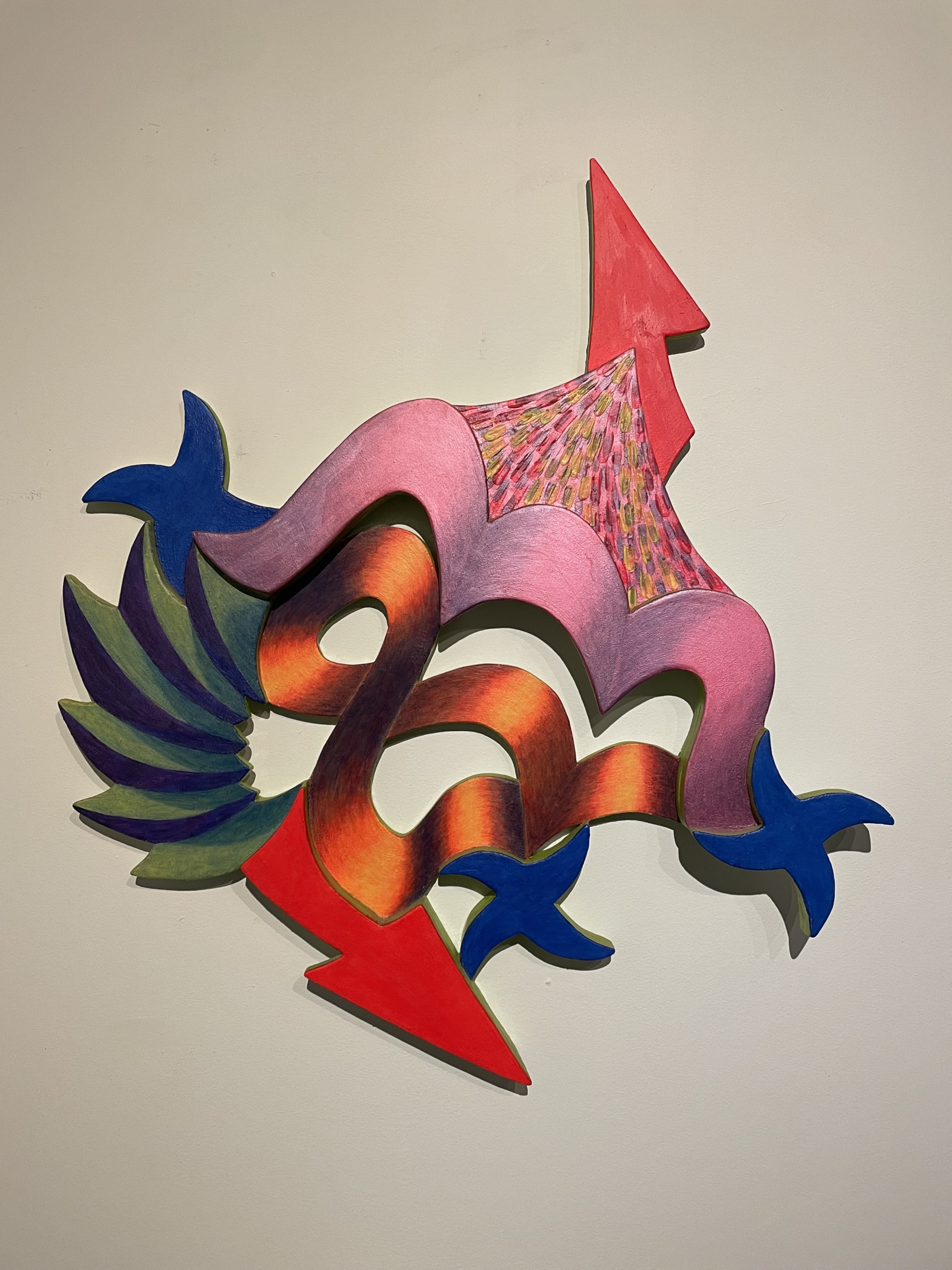
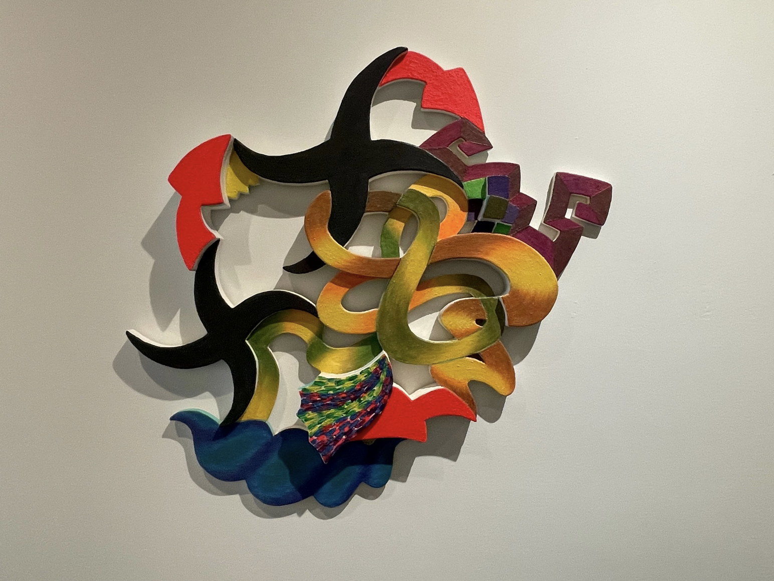
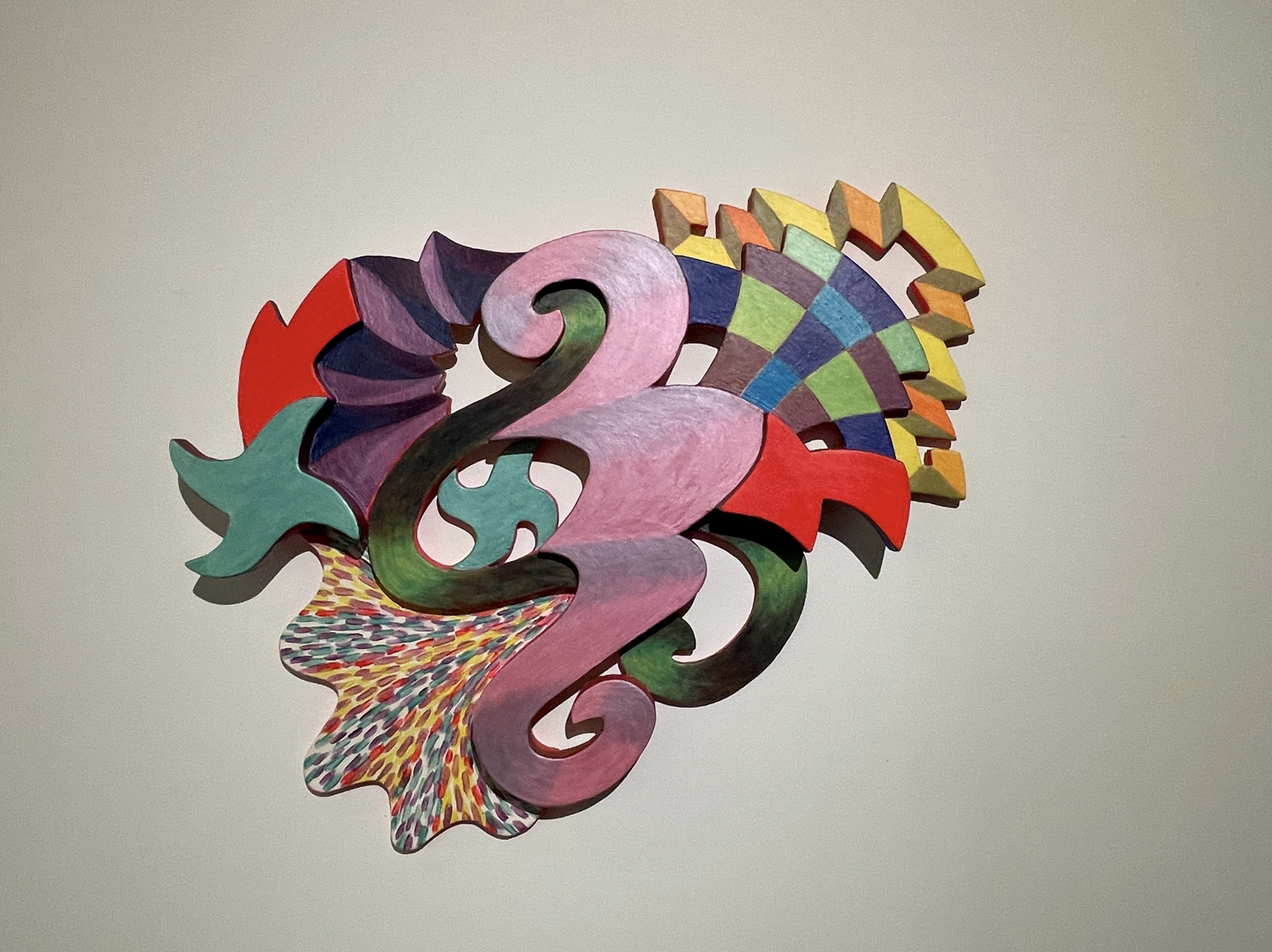
Paula worked on a grid for much of her career, but around 2016 she abandoned that and has since worked with and from gestures. This was a major change in that it announced a move from a stable structure, perhaps architectonic, to one founded in movement, where internal relationships between the forms are relationships between speeds rather than stabilities, differences between forms rather than a homogenous rhythm in all parts of the relief. I don’t think Paula was ever what could be called a Minimalist, but to the extent that her earlier work could be said to be close to it in some respects—the aforementioned homogeneity of the kind of movement that characterized it, for instance—her more recent work is quite far from it. It is now an affair of gestural relationships which are in no obvious sense derived from one another. The sweeping forms that seem to be the basis of many of the works are supported and elaborated by others. Some of these are neither sweeping nor obviously derived from movements of the body but are small and rectangular and in that even more geometric. Added to these are shapes that are also signs. These fall into two types: stars, which are wobbly but almost static, and arrows, which (as all arrows do) point the eye in directions which, in Peatross’s works, often contradict one another. These forms or shapes which are also signs are often brightly colored, and when not bright are certainly intense. If not red, then they are a darkish violet. Most of the colors in a Peatross occur as a system of complementariness, which means lots of green to balance the reds or violets. Most of the color is in a lower mid-tone that, as I have already noted, is intensified by being made of successively applied layers which end up being shiny and thus more intense than they might otherwise be by adding wax to everything. Color, like music, goes straight into one’s body. The absence of a referent—something that is illustrated rather than embodied in the painted object—makes the work into an experience one can only register and be judged as phenomena rather than interpreted as a sort of picture. Phenomena are direct rather than indirect effects. What to make of it is never expressible except as an experience which can only be approximately described.
The colors are often deep, reminiscent of the organic while quite metallic, and the reliefs are small enough to suck you in even as the general condition of the relief is to keep you at a distance through its physicality. Being quite small and very visually active, the reliefs may encourage one to compare them with Frank Stella’s reliefs, the earliest of which were made out of cut-up beer cans, but Paula’s works are less crowded than Stella’s, so the components have more room to move and are in that more or differently mobile, perhaps, and certainly they employ a contrast between deep color, which slows things down, and gestural, or gesture-inflected, drawing which does the opposite. Stella never applied fifteen layers of paint to anything either, so if density is a quality found in the works of both artists, it is not the same kind of density. The layering in hers is of a kind that causes one’s eye to rest on the separate components of the work, while Stella’s is of the sort that encourages one to see the whole as a concatenation of repeated affects, which do not require individual attention. Composition in Peatross tends to be heterogeneous while I think Stella’s retains minimalism’s characteristic homogeneity even when it’s organic in reference or aspiration—his small reliefs are named for birds.
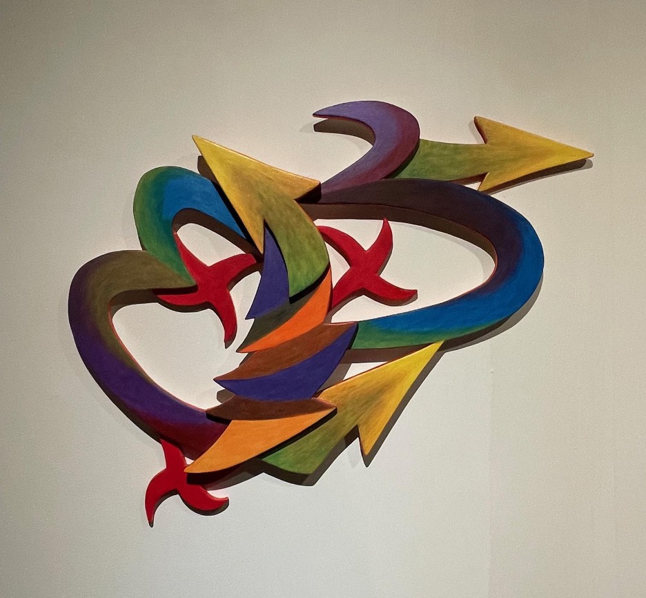
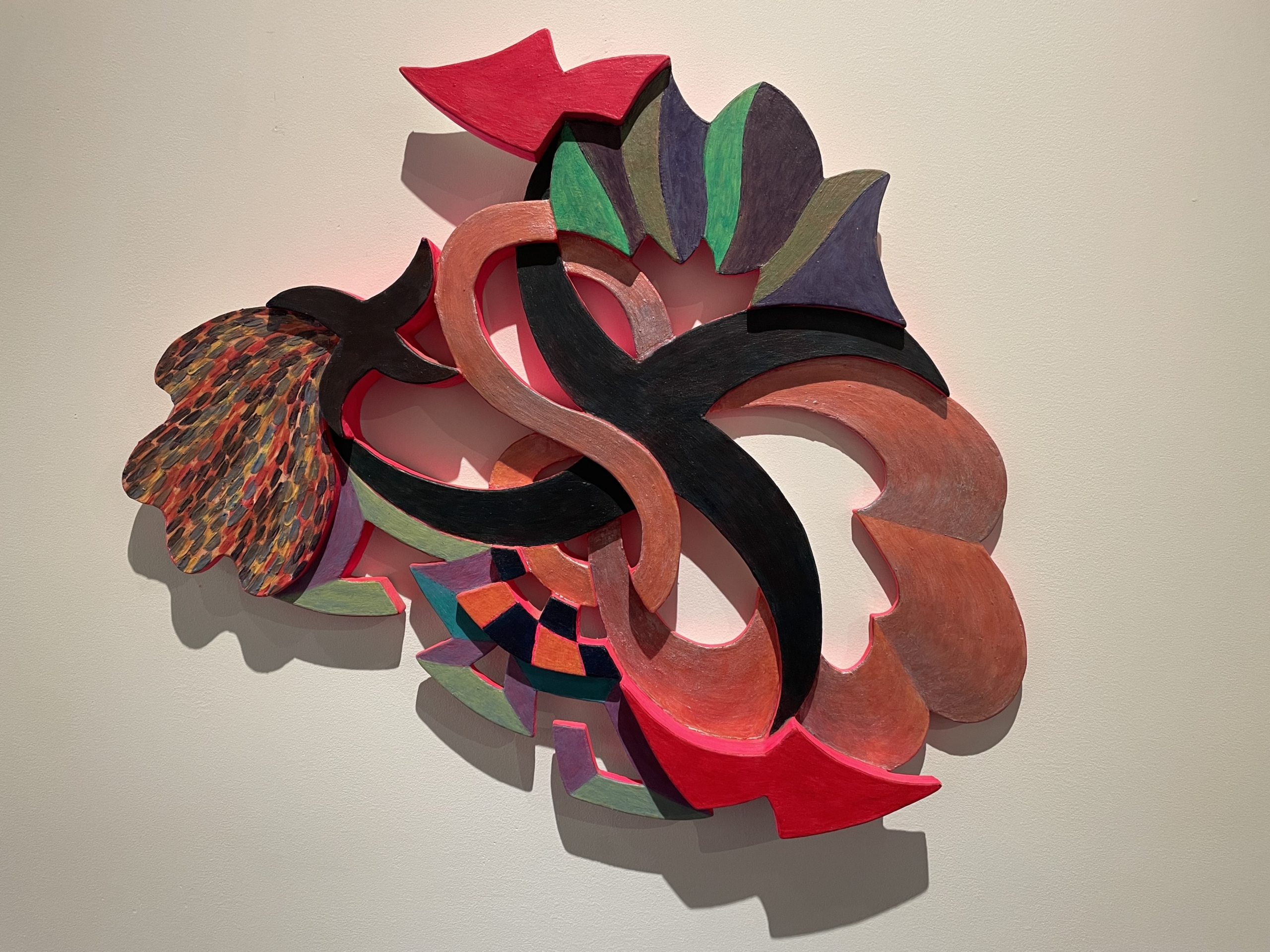
The works in the current show are mostly made after a gap in Peatross’s production that was caused by her having cataracts that needed treatment that had to be deferred as we were in the middle of the COVID pandemic. When she was able to work, the reliefs, which seem to have started before she had to stop and wait for the cataract surgery, were perhaps more filled with, or by, movement than they were before. To return now to a point I made at the beginning, the works are contemplative and, like musical works, they require one to make sense of what one sees without trying to relate it to anything as if they were illustrations of it. She is one of those artists who works with what the materials are and can do. The sound of the instruments, the shape of the forms, are in music on the one hand and in her work on the other, where the basis of meaning is to be found but not where its affect is. Peatross’s reliefs are full of moves which to a large degree are consequences of the diversity of the materials that have gone into it: the relief is itself a more complex object than a stretcher, as noted; the reliefs are made out of three kinds of paint—oil; the pearlescent and metallic paint, which comes as powder she mixes in with the wax paste; and the enamel paint with which she paints the exposed edges of the forms; and drawing which while mostly founded in free hand can also include passages that may have come into being with the use of a ruler. The range of materials itself generates expectations and a context for forms which leads one from large curvy forms to small forms which set up vibrations through repetition and contrasting colors, to an exceptional shape or form which is subdivided into brushstrokes. # 1 (2017) has all this plus two red arrows and two green stars (fig. 5). While making use of the wall that surrounds and also shows through it, the relief is an object that defeats its own objectness to become a space made out of quite awkward combinations of things that are no longer things. They are instead planes that assume some volumetric properties, and on the right of # 1, lemon yellow crops up to expand the tonal range of the work while introducing into it a color which by definition—which is to say for everyone and involuntarily (you have no choice about whether or how it enters your body)—detaches itself from its ground, becoming vaporous and free from gravity. Some colors more or less cling to the form (the pinks for instance), others are quite closely spatially identified with the shapes which they color (the stars and arrows), and others are colored in a way that breaks them up and encourages one to see them as interior coloration. Everything that should imply heaviness—the darker colors and the wax—come to do the opposite. This is painting without an obvious message having to do with the artist, although it may unavoidably have one that is implied about the culture. It may imply that the culture as a whole has room for events that are more complex than they might seem at first glance, that are exciting but not trapped in a narrative about, for instance, agency, and which speak to one through the action of their materials rather than any meaning anyone might attribute to them. Kant’s notion of the autonomous work of art, of “purposefulness with no purpose” is what Peatross works or plays with. When you leave her show there should be plenty to remember, but none of it will be what it represented; it will be instead what it presented. A presence like that of an animal maybe or a plant perhaps, in so far as it is clearly not devoid of sense but is at the same time not representing an idea. The sense it makes is sensuality as such. All that goes into laboriously making the work is there to disappear, having prepared the way for experiencing the possibility of movement in an ambiguous space, enjoyment of and in the not thoroughly namable—or maybe the not nameable at all when one comes down to it.

Paula Peatross’s work requires some explanation of how it’s made, although that only goes so far to explain how it feels. This may be true of all art to some extent, but in Peatross’s work the truth is complicated by the way in which how it feels seems to be much more the result of the work’s physical production than is usually the case. We all want to know as much as possible about how works of art are made but, as noted, that usually doesn’t turn out to tell us all that much about how they affect us. Violin music, for example, is made by a horsehair bow being dragged across catgut strings. This explains something, but not much, because it is what is done with the sound that results rather than just the sound generically that seduces us with its magic and leads us, or lets us lead ourselves, into an experience that may depend on the bow and the strings but also causes us not to think about them all that much. I think, then, that I’ll first describe the way she works and then talk about the effect: perceptions that are caused by the way the physical structure makes them possible but are in practice perceptions not of structure but of movement. Her reliefs emphasize the physical in order not to remain grounded in it, instead being almost all about the ephemeral, something which may be experienced but not demonstrated. There are few things in art as manifestly physical as a relief, which presents the space of painting as much more of a thing than the usual web of drawn lines and their accompaniments on a flat rectangular surface. Peatross’s reliefs exist not to be physical but rather to emphatically declare their physicality and then cause one’s experience to deny it involuntarily, not to notice it but instead to turn the experience into its opposite: the emphatically physical makes possible an experience of the non-physical, of movement rather than solidity, weightlessness as opposed to weight and tangibility. That is where I’ll end up.
I think, like quite a few other people, that there are broadly speaking two kinds of art. One is made for and out of propaganda; the other is made with contemplation in mind. All religious and political art belongs to the first category. It tells a story one already knows; the purpose of the art is to give it some specific bias or interpretation that one may or may not already know. The second is not a narrative at all. Instead, it encourages one’s mind to wander, to allow the audience to think and feel for itself. Peatross’s art is of this second sort. There is no story there, no attempt to find Jesus’s face in the pizza.
This is not a distinction between nonrepresentational and representational art, but it is one between narrative and nearly everything else. And Peatross’s reliefs are unambiguously nonrepresentational. In addition to not being narratives (stories) of any sort, they are made without reference to anything else outside themselves, such as a landscape, the sole exception to that general rule being that they do preserve the limits and inflexions of her body. That aside, as the artist herself puts it, “Each one is itself.”
The finished works are made out of three or four layers of 3/8” plywood with paint applied in layers of as many as fifteen coats, but they begin with mostly freehand drawings on posterboard. When she ends up with something she likes and can use, it’s transferred to plywood using her Bosch electric saw. Each layer of plywood is likely to contain more than one image, the first layer being the bottom one, touching the wall while the next two or three are built onto it. The works are generally quite small, 28.5 x 25.5 x 1 ½ (4 x 3/8)” for example. The color is rich and intense, as one might expect given the number of layers of paint, which is generally oil paint supplemented in some parts by her use of pearlescent color (Jacquards Lumiere metallic and pearlescent color) and the addition of Dorland’s dry wax to everything.
Paula worked on a grid for much of her career, but around 2016 she abandoned that and has since worked with and from gestures. This was a major change in that it announced a move from a stable structure, perhaps architectonic, to one founded in movement, where internal relationships between the forms are relationships between speeds rather than stabilities, differences between forms rather than a homogenous rhythm in all parts of the relief. I don’t think Paula was ever what could be called a Minimalist, but to the extent that her earlier work could be said to be close to it in some respects—the aforementioned homogeneity of the kind of movement that characterized it, for instance—her more recent work is quite far from it. It is now an affair of gestural relationships which are in no obvious sense derived from one another. The sweeping forms that seem to be the basis of many of the works are supported and elaborated by others. Some of these are neither sweeping nor obviously derived from movements of the body but are small and rectangular and in that even more geometric. Added to these are shapes that are also signs. These fall into two types: stars, which are wobbly but almost static, and arrows, which (as all arrows do) point the eye in directions which, in Peatross’s works, often contradict one another. These forms or shapes which are also signs are often brightly colored, and when not bright are certainly intense. If not red, then they are a darkish violet. Most of the colors in a Peatross occur as a system of complementariness, which means lots of green to balance the reds or violets. Most of the color is in a lower mid-tone that, as I have already noted, is intensified by being made of successively applied layers which end up being shiny and thus more intense than they might otherwise be by adding wax to everything. Color, like music, goes straight into one’s body. The absence of a referent—something that is illustrated rather than embodied in the painted object—makes the work into an experience one can only register and be judged as phenomena rather than interpreted as a sort of picture. Phenomena are direct rather than indirect effects. What to make of it is never expressible except as an experience which can only be approximately described.
The colors are often deep, reminiscent of the organic while quite metallic, and the reliefs are small enough to suck you in even as the general condition of the relief is to keep you at a distance through its physicality. Being quite small and very visually active, the reliefs may encourage one to compare them with Frank Stella’s reliefs, the earliest of which were made out of cut-up beer cans, but Paula’s works are less crowded than Stella’s, so the components have more room to move and are in that more or differently mobile, perhaps, and certainly they employ a contrast between deep color, which slows things down, and gestural, or gesture-inflected, drawing which does the opposite. Stella never applied fifteen layers of paint to anything either, so if density is a quality found in the works of both artists, it is not the same kind of density. The layering in hers is of a kind that causes one’s eye to rest on the separate components of the work, while Stella’s is of the sort that encourages one to see the whole as a concatenation of repeated affects, which do not require individual attention. Composition in Peatross tends to be heterogeneous while I think Stella’s retains minimalism’s characteristic homogeneity even when it’s organic in reference or aspiration—his small reliefs are named for birds.
The works in the current show are mostly made after a gap in Peatross’s production that was caused by her having cataracts that needed treatment that had to be deferred as we were in the middle of the COVID pandemic. When she was able to work, the reliefs, which seem to have started before she had to stop and wait for the cataract surgery, were perhaps more filled with, or by, movement than they were before. To return now to a point I made at the beginning, the works are contemplative and, like musical works, they require one to make sense of what one sees without trying to relate it to anything as if they were illustrations of it. She is one of those artists who works with what the materials are and can do. The sound of the instruments, the shape of the forms, are in music on the one hand and in her work on the other, where the basis of meaning is to be found but not where its affect is. Peatross’s reliefs are full of moves which to a large degree are consequences of the diversity of the materials that have gone into it: the relief is itself a more complex object than a stretcher, as noted; the reliefs are made out of three kinds of paint—oil; the pearlescent and metallic paint, which comes as powder she mixes in with the wax paste; and the enamel paint with which she paints the exposed edges of the forms; and drawing which while mostly founded in free hand can also include passages that may have come into being with the use of a ruler. The range of materials itself generates expectations and a context for forms which leads one from large curvy forms to small forms which set up vibrations through repetition and contrasting colors, to an exceptional shape or form which is subdivided into brushstrokes. # 1 (2017) has all this plus two red arrows and two green stars (fig. 5). While making use of the wall that surrounds and also shows through it, the relief is an object that defeats its own objectness to become a space made out of quite awkward combinations of things that are no longer things. They are instead planes that assume some volumetric properties, and on the right of # 1, lemon yellow crops up to expand the tonal range of the work while introducing into it a color which by definition—which is to say for everyone and involuntarily (you have no choice about whether or how it enters your body)—detaches itself from its ground, becoming vaporous and free from gravity. Some colors more or less cling to the form (the pinks for instance), others are quite closely spatially identified with the shapes which they color (the stars and arrows), and others are colored in a way that breaks them up and encourages one to see them as interior coloration. Everything that should imply heaviness—the darker colors and the wax—come to do the opposite. This is painting without an obvious message having to do with the artist, although it may unavoidably have one that is implied about the culture. It may imply that the culture as a whole has room for events that are more complex than they might seem at first glance, that are exciting but not trapped in a narrative about, for instance, agency, and which speak to one through the action of their materials rather than any meaning anyone might attribute to them. Kant’s notion of the autonomous work of art, of “purposefulness with no purpose” is what Peatross works or plays with. When you leave her show there should be plenty to remember, but none of it will be what it represented; it will be instead what it presented. A presence like that of an animal maybe or a plant perhaps, in so far as it is clearly not devoid of sense but is at the same time not representing an idea. The sense it makes is sensuality as such. All that goes into laboriously making the work is there to disappear, having prepared the way for experiencing the possibility of movement in an ambiguous space, enjoyment of and in the not thoroughly namable—or maybe the not nameable at all when one comes down to it.