The Weimar Years in Germany, fraught with political and economic tensions, were a stimulating period for architecture and the arts, with new ideas stirring and producing modernisms both multifaceted and in constant flux. Photography emerged as the most important means through which artists and architects began to clarify the new kinds of experience thrown forth by the metropolis that in its enormous scale, its complex interlacing of activities, and its furious tempo seemed to render obsolete traditional modes of interpretation. Specifically, photographs which reflected the transformation of modern formal and spatial ideas in architecture were reaching a wider public, delineating the role that new structures performed as integral parts of a dynamic and haptic metropolitan scene.
Perhaps one of the most astute exemplars of this phenomenon was Erich Mendelsohn, who played a pivotal role in role in revitalizing and revolutionizing architecture in Germany throughout the 1920s. In addition to directing his own successful architectural office, he lectured, wrote, traveled and, in 1926, published Amerika: Bilderbuch eines Architekten, the collection of iconoclastic photographs and cryptic captions which would have a profound effect on European perceptions of the American urban landscape.1 Moreover, his understanding of the power of photography both to define and to shape the reception of his own architecture led him to control, as much as possible, the printed presentation of his built structures in order to spread discourse and to open up new ways of thinking about the phenomenology of the urban environment. The photographs taken of Mendelsohn’s German projects at this time provide compelling evidence of the architect’s active involvement in controlling the production of meaning generated by his built projects, as he sought to position himself as both author and authorizer of the images of his works. By examining the relationships connecting textual reproduction, photographic effect, editorial commentary, and modern architecture in the Weimar years using the work of Mendelsohn it is possible to establish a paradigm by which to understand the interrelations between architecture and its photographic reproduction.2 The question of Mendelsohn’s intentions with respect to how his buildings were photographed, how the photographs were published, and how the publications were disseminated provides a point of entry into the identification of an entire authorial apparatus that determined how architecture became public. By concentrating on Mendelsohn’s work, it is possible to address the larger issues of the interrelations between architecture and new media in interwar Germany; such a contextualization, with its focus on Mendelsohn’s relationship to photography, and concomitantly, on the nuanced architectural, photographic and editorial networks at play, highlights photography’s particular role in conveying new ideas of order and experience at this time.
In order to situate Mendelsohn’s relationship to photography and its role as an essential tool for the architect, a brief examination of Mendelsohn’s own photographs, published in Amerika, is in order, considering the role of the architect as photographer as well as photography’s relation to other modes of visual experimentation opening up at that time, such as the cinematic, and probing his position regarding claims of authorship. Following from this, and in light of the impact and influence that magazines and other forms of mass-media were effecting in this transitional period, will be a discussion of the publication of Mendelsohn’s own buildings in two of the major architectural periodicals of the time, Wasmuths Monatshefte für Baukunst and Bauwelt.3 Emphasizing the synergic roles of the photographer and of the editor while examining both the photographs as well as their arrangement within the pages of the magazines enables a consideration of the ways in which these images entered into the economy of architectural practice. The images Mendelsohn authored and authorized played an active part in shaping the conception, perception and reception of his built structures, and charging an already active field with radical new force and vitality.
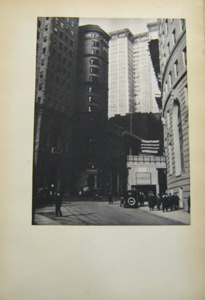
Mendelsohn’s most celebrated contribution to photography, Amerika: Bilderbuch eines Architekten, reveals his recognition of the power of the printed image as a primary agent of spreading discourse, and the expanded importance of photographs as carriers of information and creators of meaning. Prior to its publication, the challenge of elaborating the diverse photographic methods which were newly cropping up into a critical language of images with which to address modern urban experience was rarely taken up. Yet, this is precisely the ambition that can be found at work in his sophisticated compilation of photographs with short accompanying texts. Using a tightly regulated arrangement, sequence and assembly of photographs in this “Picture-book,” Mendelsohn sought to present himself as the capable voice, able to shape the German public’s image of foreign modernity through his writings and photographs, demonstrating how the camera might be used critically to comprehend urban space. The layout of the book itself employs graphic styles found in commercial print, placing an emphasis on visual imagery, as only a few lines of enigmatic text were placed opposite every full-page plate. Furthermore, as El Lissitzky remarked in his 1926 review of the book, the “Architect’s Album…thrills us like a dramatic film…. In order to understand some of the photographs you must lift the book over your head and rotate it. The architect shows us America not from a distance but from within, as he leads us into the canyon of its streets.”4 Lissitzky stresses that the cinematic experience of Amerika conveyed not only the idea but the experience of being caught up in the gigantic, impersonal forces that ruled American urban space, as the reader/viewer is guided through the cityscapes and industrial parks of the modern American terrain. The photographs, taken with a Leica camera, capture both the allure as well as the repulsion Mendelsohn felt towards the American setting, especially the urban component, as witnessed in a view of lower Broadway (fig. 1). In this image the city signage, sinister at street level, contrasts starkly with the soaring brilliance of the towering office buildings standing in the sun, and thus visually comments upon the contradictions inherent in America’s explosive growth, full of both beauty and lurking danger. Such imagery supports the text of Mendelsohn’s preface, where he writes of “A bewildered observer of the streets, of avenues like valleys of skyscrapers; bewildered by the unsuspected extent of the colonial impressions, of this chaotic, wild growth in which the separate intentions of the financial powers have erected their 20-50 story-high individualities.”5 The ever-present threats of moral and cultural decay, in spite of impressive technological advancements and enviable financial prosperity, make America a site of constantly conflicted views.
Yet, while the original publication presented itself as the unique product of Mendelsohn’s experiences and perceptions of the American urban and industrial landscape, when Amerika was reprinted in 1928 it not only included additional images,6 but also an Afterword acknowledging that not all of the photographs had been taken by Mendelsohn himself: sixteen were shot by the architect Knud Lonberg–Holm, twenty-two had been taken by Mendelsohn’s chief draftsman Erich Karweik, and one had been snapped by his original traveling partner, the director Fritz Lang.7 This recognition points to Mendelsohn’s awareness of photography’s, and by extension the photographer’s, power to transform perceptions of architecture on the printed page, as well as Mendelsohn’s own appropriation of this power, locating the medium’s potency in its ability to translate experiences of space, dynamism and form through the manipulation of perspective, light, and angles. Moreover, by this time, Lonberg-Holm’s radiant “lightscapes” and views of skyscrapers had cropped up in design and architecture magazines in Holland, Germany, and Russia, while Lang’s film Metropolis (1926) had been released, to wide critical acclaim, thus calling for professional credit for their creative efforts as well.8 The book’s popular reception and tremendous impact on fellow artists and architects provided further proof that photography was not a neutral medium of documentation, but could serve as an influential means of cultural critique.
Such an acknowledgement also points to the remarkable power of the printed media at this time, as one of the principal vehicles of the new mass culture was illustrated magazines. The importance of magazines in shaping the reception of new ideas regarding architecture’s social, functional and aesthetic role in the new German city has already been much commented upon, and as Barbara Miller Lane has observed, “The radical architects owed their success in Germany in the later twenties not only to the patronage of the federal and municipal governments but also to the energy with which they continued to publicize their work and their ideas.”9 Through a constant stream of books, pamphlets, articles and speeches, they impressed their views on the profession and on the public with the result that, although buildings in the new style represented only a minority of total construction in Germany in the twenties, both the general press and the architectural journals soon concentrated an exceptional amount of attention on the new architecture.
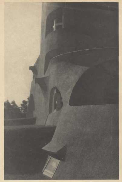
As a part of this upswing in interest in new architectural ideas and designs, between 1919 and 1933, over 250 articles on Mendelsohn were published in magazines, not only in Germany, but also Italy, France, England, Russia, the United States and Japan.10 Since images of his buildings were reaching such a wide-ranging audience, Mendelsohn had to be aware of the acute importance of controlling the ways in which his architecture was photographed; indeed, Mendelsohn’s comprehension of photography’s potential to substantially shape the reception of his buildings is evident from his earliest major project, the Einstein Tower in Potsdam (fig. 2). This now-iconic image of the once-iconoclastic building, taken by Mendelsohn’s cooperative photographer Arthur Köster after the building’s completion in 1921, delivers an intimate experience of the building, but a visitor to the site, after having seen only this image, might well be surprised.11 Moreover, Köster’s purposeful manipulation of perspective and distortion of size and space conveyed the illusion that the building was constructed entirely out of concrete, rather than stuccoed brick.12 Thus, the structural reality of the building is masked in order to promote the experience of its organic and dramatic form, as the photograph sums up the building’s spirit in a way that other, more general views, could not.
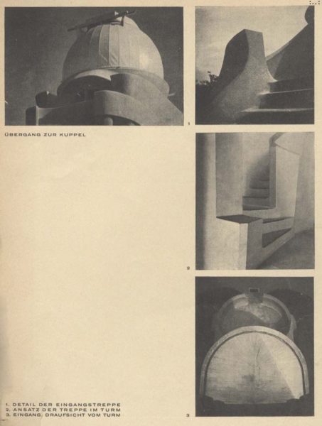
The image of the Einstein Tower appeared in both popular and architectural magazines, perhaps most famously splashed across the cover of the September 4, 1921 issue of the Berliner Illustrierte Zeitung, which at the time was the tabloid with the largest circulation of any European periodical, contributing to the building’s celebrity and renown. Indeed, if it did not initially create the building’s notoriety, this image certainly transformed and sustained it, and still carried currency three years later when it was included in a 66-page feature spread on Mendelsohn in Wasmuths Monatshefte für Baukunst, which included several additional photographs by Köster of the Tower (fig. 3), subsequent projects such as the Friedrich Steinberg, Hermann and Co. Hat Factory in Luckenwalde, excerpts from lectures, and a substantial number of sketches.13 At the time, Wasmuths Monatshefte für Baukunst was one of the most influential architectural periodicals in Germany. Köster had begun working there as a photographer in 1919; initially an assistant in the photo office of the publisher, he was named its director in the early 20s, stayed on staff for 6 years, expanding his base of professional contacts and connections by working with a wide range of architects, and, on November 20, 1924 he founded the Fotowerkstatt für Architektur.14 This unique enterprise signaled a shift in professional perceptions regarding photography’s role in not merely documenting architecture, but actively shaping it. The establishment of this business both testifies to the perceived need for an office devoted exclusively to photographing architecture, and also reveals awareness of the more active role photographs were beginning to play in shaping the reception of the newly built forms through publication.
Köster’s role in shaping this reception entailed two significant aspects: attaining professional independence and demonstrating professional accommodation or adaptability. He continued working for Wasmuths Monatshefte für Baukunst until 1926 when Berlin’s construction boom stimulated enough income for him to work exclusively out of his own office. As a result of the professional relationships he had established while at the magazine, he continued collaborating with architects including not only Mendelsohn but also the Luckhardt Brothers in collaboration with Alfons Anker, Bruno Taut, Walter Gropius, as well as Max Taut and Franz Hoffmann. Although output was prolific, no narrow specialization in particular building types or kinds of photographs can be identified in his work, as he “assisted the architects he worked for, supplying his clients with photographs of exteriors, interiors, or models, with day or night shots of any given building, modifying his approach according to their demands or needs.”15
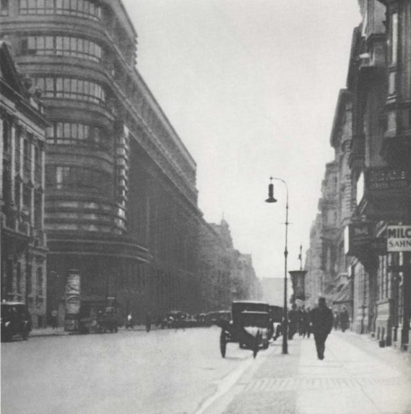
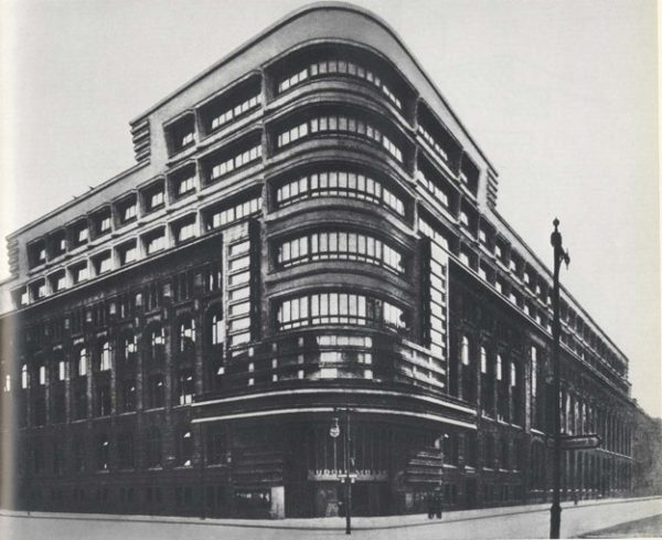
To a large degree Köster’s flexibility and openness to the needs of his architect-clients explains why Mendelsohn would have worked with him so exclusively. Consequently, it is of interest to note the adaptability of Köster’s approach over time, as Mendelsohn’s attitudes and photographic preferences evolved in conjunction with his drive to explore the relation of his buildings to their urban environment and to visualize the essential elements of his architectural idea, as witnessed in a photograph of Mendelsohn’s renovated façade for the Berliner Tageblatt on Jersulamerstrasse from 1923 (fig. 4). Here, the effective presentation of the office building is enhanced by picturing its integration within the urban environment of the street itself as, in Mendelsohn’s words, the structure
is not a disinterested spectator of the rushing cars and of the advancing and receding flow of traffic; rather, it has become an absorbing, cooperating element of the motion…. The balance of its forces soothes the frenetic pace of the street and of the passersby…. By dividing and guiding the traffic, the building, despite all tendencies of its own towards movement, becomes an immobile pillar amidst the turbulence of the streets.16
Although not the iconic view of the building which would be more widely circulated (fig. 5), this shot captures the flow of the streetscape that would prove so fascinating to Mendelsohn in Amerika. Taken from the sidewalk several meters away from the building itself, the image captures both the structure’s strong sense of horizontality, calling attention to the curvature of the entire façade, as well as a sense of the street itself, animated by people and, more importantly, by automobiles, an explicit reference to the rapid tempo of modern life in general and the motorized view in particular. The photographer echoes the role of the spectator, conveying the experience of the building, as felt within the context of the city itself, following Mendelsohn’s stance that “The man of our time, with the nervous excitement of his fast pace of life, can find his equilibrium only in the calming effect of the horizontal dimension.”17
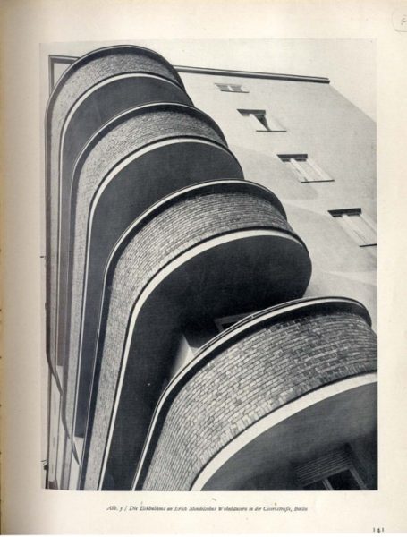
A few years later, Mendelsohn revealed an interest in having Köster exploit photography’s abstracting potential, as seen in two shots of the exterior of a block of apartment buildings on Cicerostrasse, Berlin from 1928 (figs. 6, 7). In these images, the spatially disorienting effect engendered by the worm’s eye view recalls avant-garde photographic experimentation, especially that of the Bauhaus, as they provide an unexpected perspective of the Mendelsohn’s celebrated horizontality. The slanted viewpoint of figure 6, and the diagonal thrust of figure 7, open up radically different versions of this metropolitan structure, and engender the building with an explosive vitality which metonymically refers to the role of the structure within the urban environment as a whole.
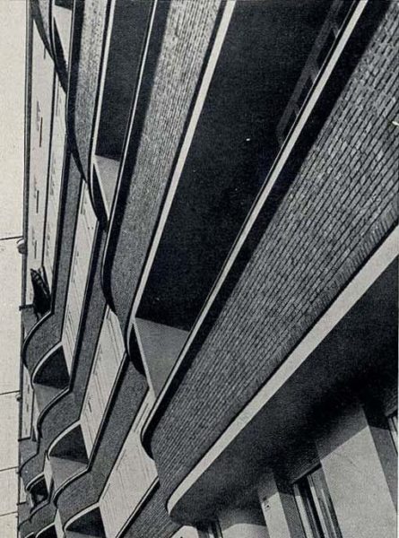
These two images were published within the pages of Wasmuths Monatshefte für Baukunst in 1929, as part of an article by editor Werner Hegemann discussing recent residential buildings. One of the more widely read architectural periodicals of the period, Wasmuths Monatshefte für Baukunst focused the majority of its pages on the new architecture, and also provided a forum for the unconventional views of Hegemann, an urban planner, publicist, theorist, critic and author of intellectual commitment, idealism and a peripatetic lifestyle – in short, a compelling figure whose character was enhanced in many ways by the contradictions he himself had difficulty reconciling. The drive to explore, examine and elucidate the rapid developments of the urban scene in Weimar Germany was evident in his work although his relationship to modernity contained multiple paradoxes. Indeed, the complexities of his views enriched early twentieth-century discussions of the modern city on both sides of the Atlantic, and by the time he assumed editorship of the magazine, he had been playing a decisive role in the dissemination of ideas of city planning, new urban environments and the exploration as the city as site for over a decade.18 Although he closely followed and published on the most recent developments in architecture, he frequently found himself at odds with the architects of Neues Bauen and was characterized by many as a strictly anti-modern figure for his views on several prominent contemporary architects, notably his persistent disdain for Frank Lloyd Wright. Moreover, at a time of manifestoes and ironclad doctrines, Hegemann’s contradictory viewpoints could not easily fit into pre-determined categories, and he was dismissed as an inconsistent advocate of architectural reform, as he promoted “city planning as a science,” while also writing of the city “as an organic, evolving process…. in perpetual flux.”19 In his role at the helm of the magazine, his non-conformist tendencies were clearly displayed as within the context of the heated debates surrounding the new architecture he was viewed as hostile to the modernist movement.
However, his contributions to the period cannot be dismissed out of hand, and his two major publications of the early twenties, American Vitruvius of 1922 (in collaboration with the landscape architect Elbert Peets) and Amerikanische Architektur und Stadtbaukunst published in 1925, reinvigorated the visual presentation of architectural material, blending photographs, drawings, plans and short snippets of text together on one page, and it is useful to consider these publications in relation to the editorial style he developed at the magazine. Using deliberately recurring and evolving themes and variations whose motifs are presented in the texts and in the choice and placement of illustrations, he followed the presentational method he had acquired in creating exhibitions both in Germany and the United States. In American Vitruvius, the 1203 illustrations are grouped thematically to elucidate urban situations, disregarding the restrictions of location in place, historic time, or style. In Amerikanische Architektur und Stadtbaukunst this approach was revised, and Hegemann moved through his subjects in a more targeted manner but again combined photographs, drawings and text on the same page. The placement of monuments within the ever-changing urban context rather than a single focus on individual buildings provides the aesthetic element within Hegemann’s concept of city planning, and the aim of publication was for “the author to express his conviction that all architecture must be understood as town planning and that the consideration of architecture from the point of view of city planning is the most significant and productive.”20
Yet despite the fact that he developed an innovative and distinct presentational format that would later be used in Wasmuths Monatshefte für Baukunst to examine the innovations and ideas of the new German architects, Mendelsohn in particular, Hegemann’s work was summarily dismissed in many corners due to the fact that within the text of Amerikanische Architektur und Stadtbaukunst he “relegated Louis Sullivan and the Chicago school to the closing pages of his book, while turning center stage over to the City Beautiful Movement’s beaux arts schemes for the civic center.”21 Moreover, following on the heels of this divisive gesture, Hegemann further alienated himself by opposing the design of Mendelsohn’s C.A. Herpich and Sons store in 1926.22 Consequently, the architect, and fellow members of the architectural group Der Ring agreed to boycott Wasmuths Monatshefte für Baukunst, and rather publish photographs of their buildings in Bauwelt, an influential trade publication also focusing on current developments in architecture and sympathetic to the work of radical architects, having published a series of articles by Gropius and a number of modern architects from other countries. 23
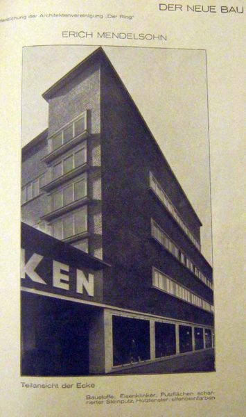
As a vehicle for architectural self-publication and promotion, Der Ring sponsored 25 eight-page supplements called Der Neue Bau in Bauwelt between July 1926 and February 1929; each spread was devoted to one to three architects, and was characterized by a unified, progressive design dominated by large photographs with short captions in a unique sans-serif typeface, and very little explanatory text. Such a layout enabled the supplements to function essentially as architectural monographs in small format, and through the auspices of the magazine the group was given a forum for controlled dissemination of their latest achievements in a publication with a wide circulation. An examination of the formal arrangement and photographic selection used in these spreads illuminates the ways in which the architects wished their built structures to be viewed. Additionally, a consideration of how the photographs were originally conceived and subsequently received offers further evidence of the degree to which the context-and-reception project evolved in the late 20s. For example, Mendelsohn’s first appearance as part of the group, in a 1926 spread featuring the Schocken Department store in Nürnberg (fig. 8), opens with a wide-angle view taken from an extremely oblique angle along the front façade which emphasizes the linear, specifically horizontal qualities of the building.24 Köster’s photograph heightens the overall novelty of the design, revealing the horizontal articulation in a single glance. The store’s signage has been cut off, amplifying the tectonic nature of the shot which aims to provide comprehensive structural information rather than branded recognition.
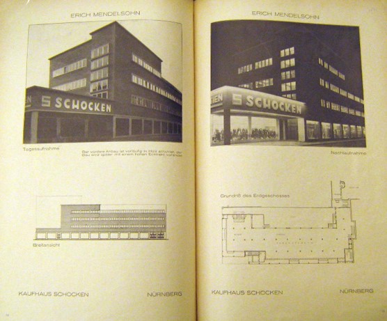
Yet the commercial identity of the building is made self-evident in the following two pages of the supplement, which feature identically framed day and night shots, revealing the adaptability of the building to differently lighted states, complementing each other in their informational content and providing almost photographic negative views (fig. 9). Such a strategy relates to the widespread interest in the use of glass and light in the newest styles of architecture not only as innovative methods of construction, but also as the latest and most effective forms of advertising. The department store was a building type subject to such diverse requirements as urbanistic integration, economic functionality, technical modernity, and a high level of advertising effectiveness through the use of the newest lighting techniques, and these images reveal the influence of Lichtarchitektur, defined by Janet Ward as “a diurnal form of advertising construction in which light is used as a building element, in the form of shining surfaces and shapes composed of the latter.”25 The use of light as an active and activating force recalls Mendelsohn’s celebrations in Amerika of New York’s electrically illuminated wonders, and emphasizes the building’s function as an urban commercial structure. Here, Mendelsohn’s buildings are conceived in relation not just to their material monumentality by day but to their illusionary monumentality by night. The new smooth surfaces and horizontal streamlining of the building’s facade set the stage for the use of exterior advertising text, not as something fanciful but something organized and efficient; thus the clear, bold Schocken logo, legible and distinct regardless of the time, demonstrates a bold new synthesis of light and form, as well as the radiant luminosity created when glazed storefronts and buildings are lit after dark.
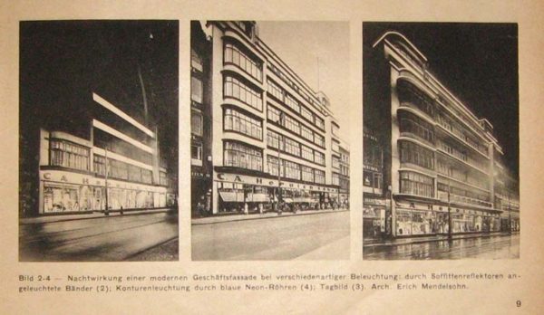
Indeed, Mendelsohn’s prowess at producing dramatic commercial structures was highlighted in a January, 1930 photospread in Bauwelt on “Das licht in der Baukunst” (fig. 10), which shows the façade of his C.A. Herpich and Sons store, the very building that had caused such acrimony with Hegemann, lit up in three different states. Again, the technique of photographing the building from almost the exact same spot so as to produce a photographic negative signals the strong interest in the integration of such buildings, and their lighting, into the dynamic and commercial ebb and flow of the city. This differs Mendelsohn’s works in particular, with their emphasis on horizontality, responded to the need for an architecture which would draw the eye and successfully advertise the function of the commercial buildings that he worked on, and this may be the major reason that Hegemann reversed his formerly antagonistic stance towards the architect. In his 1929 publication Facades of Buildings, published in both English and German as a “photographic sketch-book to meet the demand for a work on facades,” the city-planner equivocally praised the Herpich store, stating that
Much may be said in criticism of the Herpich-House… [but] in fact the new Herpich-House appears at present as the finest building on this long Leipziger Strasse and one of the most interesting buildings of our period. Compared with its concise elegance, the enormous pillars of the Wertheim building appear already out of fashion and exaggerated in scale. Herpich-House, with its expanses of travertine and its projecting wings, presents as a whole the appearance of one of those symmetrical compositions which, for centuries in the past, were considered pleasing.26
Hegemann recognized that an entirely new discursivity of the street as a spatial entity framed by façade-lines of light was emerging, as the architecture of light developed as the architecture of the pure façade in both the literal and metaphorical sense; yet this discursivity relied on longstanding standards of symmetry and proportion, which rendered such developments positive in advancing the tenets which he supported.
The publication of Facades of Buildings coincided, perhaps not inadvertently, with Mendelsohn’s re-appearance within the pages of Wasmuths Monatshefte für Baukunst. Although the magazine itself was not 100% supportive of Mendelsohn, or any one architect for that matter, it enjoyed a wide audience and provided a further outlet for Mendelsohn’s vision and ideas, which he undoubtedly desired.27 Although never completely uncritical, and in fact remaining at odds with other architects in Der Ring, Hegemann recognized Mendelsohn’s achievements within their urban context and promoted his works through written reviews which spotlighted their structural innovations and achievements in design. Hegemann’s admiration and respect for Mendelsohn’s accomplishments resulted from his modulating view of the role of architecture within the urban environment. This evolving viewpoint further highlighted the complexities and contradictions of Hegemann’s “anti-modernist” stance, as his exchange of ideas with Mendelsohn represented not simply a professional relationship but the interaction between two fields of practice and two fields of theory, an interplay wherein the adjacencies between architecture and urban planning overlapped and opposed one another as each sought to promote their unique visions of the urban scene.
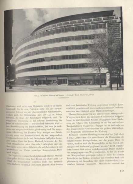
Within this context it is useful to compare the publication of photographs of one of Mendelsohn’s major buildings, the Schocken department store in Chemnitz, as they were published in both Wasmuths Monatshefte für Baukunst and Bauwelt, in order to consider more specifically the function of photography and layout as tools for both the architect and the editor (figs. 11, 12, 13). Designed and built from 1928-29, the department store sits on a large plot in the city center, and is a fairly massive structure, measuring nine stories tall and seventy meters long. Yet the five rows of repeating, equally sized windows lighten the feel of the building and allow for an integrated play of light; and, although each publication used the same photographs taken by Köster, the differences in presentation are revealing and provide a tangible counterpoint to the issues under discussion.
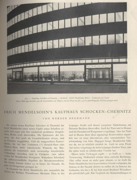
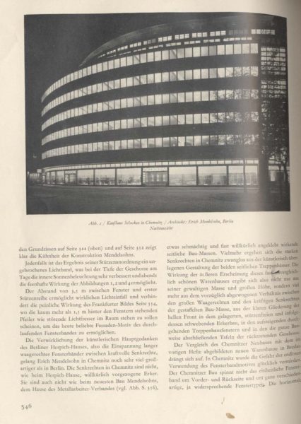
In Hegemann’s glowing 1930 review of the “triumphant” Schocken department store in Chemnitz, the store is compared favorably with the Bauhaus, and the article begins with a half-page photograph featuring a closely cropped night view of the store’s façade (fig. 11). This partial view shows a fragment of the structure which speaks to the experience of the building as a whole, in a manner similar to the image of the Einstein Tower discussed earlier. Shot from street level, the building seems to extend infinitely outward, as the image has been cropped so that it continues indefinitely off the printed page. The luminous upper levels of the interior radiate from within, as the alternating bands of travertine and glass create belts of solid and void, enhancing the curvature of the building, and further highlighting the structure’s horizontality. The second page of the article features a more informative view of the building (fig. 12) as the photographer has zoomed out in order to show the full scope of the façade. The building’s outward movement, following the curved street line, is enhanced by the angle of the shot which dramatizes the structure’s sweeping momentum, as well as the tenets of light architecture mentioned earlier. The slightly oblique view from ground level serves to monumentalize the building and give it a hieratic suggestive presence, as the strong sense of spatiality effected by the angle of vision and lighting renders glorious the full façade.
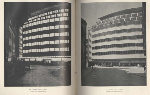
Conversely, the following page is a photographic negative of the prior shot, (fig. 13) as Köster once again exploits the lighted potential of the structure in order to convey a contextual sense of its appearance. Ironically, the windows which at night were so glowing and transparent are now impenetrable, while the white bands of limestone seamlessly define the building’s shape. The inclusion of pedestrians and an automobile on the street grounds the image, situating it directly within its urban context, recalling Mendelsohn’s emphasis on the role of the viewer and the incorporation of the building into the greater dynamic of the city itself. In the final two pages of the article (fig. 14) the photographic-negative comparison is utilized to full effect, as two full-page photographs, one daytime and one night, are placed side by side to afford a more direct comparison of the drastically different effects of the building depending on when it is encountered. These asymmetrical images serve to capture the currents of life around building, as its horizontal bands echo and reinvigorate the passage and energy of the street, giving visual expression to the boldness of Mendelsohn’s conception. The progression of images through the article has brought us full circle as it were, as if following a movie camera’s slow pan around the building itself, and we can see on the left the second set of fully glazed stair towers which flank the outward-curving expanse of the façade.
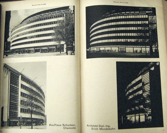
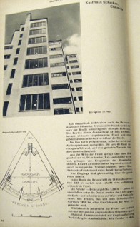
This dramatic layout, wherein the viewer is led page by page around the exterior of the building, effectively elevating it to an almost monumental level, an impact which is much more tempered in the October, 1930 issue of Bauwelt (fig, 15), where some of the same photographs appear, but in a comparatively subdued presentation. Here, in the publication controlled by Mendelsohn, the emphasis is less on dramatic force and more on conveying the characteristic design of the building itself. The first two pages provide an overall view and a detailed shot placed on each side, one by day and one by night, and although the top images are the same as those seen in Hegemann’s article, the bottom two, consisting of oblique-angled shots of the ends of the building, are unique. This page is followed by a side-on view, a ground-plan, and a full-page view of the façade that was also included in Wasmuths Monatshefte für Baukunst (figs. 16, 17). The final page provides information on the building from within through both an interior shot as well as an exterior shot taken from the balcony itself (fig. 18). Rather than panning around the exterior of the building, this feature has moved around and inside, and it is clear that Mendelsohn’s objective is to provide functional information about the structure of the building, its construction, and the way it works in addition to the more glamorous and aesthetic comparisons of light. Of course, this is hardly surprising, given Der Ring’s objectives of spreading knowledge about their built forms as well as Bauwelt’s appeal as an industrial publication aimed at an architecturally savvy audience. Such readers are able, and inclined, to form their own opinion about the structure, given key visual particulars such as those included here. Given the clarity of such a layout, Hegemann’s dramatic format and editorializing seem less structurally informative, but in the end perhaps such qualities would widen the article’s appeal for a mass audience rather than solely specialists.
Furthermore, these distinctions point to a fundamental issue of the use of photography, raising the question of how to speak critically through photographic images without the images becoming an aesthetic end in themselves. In Bauwelt, criticality is achieved through the elimination of text and the provision of multiple views, all of which purport to reveal an essential functional aspect of the building, and thus provide a “true” picturing of its form. In Hegemann’s article, the critical element is supplied by way of the text, which is both descriptive and analytical, and enables him exploit the potentials of a dramatic layout, a technique which may in fact be less structurally informative if the audience in question is a “hurried reader.”28 In each case the purported intent of providing information is achieved, although the precise reception of that information varies considerably.
Yet Hegemann clearly understood the benefits of a clear and judicious layout and minimal use of text, as witnessed in the 1933 spread featuring Mendelsohn’s final project in Berlin, the Columbushaus of 1931-2, which was received to great acclaim both in the German as well as the British and American press.29 In Hegemann’s feature, the building is first introduced to the reader in a single full-page image which is somewhat unusual for Köster, including as it does a foregrounded Classical or Baroque statue framed by the delicate tracery of leaf-bare trees (fig. 19). Were it not for the lettering of Columbushaus on the upper left had portion of the building itself, it would be difficult from this angle to know its identity for certain: yet the bold font of the signage, as well as the horizontal articulation of the façade alert the viewer that this is Mendelsohn’s building, and, despite the profusion of distractions in the foreground, the clear, unadorned volume of the building is a firm presence, radiant in the sunlight and solid in its mass.
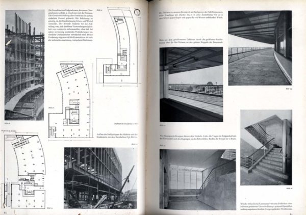
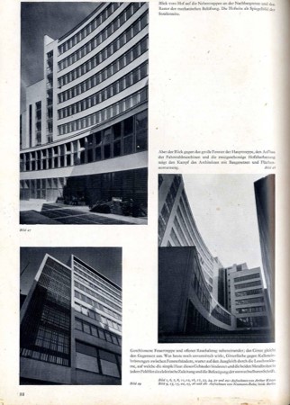
The following pages of the article (figs. 20, 21) showcase the building in a format similar to that used by Hegemann in Amerikanische Architektur und Stadtbaukunst, combining text, photographs, and plans in order to clarify and explain this complex structure, and this informative layout provides a didactic window onto Mendelsohn’s design. Significantly, this is the only article featuring works by Mendelsohn in which Köster was credited (fig. 22), revealing the extent to which the architect was controlling the depiction of his buildings from behind the scenes, as it were, since all images reveal a coherence of vision through their dynamic perspectives.30 Köster’s exterior shots recall the techniques used in the Schocken Department store, while those of the window bays and outer balconies present expanses of infinite space, curving outward in an infinite continuum, and relaying a sense of visual and material lightness. In Hegemann’s layout, the blend of photographs featuring constructional elements which ostensibly foreground the building’s materiality and construction from glass, limestone, and steel, with drawn plans and brief explanatory text, provides a more comprehensive view of this complicated structure than witnessed in his earlier review, and his editorializing has been minimized in favor of a more technical approach. However, within the photographs themselves, the interplay of the dynamics of light and shadow upon the surface of the structure, the manipulated viewpoints which create sloping flanks out of the building’s curved walls, and the close cropping capture the intangible essence of Mendelsohn’s work in his attempt to unite “spirit and matter” through the rhythmic articulation of space.
Years later, in a 1967 lecture on Expressionism delivered by Julius Posener to the Architectural Association, the architectural historian compared Mendelsohn to his contemporary Hans Poelzig, stating that:
like Poelzig, Mendelsohn was a lone wolf. He never belonged to the “Gläserne Kette, though he did belong to the “Arbeitstrat”; nor was he at any time close to the Bauhaus circle whose history also goes back to immediately after 1918. But he considered himself, rightly, I think, as standing in the mainstream of the developments which began with Art Nouveau.31
To a large extent, it was Mendelsohn’s “lone” position which prevented his inclusion in grand narratives of modernism, unable to incorporate individual expressions which diverged from accepted paths. However, Posener, in his exhibitions and subsequent publications, made use of Köster’s photographs, giving new life and fresh awareness to these images which both mythologized Mendelsohn’s architecture and also aided in the widest possible circulation of his ideas. As the pool of published images has gradually shrunk due to isolated duplication and broad dissemination of only the most famous views, subsequent architectural historians, theorists and critics have relied on images produced in Mendelsohn’s lifetime which represent a body of architecture in and of itself. Thus, Mendelsohn left his mark on the history and continual practice of architecture not only in the buildings which he designed and constructed but especially in the architectural complex of ideas which he sponsored, developed, assimilated, and realized in his strategic use of photographic images and published texts. This comprehensive paradigm surrounded, promoted, and, in fact, redefined his own architecture, and such re-definition appears not only in the actual presence of buildings erected in early twentieth-century Germany, but, more remarkably, in the present continuation of his architectural accomplishments in the journals, books, albums, and other media memorials of today and the future, which form a constructed genre of irradicable continuation. As such, the triad of architectural construction, photographic representation, and editorial commentary has created an enduring edifice, true to Mendelsohn’s own ideas and views, renovative in its combining of these into a unique concept of architecture, and full of the invigoration of new art that continually expands even as it continues to build upon itself.
Notes
The Weimar Years in Germany, fraught with political and economic tensions, were a stimulating period for architecture and the arts, with new ideas stirring and producing modernisms both multifaceted and in constant flux. Photography emerged as the most important means through which artists and architects began to clarify the new kinds of experience thrown forth by the metropolis that in its enormous scale, its complex interlacing of activities, and its furious tempo seemed to render obsolete traditional modes of interpretation. Specifically, photographs which reflected the transformation of modern formal and spatial ideas in architecture were reaching a wider public, delineating the role that new structures performed as integral parts of a dynamic and haptic metropolitan scene.
Perhaps one of the most astute exemplars of this phenomenon was Erich Mendelsohn, who played a pivotal role in role in revitalizing and revolutionizing architecture in Germany throughout the 1920s. In addition to directing his own successful architectural office, he lectured, wrote, traveled and, in 1926, published Amerika: Bilderbuch eines Architekten, the collection of iconoclastic photographs and cryptic captions which would have a profound effect on European perceptions of the American urban landscape.1 Moreover, his understanding of the power of photography both to define and to shape the reception of his own architecture led him to control, as much as possible, the printed presentation of his built structures in order to spread discourse and to open up new ways of thinking about the phenomenology of the urban environment. The photographs taken of Mendelsohn’s German projects at this time provide compelling evidence of the architect’s active involvement in controlling the production of meaning generated by his built projects, as he sought to position himself as both author and authorizer of the images of his works. By examining the relationships connecting textual reproduction, photographic effect, editorial commentary, and modern architecture in the Weimar years using the work of Mendelsohn it is possible to establish a paradigm by which to understand the interrelations between architecture and its photographic reproduction.2 The question of Mendelsohn’s intentions with respect to how his buildings were photographed, how the photographs were published, and how the publications were disseminated provides a point of entry into the identification of an entire authorial apparatus that determined how architecture became public. By concentrating on Mendelsohn’s work, it is possible to address the larger issues of the interrelations between architecture and new media in interwar Germany; such a contextualization, with its focus on Mendelsohn’s relationship to photography, and concomitantly, on the nuanced architectural, photographic and editorial networks at play, highlights photography’s particular role in conveying new ideas of order and experience at this time.
In order to situate Mendelsohn’s relationship to photography and its role as an essential tool for the architect, a brief examination of Mendelsohn’s own photographs, published in Amerika, is in order, considering the role of the architect as photographer as well as photography’s relation to other modes of visual experimentation opening up at that time, such as the cinematic, and probing his position regarding claims of authorship. Following from this, and in light of the impact and influence that magazines and other forms of mass-media were effecting in this transitional period, will be a discussion of the publication of Mendelsohn’s own buildings in two of the major architectural periodicals of the time, Wasmuths Monatshefte für Baukunst and Bauwelt.3 Emphasizing the synergic roles of the photographer and of the editor while examining both the photographs as well as their arrangement within the pages of the magazines enables a consideration of the ways in which these images entered into the economy of architectural practice. The images Mendelsohn authored and authorized played an active part in shaping the conception, perception and reception of his built structures, and charging an already active field with radical new force and vitality.
Mendelsohn’s most celebrated contribution to photography, Amerika: Bilderbuch eines Architekten, reveals his recognition of the power of the printed image as a primary agent of spreading discourse, and the expanded importance of photographs as carriers of information and creators of meaning. Prior to its publication, the challenge of elaborating the diverse photographic methods which were newly cropping up into a critical language of images with which to address modern urban experience was rarely taken up. Yet, this is precisely the ambition that can be found at work in his sophisticated compilation of photographs with short accompanying texts. Using a tightly regulated arrangement, sequence and assembly of photographs in this “Picture-book,” Mendelsohn sought to present himself as the capable voice, able to shape the German public’s image of foreign modernity through his writings and photographs, demonstrating how the camera might be used critically to comprehend urban space. The layout of the book itself employs graphic styles found in commercial print, placing an emphasis on visual imagery, as only a few lines of enigmatic text were placed opposite every full-page plate. Furthermore, as El Lissitzky remarked in his 1926 review of the book, the “Architect’s Album…thrills us like a dramatic film…. In order to understand some of the photographs you must lift the book over your head and rotate it. The architect shows us America not from a distance but from within, as he leads us into the canyon of its streets.”4 Lissitzky stresses that the cinematic experience of Amerika conveyed not only the idea but the experience of being caught up in the gigantic, impersonal forces that ruled American urban space, as the reader/viewer is guided through the cityscapes and industrial parks of the modern American terrain. The photographs, taken with a Leica camera, capture both the allure as well as the repulsion Mendelsohn felt towards the American setting, especially the urban component, as witnessed in a view of lower Broadway (fig. 1). In this image the city signage, sinister at street level, contrasts starkly with the soaring brilliance of the towering office buildings standing in the sun, and thus visually comments upon the contradictions inherent in America’s explosive growth, full of both beauty and lurking danger. Such imagery supports the text of Mendelsohn’s preface, where he writes of “A bewildered observer of the streets, of avenues like valleys of skyscrapers; bewildered by the unsuspected extent of the colonial impressions, of this chaotic, wild growth in which the separate intentions of the financial powers have erected their 20-50 story-high individualities.”5 The ever-present threats of moral and cultural decay, in spite of impressive technological advancements and enviable financial prosperity, make America a site of constantly conflicted views.

Yet, while the original publication presented itself as the unique product of Mendelsohn’s experiences and perceptions of the American urban and industrial landscape, when Amerika was reprinted in 1928 it not only included additional images,6 but also an Afterword acknowledging that not all of the photographs had been taken by Mendelsohn himself: sixteen were shot by the architect Knud Lonberg–Holm, twenty-two had been taken by Mendelsohn’s chief draftsman Erich Karweik, and one had been snapped by his original traveling partner, the director Fritz Lang.7 This recognition points to Mendelsohn’s awareness of photography’s, and by extension the photographer’s, power to transform perceptions of architecture on the printed page, as well as Mendelsohn’s own appropriation of this power, locating the medium’s potency in its ability to translate experiences of space, dynamism and form through the manipulation of perspective, light, and angles. Moreover, by this time, Lonberg-Holm’s radiant “lightscapes” and views of skyscrapers had cropped up in design and architecture magazines in Holland, Germany, and Russia, while Lang’s film Metropolis (1926) had been released, to wide critical acclaim, thus calling for professional credit for their creative efforts as well.8 The book’s popular reception and tremendous impact on fellow artists and architects provided further proof that photography was not a neutral medium of documentation, but could serve as an influential means of cultural critique.
Such an acknowledgement also points to the remarkable power of the printed media at this time, as one of the principal vehicles of the new mass culture was illustrated magazines. The importance of magazines in shaping the reception of new ideas regarding architecture’s social, functional and aesthetic role in the new German city has already been much commented upon, and as Barbara Miller Lane has observed, “The radical architects owed their success in Germany in the later twenties not only to the patronage of the federal and municipal governments but also to the energy with which they continued to publicize their work and their ideas.”9 Through a constant stream of books, pamphlets, articles and speeches, they impressed their views on the profession and on the public with the result that, although buildings in the new style represented only a minority of total construction in Germany in the twenties, both the general press and the architectural journals soon concentrated an exceptional amount of attention on the new architecture.

As a part of this upswing in interest in new architectural ideas and designs, between 1919 and 1933, over 250 articles on Mendelsohn were published in magazines, not only in Germany, but also Italy, France, England, Russia, the United States and Japan.10 Since images of his buildings were reaching such a wide-ranging audience, Mendelsohn had to be aware of the acute importance of controlling the ways in which his architecture was photographed; indeed, Mendelsohn’s comprehension of photography’s potential to substantially shape the reception of his buildings is evident from his earliest major project, the Einstein Tower in Potsdam (fig. 2). This now-iconic image of the once-iconoclastic building, taken by Mendelsohn’s cooperative photographer Arthur Köster after the building’s completion in 1921, delivers an intimate experience of the building, but a visitor to the site, after having seen only this image, might well be surprised.11 Moreover, Köster’s purposeful manipulation of perspective and distortion of size and space conveyed the illusion that the building was constructed entirely out of concrete, rather than stuccoed brick.12 Thus, the structural reality of the building is masked in order to promote the experience of its organic and dramatic form, as the photograph sums up the building’s spirit in a way that other, more general views, could not.

The image of the Einstein Tower appeared in both popular and architectural magazines, perhaps most famously splashed across the cover of the September 4, 1921 issue of the Berliner Illustrierte Zeitung, which at the time was the tabloid with the largest circulation of any European periodical, contributing to the building’s celebrity and renown. Indeed, if it did not initially create the building’s notoriety, this image certainly transformed and sustained it, and still carried currency three years later when it was included in a 66-page feature spread on Mendelsohn in Wasmuths Monatshefte für Baukunst, which included several additional photographs by Köster of the Tower (fig. 3), subsequent projects such as the Friedrich Steinberg, Hermann and Co. Hat Factory in Luckenwalde, excerpts from lectures, and a substantial number of sketches.13 At the time, Wasmuths Monatshefte für Baukunst was one of the most influential architectural periodicals in Germany. Köster had begun working there as a photographer in 1919; initially an assistant in the photo office of the publisher, he was named its director in the early 20s, stayed on staff for 6 years, expanding his base of professional contacts and connections by working with a wide range of architects, and, on November 20, 1924 he founded the Fotowerkstatt für Architektur.14 This unique enterprise signaled a shift in professional perceptions regarding photography’s role in not merely documenting architecture, but actively shaping it. The establishment of this business both testifies to the perceived need for an office devoted exclusively to photographing architecture, and also reveals awareness of the more active role photographs were beginning to play in shaping the reception of the newly built forms through publication.
Köster’s role in shaping this reception entailed two significant aspects: attaining professional independence and demonstrating professional accommodation or adaptability. He continued working for Wasmuths Monatshefte für Baukunst until 1926 when Berlin’s construction boom stimulated enough income for him to work exclusively out of his own office. As a result of the professional relationships he had established while at the magazine, he continued collaborating with architects including not only Mendelsohn but also the Luckhardt Brothers in collaboration with Alfons Anker, Bruno Taut, Walter Gropius, as well as Max Taut and Franz Hoffmann. Although output was prolific, no narrow specialization in particular building types or kinds of photographs can be identified in his work, as he “assisted the architects he worked for, supplying his clients with photographs of exteriors, interiors, or models, with day or night shots of any given building, modifying his approach according to their demands or needs.”15


To a large degree Köster’s flexibility and openness to the needs of his architect-clients explains why Mendelsohn would have worked with him so exclusively. Consequently, it is of interest to note the adaptability of Köster’s approach over time, as Mendelsohn’s attitudes and photographic preferences evolved in conjunction with his drive to explore the relation of his buildings to their urban environment and to visualize the essential elements of his architectural idea, as witnessed in a photograph of Mendelsohn’s renovated façade for the Berliner Tageblatt on Jersulamerstrasse from 1923 (fig. 4). Here, the effective presentation of the office building is enhanced by picturing its integration within the urban environment of the street itself as, in Mendelsohn’s words, the structure
is not a disinterested spectator of the rushing cars and of the advancing and receding flow of traffic; rather, it has become an absorbing, cooperating element of the motion…. The balance of its forces soothes the frenetic pace of the street and of the passersby…. By dividing and guiding the traffic, the building, despite all tendencies of its own towards movement, becomes an immobile pillar amidst the turbulence of the streets.16
Although not the iconic view of the building which would be more widely circulated (fig. 5), this shot captures the flow of the streetscape that would prove so fascinating to Mendelsohn in Amerika. Taken from the sidewalk several meters away from the building itself, the image captures both the structure’s strong sense of horizontality, calling attention to the curvature of the entire façade, as well as a sense of the street itself, animated by people and, more importantly, by automobiles, an explicit reference to the rapid tempo of modern life in general and the motorized view in particular. The photographer echoes the role of the spectator, conveying the experience of the building, as felt within the context of the city itself, following Mendelsohn’s stance that “The man of our time, with the nervous excitement of his fast pace of life, can find his equilibrium only in the calming effect of the horizontal dimension.”17

A few years later, Mendelsohn revealed an interest in having Köster exploit photography’s abstracting potential, as seen in two shots of the exterior of a block of apartment buildings on Cicerostrasse, Berlin from 1928 (figs. 6, 7). In these images, the spatially disorienting effect engendered by the worm’s eye view recalls avant-garde photographic experimentation, especially that of the Bauhaus, as they provide an unexpected perspective of the Mendelsohn’s celebrated horizontality. The slanted viewpoint of figure 6, and the diagonal thrust of figure 7, open up radically different versions of this metropolitan structure, and engender the building with an explosive vitality which metonymically refers to the role of the structure within the urban environment as a whole.

These two images were published within the pages of Wasmuths Monatshefte für Baukunst in 1929, as part of an article by editor Werner Hegemann discussing recent residential buildings. One of the more widely read architectural periodicals of the period, Wasmuths Monatshefte für Baukunst focused the majority of its pages on the new architecture, and also provided a forum for the unconventional views of Hegemann, an urban planner, publicist, theorist, critic and author of intellectual commitment, idealism and a peripatetic lifestyle – in short, a compelling figure whose character was enhanced in many ways by the contradictions he himself had difficulty reconciling. The drive to explore, examine and elucidate the rapid developments of the urban scene in Weimar Germany was evident in his work although his relationship to modernity contained multiple paradoxes. Indeed, the complexities of his views enriched early twentieth-century discussions of the modern city on both sides of the Atlantic, and by the time he assumed editorship of the magazine, he had been playing a decisive role in the dissemination of ideas of city planning, new urban environments and the exploration as the city as site for over a decade.18 Although he closely followed and published on the most recent developments in architecture, he frequently found himself at odds with the architects of Neues Bauen and was characterized by many as a strictly anti-modern figure for his views on several prominent contemporary architects, notably his persistent disdain for Frank Lloyd Wright. Moreover, at a time of manifestoes and ironclad doctrines, Hegemann’s contradictory viewpoints could not easily fit into pre-determined categories, and he was dismissed as an inconsistent advocate of architectural reform, as he promoted “city planning as a science,” while also writing of the city “as an organic, evolving process…. in perpetual flux.”19 In his role at the helm of the magazine, his non-conformist tendencies were clearly displayed as within the context of the heated debates surrounding the new architecture he was viewed as hostile to the modernist movement.
However, his contributions to the period cannot be dismissed out of hand, and his two major publications of the early twenties, American Vitruvius of 1922 (in collaboration with the landscape architect Elbert Peets) and Amerikanische Architektur und Stadtbaukunst published in 1925, reinvigorated the visual presentation of architectural material, blending photographs, drawings, plans and short snippets of text together on one page, and it is useful to consider these publications in relation to the editorial style he developed at the magazine. Using deliberately recurring and evolving themes and variations whose motifs are presented in the texts and in the choice and placement of illustrations, he followed the presentational method he had acquired in creating exhibitions both in Germany and the United States. In American Vitruvius, the 1203 illustrations are grouped thematically to elucidate urban situations, disregarding the restrictions of location in place, historic time, or style. In Amerikanische Architektur und Stadtbaukunst this approach was revised, and Hegemann moved through his subjects in a more targeted manner but again combined photographs, drawings and text on the same page. The placement of monuments within the ever-changing urban context rather than a single focus on individual buildings provides the aesthetic element within Hegemann’s concept of city planning, and the aim of publication was for “the author to express his conviction that all architecture must be understood as town planning and that the consideration of architecture from the point of view of city planning is the most significant and productive.”20
Yet despite the fact that he developed an innovative and distinct presentational format that would later be used in Wasmuths Monatshefte für Baukunst to examine the innovations and ideas of the new German architects, Mendelsohn in particular, Hegemann’s work was summarily dismissed in many corners due to the fact that within the text of Amerikanische Architektur und Stadtbaukunst he “relegated Louis Sullivan and the Chicago school to the closing pages of his book, while turning center stage over to the City Beautiful Movement’s beaux arts schemes for the civic center.”21 Moreover, following on the heels of this divisive gesture, Hegemann further alienated himself by opposing the design of Mendelsohn’s C.A. Herpich and Sons store in 1926.22 Consequently, the architect, and fellow members of the architectural group Der Ring agreed to boycott Wasmuths Monatshefte für Baukunst, and rather publish photographs of their buildings in Bauwelt, an influential trade publication also focusing on current developments in architecture and sympathetic to the work of radical architects, having published a series of articles by Gropius and a number of modern architects from other countries. 23

As a vehicle for architectural self-publication and promotion, Der Ring sponsored 25 eight-page supplements called Der Neue Bau in Bauwelt between July 1926 and February 1929; each spread was devoted to one to three architects, and was characterized by a unified, progressive design dominated by large photographs with short captions in a unique sans-serif typeface, and very little explanatory text. Such a layout enabled the supplements to function essentially as architectural monographs in small format, and through the auspices of the magazine the group was given a forum for controlled dissemination of their latest achievements in a publication with a wide circulation. An examination of the formal arrangement and photographic selection used in these spreads illuminates the ways in which the architects wished their built structures to be viewed. Additionally, a consideration of how the photographs were originally conceived and subsequently received offers further evidence of the degree to which the context-and-reception project evolved in the late 20s. For example, Mendelsohn’s first appearance as part of the group, in a 1926 spread featuring the Schocken Department store in Nürnberg (fig. 8), opens with a wide-angle view taken from an extremely oblique angle along the front façade which emphasizes the linear, specifically horizontal qualities of the building.24 Köster’s photograph heightens the overall novelty of the design, revealing the horizontal articulation in a single glance. The store’s signage has been cut off, amplifying the tectonic nature of the shot which aims to provide comprehensive structural information rather than branded recognition.

Yet the commercial identity of the building is made self-evident in the following two pages of the supplement, which feature identically framed day and night shots, revealing the adaptability of the building to differently lighted states, complementing each other in their informational content and providing almost photographic negative views (fig. 9). Such a strategy relates to the widespread interest in the use of glass and light in the newest styles of architecture not only as innovative methods of construction, but also as the latest and most effective forms of advertising. The department store was a building type subject to such diverse requirements as urbanistic integration, economic functionality, technical modernity, and a high level of advertising effectiveness through the use of the newest lighting techniques, and these images reveal the influence of Lichtarchitektur, defined by Janet Ward as “a diurnal form of advertising construction in which light is used as a building element, in the form of shining surfaces and shapes composed of the latter.”25 The use of light as an active and activating force recalls Mendelsohn’s celebrations in Amerika of New York’s electrically illuminated wonders, and emphasizes the building’s function as an urban commercial structure. Here, Mendelsohn’s buildings are conceived in relation not just to their material monumentality by day but to their illusionary monumentality by night. The new smooth surfaces and horizontal streamlining of the building’s facade set the stage for the use of exterior advertising text, not as something fanciful but something organized and efficient; thus the clear, bold Schocken logo, legible and distinct regardless of the time, demonstrates a bold new synthesis of light and form, as well as the radiant luminosity created when glazed storefronts and buildings are lit after dark.

Indeed, Mendelsohn’s prowess at producing dramatic commercial structures was highlighted in a January, 1930 photospread in Bauwelt on “Das licht in der Baukunst” (fig. 10), which shows the façade of his C.A. Herpich and Sons store, the very building that had caused such acrimony with Hegemann, lit up in three different states. Again, the technique of photographing the building from almost the exact same spot so as to produce a photographic negative signals the strong interest in the integration of such buildings, and their lighting, into the dynamic and commercial ebb and flow of the city. This differs Mendelsohn’s works in particular, with their emphasis on horizontality, responded to the need for an architecture which would draw the eye and successfully advertise the function of the commercial buildings that he worked on, and this may be the major reason that Hegemann reversed his formerly antagonistic stance towards the architect. In his 1929 publication Facades of Buildings, published in both English and German as a “photographic sketch-book to meet the demand for a work on facades,” the city-planner equivocally praised the Herpich store, stating that
Much may be said in criticism of the Herpich-House… [but] in fact the new Herpich-House appears at present as the finest building on this long Leipziger Strasse and one of the most interesting buildings of our period. Compared with its concise elegance, the enormous pillars of the Wertheim building appear already out of fashion and exaggerated in scale. Herpich-House, with its expanses of travertine and its projecting wings, presents as a whole the appearance of one of those symmetrical compositions which, for centuries in the past, were considered pleasing.26
Hegemann recognized that an entirely new discursivity of the street as a spatial entity framed by façade-lines of light was emerging, as the architecture of light developed as the architecture of the pure façade in both the literal and metaphorical sense; yet this discursivity relied on longstanding standards of symmetry and proportion, which rendered such developments positive in advancing the tenets which he supported.
The publication of Facades of Buildings coincided, perhaps not inadvertently, with Mendelsohn’s re-appearance within the pages of Wasmuths Monatshefte für Baukunst. Although the magazine itself was not 100% supportive of Mendelsohn, or any one architect for that matter, it enjoyed a wide audience and provided a further outlet for Mendelsohn’s vision and ideas, which he undoubtedly desired.27 Although never completely uncritical, and in fact remaining at odds with other architects in Der Ring, Hegemann recognized Mendelsohn’s achievements within their urban context and promoted his works through written reviews which spotlighted their structural innovations and achievements in design. Hegemann’s admiration and respect for Mendelsohn’s accomplishments resulted from his modulating view of the role of architecture within the urban environment. This evolving viewpoint further highlighted the complexities and contradictions of Hegemann’s “anti-modernist” stance, as his exchange of ideas with Mendelsohn represented not simply a professional relationship but the interaction between two fields of practice and two fields of theory, an interplay wherein the adjacencies between architecture and urban planning overlapped and opposed one another as each sought to promote their unique visions of the urban scene.
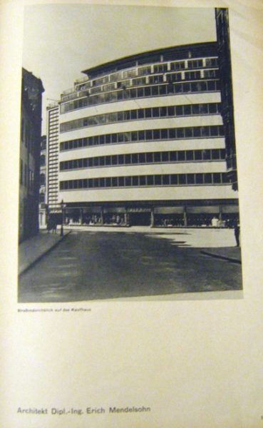
Within this context it is useful to compare the publication of photographs of one of Mendelsohn’s major buildings, the Schocken department store in Chemnitz, as they were published in both Wasmuths Monatshefte für Baukunst and Bauwelt, in order to consider more specifically the function of photography and layout as tools for both the architect and the editor (figs. 11, 12, 13). Designed and built from 1928-29, the department store sits on a large plot in the city center, and is a fairly massive structure, measuring nine stories tall and seventy meters long. Yet the five rows of repeating, equally sized windows lighten the feel of the building and allow for an integrated play of light; and, although each publication used the same photographs taken by Köster, the differences in presentation are revealing and provide a tangible counterpoint to the issues under discussion.


In Hegemann’s glowing 1930 review of the “triumphant” Schocken department store in Chemnitz, the store is compared favorably with the Bauhaus, and the article begins with a half-page photograph featuring a closely cropped night view of the store’s façade (fig. 11). This partial view shows a fragment of the structure which speaks to the experience of the building as a whole, in a manner similar to the image of the Einstein Tower discussed earlier. Shot from street level, the building seems to extend infinitely outward, as the image has been cropped so that it continues indefinitely off the printed page. The luminous upper levels of the interior radiate from within, as the alternating bands of travertine and glass create belts of solid and void, enhancing the curvature of the building, and further highlighting the structure’s horizontality. The second page of the article features a more informative view of the building (fig. 12) as the photographer has zoomed out in order to show the full scope of the façade. The building’s outward movement, following the curved street line, is enhanced by the angle of the shot which dramatizes the structure’s sweeping momentum, as well as the tenets of light architecture mentioned earlier. The slightly oblique view from ground level serves to monumentalize the building and give it a hieratic suggestive presence, as the strong sense of spatiality effected by the angle of vision and lighting renders glorious the full façade.

Conversely, the following page is a photographic negative of the prior shot, (fig. 13) as Köster once again exploits the lighted potential of the structure in order to convey a contextual sense of its appearance. Ironically, the windows which at night were so glowing and transparent are now impenetrable, while the white bands of limestone seamlessly define the building’s shape. The inclusion of pedestrians and an automobile on the street grounds the image, situating it directly within its urban context, recalling Mendelsohn’s emphasis on the role of the viewer and the incorporation of the building into the greater dynamic of the city itself. In the final two pages of the article (fig. 14) the photographic-negative comparison is utilized to full effect, as two full-page photographs, one daytime and one night, are placed side by side to afford a more direct comparison of the drastically different effects of the building depending on when it is encountered. These asymmetrical images serve to capture the currents of life around building, as its horizontal bands echo and reinvigorate the passage and energy of the street, giving visual expression to the boldness of Mendelsohn’s conception. The progression of images through the article has brought us full circle as it were, as if following a movie camera’s slow pan around the building itself, and we can see on the left the second set of fully glazed stair towers which flank the outward-curving expanse of the façade.


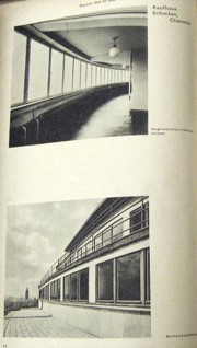
This dramatic layout, wherein the viewer is led page by page around the exterior of the building, effectively elevating it to an almost monumental level, an impact which is much more tempered in the October, 1930 issue of Bauwelt (fig, 15), where some of the same photographs appear, but in a comparatively subdued presentation. Here, in the publication controlled by Mendelsohn, the emphasis is less on dramatic force and more on conveying the characteristic design of the building itself. The first two pages provide an overall view and a detailed shot placed on each side, one by day and one by night, and although the top images are the same as those seen in Hegemann’s article, the bottom two, consisting of oblique-angled shots of the ends of the building, are unique. This page is followed by a side-on view, a ground-plan, and a full-page view of the façade that was also included in Wasmuths Monatshefte für Baukunst (figs. 16, 17). The final page provides information on the building from within through both an interior shot as well as an exterior shot taken from the balcony itself (fig. 18). Rather than panning around the exterior of the building, this feature has moved around and inside, and it is clear that Mendelsohn’s objective is to provide functional information about the structure of the building, its construction, and the way it works in addition to the more glamorous and aesthetic comparisons of light. Of course, this is hardly surprising, given Der Ring’s objectives of spreading knowledge about their built forms as well as Bauwelt’s appeal as an industrial publication aimed at an architecturally savvy audience. Such readers are able, and inclined, to form their own opinion about the structure, given key visual particulars such as those included here. Given the clarity of such a layout, Hegemann’s dramatic format and editorializing seem less structurally informative, but in the end perhaps such qualities would widen the article’s appeal for a mass audience rather than solely specialists.


Furthermore, these distinctions point to a fundamental issue of the use of photography, raising the question of how to speak critically through photographic images without the images becoming an aesthetic end in themselves. In Bauwelt, criticality is achieved through the elimination of text and the provision of multiple views, all of which purport to reveal an essential functional aspect of the building, and thus provide a “true” picturing of its form. In Hegemann’s article, the critical element is supplied by way of the text, which is both descriptive and analytical, and enables him exploit the potentials of a dramatic layout, a technique which may in fact be less structurally informative if the audience in question is a “hurried reader.”28 In each case the purported intent of providing information is achieved, although the precise reception of that information varies considerably.

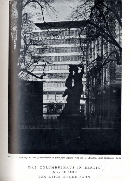
Yet Hegemann clearly understood the benefits of a clear and judicious layout and minimal use of text, as witnessed in the 1933 spread featuring Mendelsohn’s final project in Berlin, the Columbushaus of 1931-2, which was received to great acclaim both in the German as well as the British and American press.29 In Hegemann’s feature, the building is first introduced to the reader in a single full-page image which is somewhat unusual for Köster, including as it does a foregrounded Classical or Baroque statue framed by the delicate tracery of leaf-bare trees (fig. 19). Were it not for the lettering of Columbushaus on the upper left had portion of the building itself, it would be difficult from this angle to know its identity for certain: yet the bold font of the signage, as well as the horizontal articulation of the façade alert the viewer that this is Mendelsohn’s building, and, despite the profusion of distractions in the foreground, the clear, unadorned volume of the building is a firm presence, radiant in the sunlight and solid in its mass.

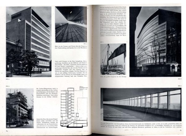
The following pages of the article (figs. 20, 21) showcase the building in a format similar to that used by Hegemann in Amerikanische Architektur und Stadtbaukunst, combining text, photographs, and plans in order to clarify and explain this complex structure, and this informative layout provides a didactic window onto Mendelsohn’s design. Significantly, this is the only article featuring works by Mendelsohn in which Köster was credited (fig. 22), revealing the extent to which the architect was controlling the depiction of his buildings from behind the scenes, as it were, since all images reveal a coherence of vision through their dynamic perspectives.30 Köster’s exterior shots recall the techniques used in the Schocken Department store, while those of the window bays and outer balconies present expanses of infinite space, curving outward in an infinite continuum, and relaying a sense of visual and material lightness. In Hegemann’s layout, the blend of photographs featuring constructional elements which ostensibly foreground the building’s materiality and construction from glass, limestone, and steel, with drawn plans and brief explanatory text, provides a more comprehensive view of this complicated structure than witnessed in his earlier review, and his editorializing has been minimized in favor of a more technical approach. However, within the photographs themselves, the interplay of the dynamics of light and shadow upon the surface of the structure, the manipulated viewpoints which create sloping flanks out of the building’s curved walls, and the close cropping capture the intangible essence of Mendelsohn’s work in his attempt to unite “spirit and matter” through the rhythmic articulation of space.


Years later, in a 1967 lecture on Expressionism delivered by Julius Posener to the Architectural Association, the architectural historian compared Mendelsohn to his contemporary Hans Poelzig, stating that:
like Poelzig, Mendelsohn was a lone wolf. He never belonged to the “Gläserne Kette, though he did belong to the “Arbeitstrat”; nor was he at any time close to the Bauhaus circle whose history also goes back to immediately after 1918. But he considered himself, rightly, I think, as standing in the mainstream of the developments which began with Art Nouveau.31
To a large extent, it was Mendelsohn’s “lone” position which prevented his inclusion in grand narratives of modernism, unable to incorporate individual expressions which diverged from accepted paths. However, Posener, in his exhibitions and subsequent publications, made use of Köster’s photographs, giving new life and fresh awareness to these images which both mythologized Mendelsohn’s architecture and also aided in the widest possible circulation of his ideas. As the pool of published images has gradually shrunk due to isolated duplication and broad dissemination of only the most famous views, subsequent architectural historians, theorists and critics have relied on images produced in Mendelsohn’s lifetime which represent a body of architecture in and of itself. Thus, Mendelsohn left his mark on the history and continual practice of architecture not only in the buildings which he designed and constructed but especially in the architectural complex of ideas which he sponsored, developed, assimilated, and realized in his strategic use of photographic images and published texts. This comprehensive paradigm surrounded, promoted, and, in fact, redefined his own architecture, and such re-definition appears not only in the actual presence of buildings erected in early twentieth-century Germany, but, more remarkably, in the present continuation of his architectural accomplishments in the journals, books, albums, and other media memorials of today and the future, which form a constructed genre of irradicable continuation. As such, the triad of architectural construction, photographic representation, and editorial commentary has created an enduring edifice, true to Mendelsohn’s own ideas and views, renovative in its combining of these into a unique concept of architecture, and full of the invigoration of new art that continually expands even as it continues to build upon itself.
Notes