En route through medium specific investigation in an era of collective and performative action in the art world, some photographers have taken a turn for the Minimal. Not only do many of the works in question correspond aesthetically to certain affects of Minimalism, but they behave as did Minimalist works as well: performing for their viewers, dependant upon their viewers, and in general inverting the conventional relationship between the subject and the photographic window. What does this instinct mean, forty years after painting made something like the same theatrical turn? How is it of consequence to photography and what photographic practices led up to it? Why might it happen now, in the context of artmaking at large?
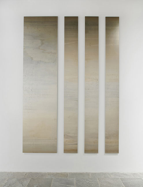
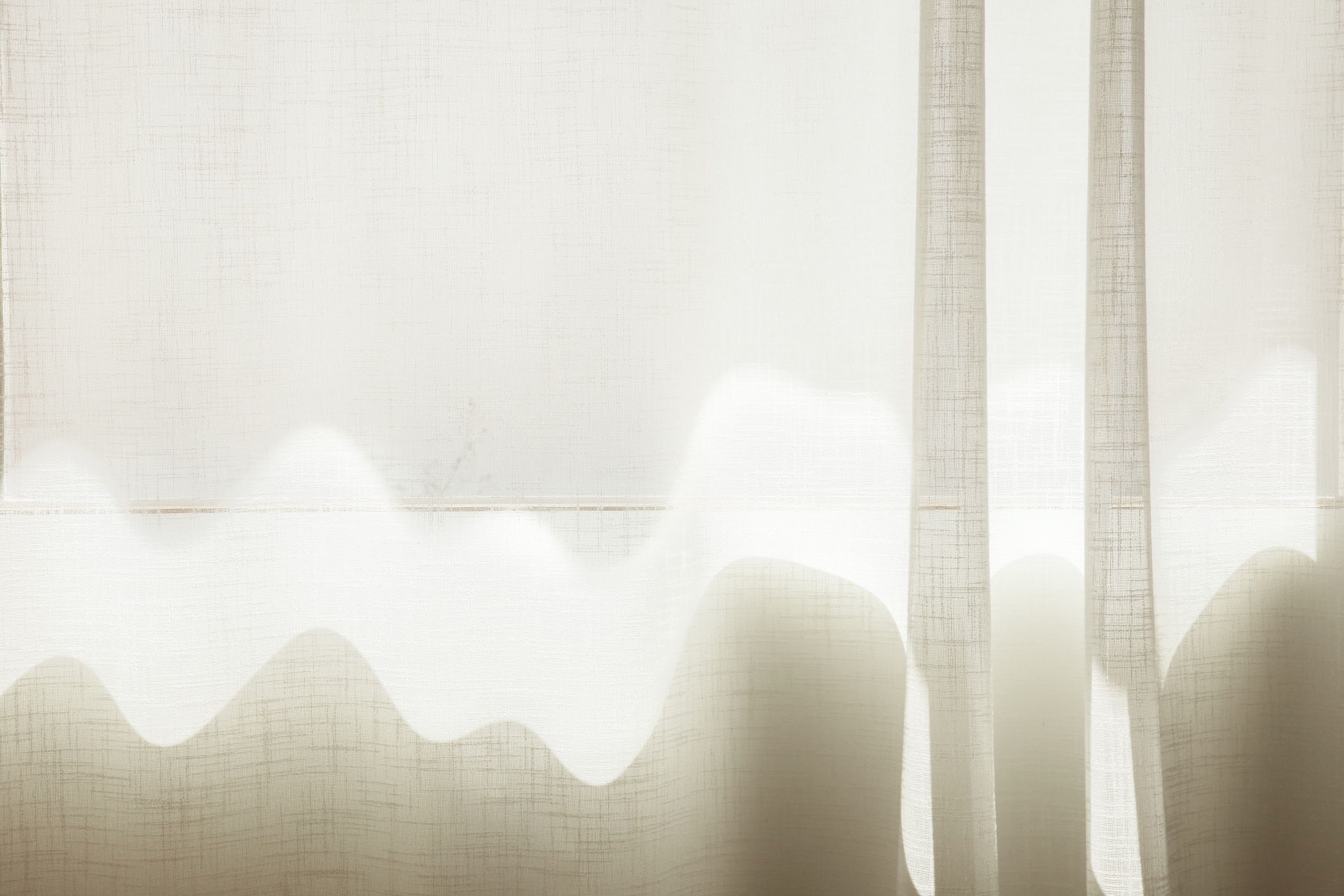
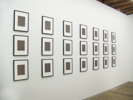
Four vertical rectangular panels hang on a wall at the 2012 Whitney Biennial. They seem stained but shimmery, like rusty galvanized sheet metal. They are each ten feet high and together take up seven feet of width, but the panel on the left is double the width of any of the three to its right. They are spaced evenly apart on the wall. If they seem designed or destined for this space, it is because their tonality somewhat rhymes with that of the flagstone floor. If they engage with the space, it is because they reflect it somewhat. They are a few mm thick and stand off the wall. They recall pieces of factory-finished material Carl Andre might have arranged on a floor in the 1970s.
They are, however, made by Liz Deschenes in 2012, and they are, actually, cameraless photographs. They are not raw material, positioned a la Andre; the phenomena on their surface is both pictorial and material, the result of light and chemistry’s interaction on photosensitive paper. Realizing that they are photograms, and knowing that photographs are often mounted to metal and that Deschenes’ work has a history of self-reflexivity, it’s possible to imagine a reference in this surface to the idea of the picture’s support: an image of or like metal mounted to metal.
In this case, though, the prints are mounted to Dibond, a substrate of aluminum and polyethylene, and so, no: Deschenes’ photograms do not depict metal or any other material; they are a material and they act as such (if assisted in this role by their substrate, which enables them to lie flat). Deschenes has arranged this material as Andre might have arranged the material at his disposal.
The difference is in the nature of the material: it is not raw – a form with a given surface – but, rather, it is worked – a form with an intended finish on its surface. Every photograph has a worked surface, but these make issue of the fact. That these prints are cameraless and that chance is a part of this as it is a part of every photographic process does not detract from the fact that the surface is invented rather than found. A picture is here. The picture refuses the nomenclature of the pictorial insofar as it is allover and refers to no noun, but it is in fact an image.
Photographic pictures are conventionally read with respect to their referent: a photographic picture of a line invokes as much of a question of how the line came to be as does a photographic picture of a cheerleader. Deschenes’ pictures, here, can be explained – and are, in press materials – but more than begging their own origin story, they simply exist in real space and time. Part of what lends them this authority is the repetition of the panels’ forms: like the iterative nature of Minimalist sculpture, they beg questions of relations between their own parts, of relations between those parts and the space in which they are installed, and between their parts and the viewer(s) that stand before them, slightly reflected in their surface.
What does it mean to arrange a photograph as if it were a material? If the photograph, laden with signification such that anything it looks like it must refer to, is asked to lie on a wall and look like metal but adamantly not be so, with which facts and which fictions does it play? Also, does it perform as an art object other than in real space and real time? Does it, in other words, require of its viewers the activity of Minimalism, or even if possible the activity of viewers of more contemporary performative work, such as that which surrounds the Untitled piece at the Whitney Biennial 2012?
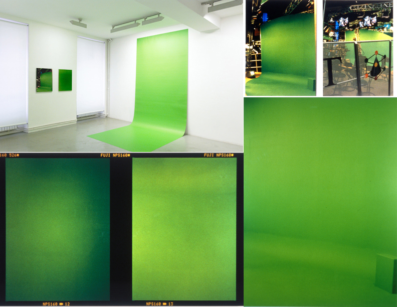
Liz Deschenes has been working with photography and against depiction throughout her career. Her green screen photograms of the first decade of the 21st century function at once as green screens and as representations of green screens. They suggest an interest in the apparatus of photography both through their color and the postures in which they are installed. Some are tacked to the wall and flow onto the ground seamlessly, as would a backdrop in a commercial shoot. Some, however, picture green screens in commercial situ. This project, then, marks a transition in the treatment of a print: as window onto an event in which an object is pictured and, alternatively, as object itself, to be viewed – and potentially acted upon or with – by an active subject.
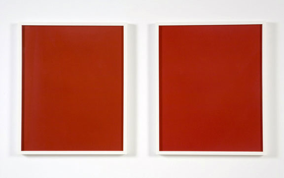
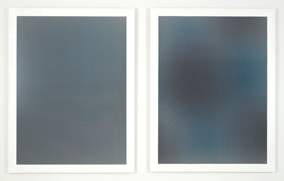
Other works of Deschenes’ prior to the work at the Whitney Biennial similarly assert their lack of depicted referent but admit less overtly to the photographic postures to which they refer than do the green screens. Some of her dye transfers, for example, are two monochromes framed next to one another on the wall – subtly sculptural in their doubling, but not transparently so. It is possible and valid to read them, in other words, as two pictures next to one another, framed, even if those in the know understand that there is a logic to the doubling that has to do with how dye transfers are made. The sculptural nature of these prints – their pairing, their existence in space together – is available to all photographs: two photographs can be shown together and augment one another, compositionally or conceptually. One print can be rotated, disturbing the effects of the photographic fiction. This is true of Deschenes’ dye transfers and also of her moirés, which are optical experiments, almost to the irrelevance of their physical realization, except in that their significance relies on being viewed – a physical relation between the work and its affecting subject.
It is really the green screens that pave the way for the assertion of the theatrical body of the print that is the accomplishment of her work since 2009, especially in tilt/swing, shift/rise, and the Untitled work at the Biennial. Deschenes’ green screens, and especially the ones that exist in real space, have a sculptural logic that does not belong to all photographs: they have a specific scale – big enough for a person to stand on, immersed – and a specific height at which they are hung, a specific distance of the ground that they traverse. The logic of the size and scale of the green screens is fixed, at least at its minimum.
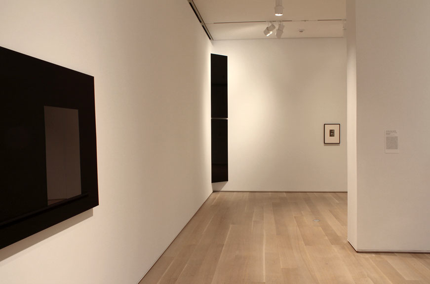
At the Langen Foundation in 2011 and again at the Art Institute of Chicago in 2012, she situated a black, mounted photogram in a corner: its shadow shed behind it, describing both the absence of sculptural or architectural stuff behind the print and the presence of a back to the print at all. Here again the nature of the print as material, rather than picture, is asserted. Material has a back; pictures don’t. Here again the specific scale of the print is important: it must reach from one wall to the other and therefore has a minimum width, plus it must not be taller than the distance between floor and ceiling and therefore has a maximum height. If Deschenes could have gone bigger or smaller in one or the other direction, still, the specificity of the scale becomes a question as it does not for most photographs. Here, we do not speak of the relatively short width of the piece as being intimate nor the relatively tall height as being ambitious: we see that there’s a fit, and that’s architecturally-responsive – the room as a frame. It is not site-specific – we overuse that term; this piece can be moved – but it does delineate a phenomenon of the space of the room in which it is situated as would, say, Richard Serra’s Delineator of 1974-75 (installed at the Museum of Modern Art in New York just after the 2012 Biennial came down.)
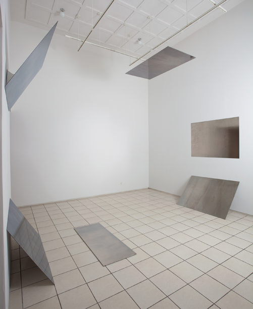
In 2009 and 2010, in two versions of a piece called tilt/swing (360° field of vision), Deschenes playfully deployed mounted photograms in a 360 degree circuit from floor to ceiling; the prints in this piece behave like the seats on a carousel, abstracted into planes. They also, however, behave like a Donald Judd, dependent as they are on the presence and position of their viewers for their specific realization. If the title of the piece refers to the phenomenon of large format photography used frequently to correct parallax divergence, often in architecture, Deschenes’ work here inverts this possibility, creating of her prints an architecture of their own, necessarily viewed in perspective.
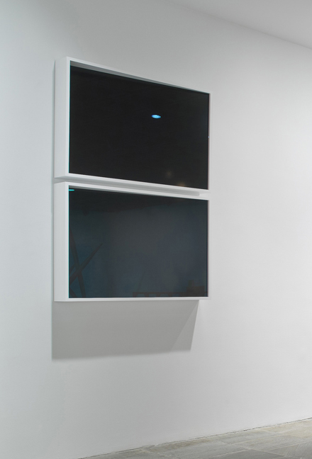
Another piece of Deschenes’ shown at the Whitney is a dyad of two photograms, both reflective, which are housed at angles in their frames. That these boxes are modeled after the windows of the Whitney’s Marcel Breuer building is the piece’s intended nod to architecture, but, more essentially, the relations of the prints to the boxes in which they are housed and the relations of one box to the other inscribes the sculptural and performative reality of the prints even more deeply into the Minimalist tendency towards real space and real time. If her earlier diptychs – the moirés, the dye transfers – could be read as two pictures next to one another, these read as two material actions, making the space of the frame one space in which the meaning of the piece plays out. Here is a relation of picture to support that radicalizes the notion of frame recognizable in an Elad Lassry union of pictorial color with frame color or in a Jeff Wall lightbox. The print does not just extend into or depend on its frame; it interacts with it, and that is all.
Deschenes then begins to build into the logic of each of her photographs a specific quality – scale, frame, posture, and sometimes color. This is what abstraction means, in case we have forgotten: a work of art does not “look abstract” and it “is” not “an abstraction.” A work of art abstracts a specific quality. Sometimes such qualities derive from observation: a subject can be abstracted, but that does not mean that it is rendered blurry or otherwise stylistically abstract.
It has seemed, throughout photography’s history, that the abstract potential of a photograph is understood to be housed in the pictorial rendering of a subject. In general, when we speak about the photographic print as bearing imagery, we presuppose a subject, but of course that subject can be constituted of abstract concerns.
The concerns of abstraction have changed radically for photography over the years: they have moved, literally, through the window that is the surface of the print. If they begin in an object that looks abstract – photographs of distressed surfaces – and move to include abstraction in terms of the way, say, an artist handles color or the focus on a camera, they soon become about the way the content of an image is staged, the way the physical print circulates in society, and how the print is made, perhaps cameralessly. In any one of these phases of concern, part of what is abstracted is the idea of photography itself and of what it does, in terms of action verbs: the photograph contains an abstract picture, then photograph affects the abstraction of a picture, the photograph makes abstraction in a picture, the photograph is an abstract picture.
Deschenes’ work includes the physical behavior of a print in a room in this canon of abstract concerns: the photograph behaves abstractly. Moving through these phases of abstract focus is a natural condition of the pictorial, as has been modeled by painting. Key, though: presupposing a performing body for the print does not necessitate a hostility to imagery; on the contrary, in this era of overwhelming numbers of pictures, it is existentially healthy to try to make a good picture, however little it may picture and however much it may perform.
In her work, Liz Deschenes does not neglect to address, at once, two very important qualities of photography: photographic prints can manifest and bear imagery, and they can create and occupy space. The first of these realities photographic prints do in a way no other materials can; the second of these realities photographic prints do in a way other materials can do as well, if differently. Artists working in mediums other than photography borrow the first of these realities when they appropriate the photograph: they borrow images, and the investment viewers have in the veracity of images or the circulation of images. Critics refer to the first of these qualities when they tie photography into a history of painting and also when they locate the majority of photography’s relationship to sculpture in the photography of sculpture.
The second of these qualities is less frequently tended to, but is important for the sake of the argument of Deschenes’ work: prints are objects that exist in space and are affected by it, no matter how shallow their third dimension nor how well-protected their surfaces by glazing or frame. What Deschenes does, increasingly, is to build the second of these qualities into her work abstractly, through orientation, placement, and scale. Objecthood becomes the abstract proposition of her work.
What Liz Deschenes does not do that some photographers might be tempted to do, given this focus on the performative nature of the physical print, is forget that her photographic bodies have faces, and that the logic of the photographic body in space depends upon what is on that face – referential or, as is the case with her, not. Even when the surface of her prints is decidedly monochromatic, the particulars of the colors she chooses matter. The green screen is green because green screens are that particular green. The dye transfers are particular in their shades. The blacks she uses are occasional and describe space in the way a Serra drawing does, though more typically rectangular than irregular. The rough blur of the metallic surfaces or the strangeness of the moiré: each of these two-dimensional decisions reads intentionally, unemotionally, and logically with respect to how the prints are deployed.
It is nothing new to expect that the print have a body. Wolfgang Tillmans’ paper drop pictures (in which a curling paper is pictured) and Lighter pictures (in which the paper in real space is folded or bent) are concertedly and abstractly about objecthood. Tillmans’ work, though, does not account for the dual nature of the photographic print, linking with any particular logic the folded, dropped body of the photographic paper and the monochromatic image on its surface. Mel Bochner certainly happened upon the body of the print in the 1970s, in his work with the grid, and pursued a kind of system as far as why certain of these prints were silhouetted (cut out around their images) before being mounted to the wall. Photograms in which folds determine imagery, like those of Simon Dobbroe Møller, Markus Amm, and Walead Beshty, build the body of the print abstractly into its pictorial sphere. Photograms in which the paper support influences pictorial information otherwise than through folding are the province of Marco Breuer, especially. A difference between this work in photography and Deschenes’ current work is the way her pieces stand up for themselves amongst the Biennial’s many more obviously performative artworks. Her photograms describe themselves – abstractly, as well as in the terminology of press releases – as as performative a set of objects as anything else in the show. This is one reason why they are being shown now.
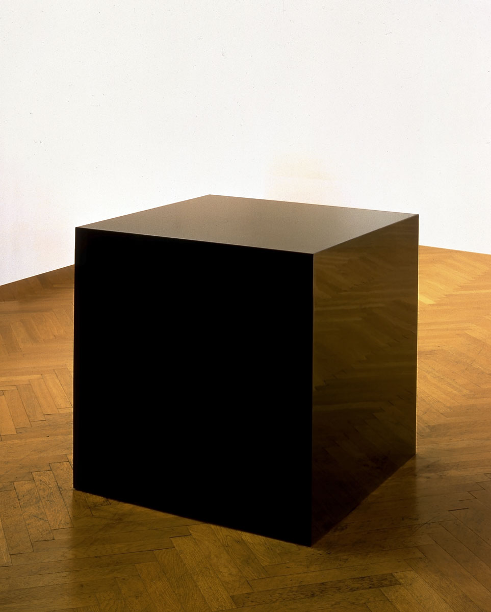
Another reason this work is being shown now is its irony. To use a photograph as a Minimalist object could be an ironic gesture: even though Deschenes is using the photograph as a material rather than to refer to a material, the work refers to a prior discovery about the way material, deployed, can delineate space. This is quotation, whether the artist intends it to be so or not, and quotation of this kind lends itself to irony. The literal rendering of a Minimalist object in a language other than that of the raw material in which Minimalist objects were originally rendered suggests that the location of difference is in the material. That difference inverts the literal meaning of the reference.
In Charles Ray’s Ink Box (1986), the essentializing tendency of the Minimalist cube is rendered less privately significant through the use of an everyday material: ink. In Deschenes’ work, the photograph could be seen as as everyday a material as ink; unfortunately, this is a stretch. Ink arrives from the factory as readymade as does steel; photographs as Deschenes uses them are, again, invented, and yet we usually see them as artifacts of events outside of the real space and time in which they are seen. It is this quality of inventedness that again distinguishes her contribution to the idea of how photographs behave as material: the irony is not in an inversion of expectation re: Minimalism, but rather, re: photography. To use a photograph as a material in a quasi-Minimalist manner is, in itself, ironic.
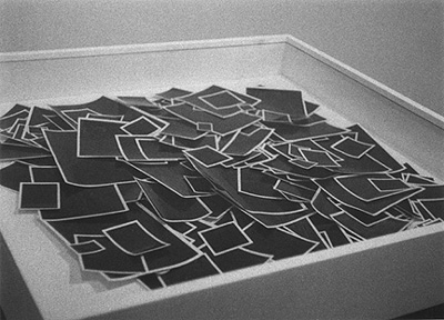
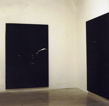
It is also not necessarily a new thing for photography to try to participate in the affects of Minimalism – aesthetic or conceptual. In 1980, Allan McCollum showed his Glossies, a number of inks and watercolors on paper, with self-adhesive plastic laminating film; these were, depending on the show, exhibited in a pile in a display case or on a table or affixed to the wall, sans frames. They are not photographs, but they perform as such in the gallery. In 1997, Alvaro Perdices produced a series of Black Photographs at 72 x 48 inches, which are mostly black, but have flickers of light in them, where traces of cigarettes had flitted across his frame. Perdices claims to have been flirting with Minimalism from a queer perspective, and hangs the photographs very close to the floor so that they seem very much like doors, especially given their dimensions. Despite the fact that the photographs enter the space of the gallery because of the way they are installed and despite the monochromatic mimicry of Minimalism, the pieces still refer specifically (via large vinyl wall labels) to the place at which they were taken, and therefore do not decry the photographic imperative to refer to a space before and beyond the real space and time of the gallery. They purport irony in the way they appropriate Minimalist affect and subvert it with cigarette butts, but do not insist on their literal presence in the room.
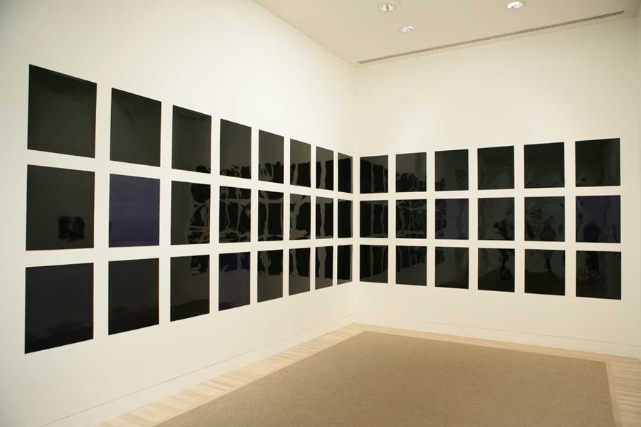
They did not have to; in 1997, the abstract concerns of photography did not lean towards the performative objecthood of a print as they do in some circles now. Across the country from the Whitney Biennial in 2012, at LAXART in Los Angeles, hang Phil Chang’s Cache, Active: twenty-one black rectangles inside of white rectangular mattes inside of black frames. They are hung in three rows of seven and are evenly spaced. Shiny, the prints and/or their frames reflect the room in which they are hung. If arriving to the exhibition just as it is hung, an observer would have seen pictures in the frames instead of black photographic paper. The pictures were of many subjects, none of which were of particular consequence, especially in combination with one another. The paper was unfixed, meaning that after the picture had been exposed, the paper had been developed, development had been stopped, and observers could see the picture, but that the paper would continue to be subject to the effects of light, because it had not been put into a fixer bath: hence, after a set period of time, black paper. The project reads (to those who know that Imagery Was Here) as existentially averse to the contemporary situation of being mired in a plethora of imagery; this position rhymes with the randomness of the variety of images set to fade to black. They reject all imagery and discover nothing: if nothing matters, nothing matters, they propose, as opposed to Tillmans’ “if one thing matters, everything matters.” They are a performance of exhaustion, like a post-post-Pictures generation sigh.
The story associated with the black rectangles, though carried on in the oral history of those in the know, is phenomenologically unavailable in the prints. Knowing that story, though, and knowing that there used to be an image other than the monochromatic one now visible, creates a sense of interiority to the photograph, as if it had an under or inner painting – as if it had an inside, like the hollowness of the Minimal object or the shadowy space in back of a silhouetted Mel Bochner or a corner piece by Liz Deschenes. This, along with the language of performance used to describe the piece in its press release and in the essay by Walter Benn Michaels that accompanied its unveiling, suggests the theatrical postures of the Minimalist object: the performance of the piece represents a death, and therefore a life. Minimalist photographs beg their own anthropomorphism. The stories of the objects live in the minds of the viewer, and the viewers therefore collectively sustain the significance of the piece; without them – or the oral history – the piece would be a simple monochrome series. Unlike Allan McCollum’s Surrogates, Chang’s Cache, Active, does not reference the dense display style of a nineteenth-century salon. The black rectangles, iterated across a white wall, reflecting those who regard them and who sustain their meaning, reference Minimalism and the rejection of the illusionistic abstractly in operation therein.
A particular character of this work is that it doesn’t make it feel as if it matters. Since the images redacted by the piece’s performance are of no apparent consequence, we don’t have an erased DeKooning drawing or a mauled poster of a dictator; we have a sense of nothingness, erased, creating a sense only that the photograph can behave as a Minimal object rather than a depicting thing – because it wants to and can. This is similar, if different in tenor, to Tillmans’ forty-two black rectangular prints exhibited in the corner of the UCLA Hammer Museum in 2006: For the Victims of Organized Religions could, for all we know, depict the same things as did Chang’s Cache, Active, but Tillmans’ piece purports to matter in its rejection or memorialization of specific imagery.
In general, Tillmans looks like he loves pictures – they’re everywhere and of all kinds in his shows – and so when he departs from that strategy, it is clear that he is treating the other more physical experiments not as replacements for images – not as negations thereof – but as their own constituent photographic argument. Similarly, Walead Beshty’s folded paper photograms exist among his oeuvre of investigations of the imagistic “processes through which we produce meaning.” They are not negations of images; they are objects unto themselves. Chang’s black pictures are not objects unto themselves; they are performing objects, and with or without having seen their performance, that is their meaning: photographs perform. They do not discover a phenomenon; photographers know that their pictures, if unfixed, will fade to black. They do not reject any specific kind of imagery, as did Tillmans’ black pictures; not do they reimagine or reclaim any specific kind of imagery, as did the Pictures’ Generation’s Cindy Shermans or Richard Princes or the post Pictures generation Elad Lassry’s. They do not use their frames or mattes sculpturally, interacting with them like a piece by Lassry or Wall or Deschenes, except insofar as they rely on their frames and mattes to emphasize their iteration.
The consequence of a performative photograph on photography at large is that it enables the medium to more clearly enter the working space of other mediums in the 21st century: it moves the work through the conventional photographic window and into the space of invented objects that function in real space and time. No longer an artifact of another space or time, the photograph acts out any number of verbs as much as a material could enact any verb on Richard Serra’s Verb List Compilation: Actions to Relate to Oneself (1967-1968). How does a photographic print – monochromatic or lacking in recognizable referent – prove more meaningful than a piece of construction paper when deployed in space? It draws on the attachment of years of belief in the photographic artifact: these pieces are only ironic or suggestive when they activate our received understanding of the photograph as a marker of an event, even if that event takes place here and now, in the neo-Minimalist space of the gallery. As the 2014 Whitney Biennial includes more collectives and collaboratives than ever before as well as more performance, distributed more organically throughout the rest of the show’s artwork, it is no wonder that the photograph should aspire to performative, interactive presence. A challenge for the photograph as it undertakes these postures, then, is to investigate what it means to perform, what kind of picture should engage in such behavior, and, of course, why.
