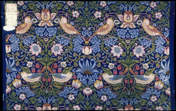
This essay investigates the poetics of indigo discharge printing as it features in William Morris’s projects. William Morris (1834–1896) worked in a great variety of media. One of his strengths was the ability to render process eloquent. Attending to the way that the dyeing and printing processes took on meaning for him, we can assess the way that his printed fabrics offer allegories relating to human life and human history. His dyestuffs and fabrics are not simple vehicles for a predetermined set of effects; materials and making processes participate in the meaning of the finished articles. In this essay I discuss colour and the attachment of dyestuffs to the fibres of the textiles, bringing this discussion to bear on an analysis of the motifs and design features developed by Morris. The essay investigates the signifying role of colour as Morris used it in textile printing and in particular the resonances of multi-colour printing. The essay is centred on the printed cotton Strawberry Thief developed by Morris for Morris & Co. (fig. 1). Morris registered the design in 1883. My argument is that the discursive power of these wares does not reside solely in the motifs selected and arranged by Morris. Drawing on personal associations he had with a printed textile patch, technical manuals from the period accessed by Morris, and on a romance by Morris that can be interpreted as an allegory of dyeing and printing, I argue that Morris was thinking of the chemical events in indigo discharge printing as analogous to the actions of human history. We can understand William Morris’s manipulation of colour in his dyeing and printing experiments as contributory elements in allegories—the allegories relating to violent struggle on one hand and utopian coexistence on the other. The material processes of getting the dye into the fabric are correlated by him to the politics of the world’s struggles and the prospects for a future society. He drew into his art the substance-invading depth of liquid colour along with the variegated yield of nature. By attending holistically to motifs, materials and making we can parse the announcement of the utopian presented in the brightly coloured world of Morris & Co.’s 1880s patterned printed textiles.
Morris & Co. printed fabrics were dyed and printed with rich, saturated colours. The company based at the Merton Abbey works, southwest of London, produced hand-printed silk, linen and cotton. The intricate designs were built up on the fabric with a number of carved pear-wood printing blocks. I contend that in the technical process of dyeing and printing, as in the motif of the design, Morris vested the epic time of history as well as the trance time of the fairy tale. His design is achievable by means of a balance between the losses of history and the gains taken from magical proliferation. Both loss and gain were characteristic of nature; his engagement with the natural world obliged him to find a way to address them both. These themes are evident across the range of his output. Morris practiced as a poet as well as a designer, craftsman and businessman. Much of his poetry summons up periods of bliss but goes on to register the stifling and benumbing nature of relentless pleasure and cavils at its shallowness. In place of everlasting pleasure, he envisages a give and take between pain and pleasure, between loss and restoration. This, rather than the infinite plane of ornament, is where we should identify Morris’s perspective: in the looping patterning of events passing from historic loss to ornamental restitution.1 We should acknowledge that at least two time frames are in play in the shuttle between deprivation and fulfillment that Morris explored: the time frame of history, with its struggle, risk, aspirations and agonies and the time frame of the dream or trance where loss is not known.
The conjunctures of history occur in directional time, arguably the time frame of the second law of thermodynamics where dissipation of energy is inevitable, a timeframe consonant, as the physicist William Thomson (1824–1907) would maintain, with Christian creation and judgement.2 This, for Victorian science, is the temporality of nature just as much as nature is the realm of generation, increase and complexification. This uni-directional time is the narrative time of lived history, vividly depicted in epic. Morris was deeply committed to the powerful stories that related to the deeds and dilemmas of mankind. Fiercely fought battles, gory sword-play and axe strokes, treachery, loyalty and sacrifice, awful vengeful immolation of heroes in burning halls mark the narratives that he worked with. Morris’s The Life and Death of Jason, first published in 1867, his translations and retelling of Icelandic sagas, and his rendition of Beowulf all tell such stories. In collaboration with Eiríkur Magnússon (1833–1913) he translated eleven Icelandic sagas from 1869.3
The grand lineaments of the tales were of appeal to Morris. Atilla the Hun, the invasion of ethnic groups into northern Europe, the battles between the Atilla’s Huns and the Ostrogoths and Visigoths and Burgundians figure as Icelandic battles between, for instance, saga characters Atli, Gunnar and Jormunrek. The historical basis of the sagas has been carefully traced by scholars such as Jesse Byock.4 Not alert to these specific historical corollaries, Morris nonetheless discerned the grand themes of history in the sagas and the decisive potential of human intervention to beneficial or tragic effect. As I understand Morris’s designs, the place of history in the grand curves of the pattern is always in reserve. If we think of the curves as winding around pockets of time we can see that the curves swell to a giant scale as they encounter phases of epic achievement and devastating loss. History is nonetheless in reserve because never explicitly described in the designs. Praxis is not summoned up or activated; it is always discreetly potential. Equally Morris focused on the saga’s episodes of enchantment and infatuation. Magic holds sway; for a period time stands still and the infinitude of sameness is glimpsed. The literary form of the conte or fairy tale might be said to expand this glimpse of enchantment. I will be investigating the way that this aspect of story-time found expression in Morris’s design and manufacture.
In looking closely at the textiles we register the interlinked system of the design in William Morris’s work. Always in his design work, the intricate intertwining can be taken as an allusion to forms of interdependence (actual or possible) in nature and in society.5 In the early 1880s Morris established the works at Merton Abbey, exasperated with the efforts to pursue his dyeing and printing under the tutelage and in collaboration with Thomas Wardle (1831–1909) at Leek.6 It was at this juncture that he had some success with his indigo-based dyeing experiments and in this period he also took on responsibilities as a socialist activist. He had been involved in campaigning politics since the late 1870s, and undertook a systematic course of reading in socialist theory in the early 1880s, including Marx’s Capital. In 1884 he founded the Socialist League and founded and edited its journal Commonweal. The intertwining in his designs of motifs based on natural forms and a readiness to identify the system of the design with the ecosystems of nature and with the co-dependencies of the social world predates his discovery of communist ideas and practice of communist or, as he put it, “collectivist” politics.7 It is as if, in his earlier work in the 1860s and 1870s, he is discovering the networks that hold the world together and in the 1880s he is able to name the networks in explicit political terms. With great vividness he presents various forms of interdependence in his designs. We see deflections, recursive turns, imperfect symmetry, strange contingencies, mutual accommodation, hooking-on spots for fragile shoots, tiny flourishes, hybrid forms, murky depths and semi-obscured, larger vital forms carrying the whole to fresh territory.
The systems featured in Morris’s designs often suggest conflict and attrition at the micro level along with harmony at the grander scale. Within the system of the design, principles of growth relate to his conception of the forces of nature and history. He constructed his designs to mirror and even exceed the powerful generative abilities of nature; he also intended them to be vectors for the energies of history.
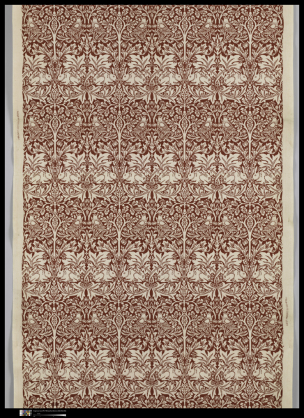
Morris includes feeding rabbits in his textile print Brother Rabbit: he gives them as beneficiaries and examples of nature’s plenty (fig. 2). They feed, they grow, they multiply. He referenced natural forms, vegetal and animal, and sought to infuse these natural elements with a sense of life and growth—not for him the deathly display of elements technically “natural” but in some designers’ hands lacking the appearance of life. Like the biologists investigating cell structure and protoplasm he found a commonality in all living things.8 This allowed or obliged him to undo the fence around the domain of the design, to broaden the horizons, to allegorise and to visualise a macro-system. By the 1880s this system relates to history and society understood from the perspective of communist theory. He sought a cohesiveness of design that modelled the interdependency of organisms in nature and individuals in society. Beauty in design was not, for Morris, a conflict-free matter. He did not settle for sweet surface harmony repeated ad infinitum, for all that this might seem the proper zone for ornament. He did draw on the capability of ornament—its ability to set up a repeat that is infinitely extendable—but this is not the sole principle in his design.
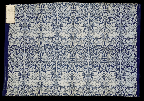
The Brother Rabbit design for printed textiles was developed in 1881, at the period when Morris was about to establish the works at Merton, and was registered in 1882. Morris’s colleague Philip Webb may have contributed to the design by depicting the rabbits for Morris to include, as he did frequently in the case of birds.9 The knowing reference of the textile name to the Brer Rabbit stories suggests a primitivist correlation of the immersive, squelching handcraft techniques with what was understood to be authentic folklore of the American South featuring the trickster canniness of the hero, derived in part from African mythology (Morris’s daughter May Morris called them “African stories”) and more recently identified as deriving also in part from native-American traditions.10 It is no coincidence that one of the titles selected for the Kelmscott Press, run by Morris, was William Caxton’s version of Reynard the Fox, dating from 1481, and issued by the Kelmscott Press in 1892. This was another trickster-centred narrative.
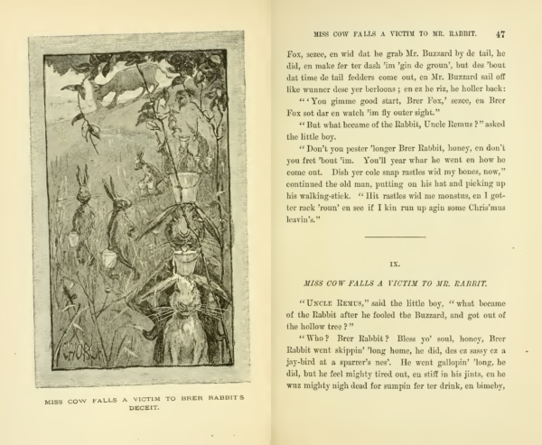
Morris named the Brother Rabbit design in tribute to the Brer Rabbit stories which he found hilarious and read aloud in family gatherings around the fire and, on one occasion, at a socialist meeting in Hammersmith.11 The cheeky efforts of the subordinate rabbit protagonist, cavilling at slave status and levels of deprivation, were clearly appealing to him. The stories were written by Joel Chandler Harris in an approximation of dialect, with the first volume of stories, Uncle Remus: His Songs and Sayings, appearing in 1880 (fig. 3). The animal characters give the fiction the character of fable. There is a savage edge to many of the “comic” incidents in this and subsequent Uncle Remus publications. For instance, the successful extraction of buckets of milk by Brer Rabbit and all his rabbit friends from the domineering Miss Cow queasily suggests a gang rape. It is an incident of retributive extraction, shadow of the ferocity of primitive accumulation.
The 1880s textile work of Morris with its patent primitivism, and its inflections of communist politics, resonates in certain ways with the Harris stories. Cotton fields are the setting for the Uncle Remus tales; racial issues and the politics of slavery (and the fight against slavery) translate compellingly to the cotton of Morris’s textile prints and the dark/light of the indigo-colouring process. The politics of racial subordination was equally associated with the indigo fields of Bengal. In the 1880s the use of coercion against peasant smallholders in the Indian subcontinent by European stakeholders in the indigo business was still notorious.12 The black American field-hand or dyed-blue Bengali indigo factory worker answers back with sharp wit, perhaps, in the cotton/indigo substance of the printed rabbit. However, the mismatch between what Morris saw as “the fascinating drolleries” of Brer Rabbit, with its nervy, chaotic and zany atmosphere, and the placid and systematic feeding of the rabbits in Brother Rabbit demands consideration. There is no harum-scarum comedy in Morris’s Brother Rabbit.
The rabbits occupy a highly visible, thick, horizontal band across the textile: their forms wrapped around by the broad surfaces of the lush and springy tulip or acanthus leaf, also showing up as predominantly white. Everything in this band tends to the foursquare, both the big looped X at the tail end and the slimmer X at nose end create stability. The complex fold in the leaf form that occurs under the ear of the rabbit and across his back indicates the compression of this dominant motif, so within the area of stability there is potential energy. The quietness of the nibbling is not an indication of the humility or stasis of the creatures. It is the building up of the potential for growth and expansion. The taking in of nourishment is the prelude for a possible unfolding of the crouched posture in an energetic movement that would match the unfolding of that sizeable leaf. Above is the evenly distributed lacy canopy of the oak tree, along with the tulip stems which are gently depressed by the feet of the chirping birds. The oak trees have their flower and fruit. The flower rises above the raised heads of the birds. The fruit is the acorn, that acts as seed of the tree at the junction of the rabbit noses, and as the fruit of the tree at the top of the trunk. The relay up the white verticals of the design, along the tree trunks, from acorn to acorn, seed to fruit, is the only motif that holds its own against the tight muscularity of the feeding rabbits. Secure, powerful, peaceable, equal, supplied plentifully with fresh shoots and nutritious acorns, they are most unlike the skittish, oppressed, violent and resentful Brer Rabbit.
The germinal power of the acorn is visible in its role as junction point for the oak tree motif and is associated with the storing up of energy in the feeding rabbits in Morris’s design. Acorns were linked to the golden age in lines written by Ovid in his Metamorphoses. Ovid describes an age of virtue and simplicity, devoid of oppression, where property-owning war and crime are unknown and where no toil is required to bring forth the fruits of the earth:
Content with Food, which Nature freely bred,
On Wildings, and on Strawberries they fed;
Cornels and Bramble-berries gave the rest,
And falling Acorns, furnisht out a Feast …
From Veins of Vallies, Milk and Nectar broke;
And Honey sweating through the pores of Oak.13
This points us in a different direction from the wily trickster rabbits evoked by Morris’s title. The lines are recalled in a speech (canonical in nineteenth-century Britain) made by the utterly ingenuous would-be knight of Cervantes’s novel Don Quixote (1605 and 1615).14 Don Quixote rhapsodises about the golden age, standing with a handful of sweet Iberian acorns in his hand:15
Happy age and happy times, those to which the ancients gave the name of “golden.” … those who lived in it were innocent of those two words, thine and mine. In that holy age all things were in common; no man needed, in order to get his ordinary sustenance, to take other trouble than to raise the hand to pluck it from the sturdy oaks, which did freely invite him with their sweet and wholesome fruit.16
He continues at length. Don Quixote’s evocation of simplicity and plenty is hedged around with paradox, as are all his high-minded exploits. His own knight errantry is posed in his speech as the necessary resource to counter the wickedness and rapacity that have taken the place of the virtue and community of the golden age. The book constantly asks whether his vision and his values are obsolete and valueless, whether the banal quotidian world simply rules them out, indeed whether history has eroded the possibilities of magic and abundance. Cervantes gives no simple answer to this question, which, I contend, is posed again by Morris across the range of his own oeuvre.
In Morris’s textile the rabbits surely reference subaltern groups capable of taking pleasure in subversive thievery, but then again Morris envisages them as inhabitants of a golden age, beneficiaries and examples of nature’s plenty. Their multiplication through printing is happily correlated to nature’s (and especially the rabbit’s) own fecundity.
In the 1880s Morris favoured the indigo-discharge printing process, which consisted of a series of stages. The fabric underwent preliminary bleaching and washing after weaving, to remove grease and other impurities such as weavers’ size remaining from the substances used to stiffen the warp threads for weaving. This bleaching and washing rendered the fibre capable of taking up the initial dye evenly. It was first of all dyed blue by immersion in a heated vat of indigo and exposure to air; then printing blocks were used with a bleach paste to bleach out areas establishing the pattern, leaving them mid-blue, pale blue or white (depending on the degree of bleaching). This, with two-colour indigo-discharge patterns such as Brother Rabbit, was sufficient, once further washing (in the waters of the adjacent River Wandle) and drying had been done, to complete the printing process. Morris found that indigo, derived from plants sourced in Southeast Asia and closely related to (indeed, chemically speaking, virtually interchangeable with) the Northern European woad, gave a deeper and more stable colour than the chemical blue dyes that were coming into commercial textile printing in the 1870s.17
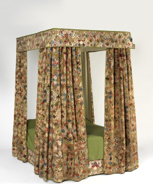
When rendering the mythically fertile subject of his Brother Rabbit in dye Morris operated with procedures that he associated with animal reproduction and the maternal body. Morris had, as a reference object which he mentioned to correspondents, a scrap of printed fabric in red and blue that was taken from the bed in which he was born in 1834. The fabric scrap does not survive, but it is possible to see some printed fabrics, which may be comparable, in the patchwork bed coverings for a mid-eighteenth-century bed, preserved at the Victoria and Albert Museum (fig. 4). In these patches indigo and madder dyeing and printing methods are used. The scrap from his mother’s bed he called “my natal print” in a letter to Aglaia Coronio in 1875.18 He explained to Georgiana Burne-Jones, as his indigo dyeing experiments went forward, that the indigo dyeing vat was always referred to as female. “If you are a dyer you must call it her.” “She” was a receptacle big enough to contain a man: six foot by six foot and nine feet deep, set into the ground; indeed in the same letter Morris envisaged being cast into the vat. He said the dye workers might lose patience with him due to his ragged temper: “perhaps they will turn me out tomorrow morning, or put me in the blue-vat.” The liquids of his craft were, it seems, identified with the feminine, with the breaking blue waters and gushing scarlet blood of the delivery bed.19
Let us specify what is implied by this reference to his two-colour natal print. First there is a reaching back into time to find the most powerful instance of the art he was pursuing: this recursive move is a defining aspect of his primitivism and is familiar from his revival of archaic artisanal techniques in many departments: stained-glass making, weaving and book printing, to name but a few. His study of dyeing was characteristically energetic and thorough. He assembled an array of dyeing and printing manuals from classical texts, through renaissance, early modern and modern handbooks. He mentions titles in his lectures, in correspondence with his collaborator Thomas Wardle, and lists a number of titles in an 1883 notebook: his resources ranging from Pliny; Roseta of the sixteenth century; renaissance herbals and materia medica publications; at least six authors from the eighteenth century; and in the nineteenth century, Koechlin, Hommasel, Napier, Chaptal, Persoz, Thompson, Chevreul and that prolific English author of the 1860s and 1870s, Charles O’Neill, editor of The Textile Colourist, established in 1876.20 All the nineteenth-century sources that Morris worked with made extensive reference to the French chemist and colour theorist M. E. Chevreul (1786–1889) and his findings in the analysis of organic compounds.21 Morris was not averse to the use of the synthetically created compound alizarin which was widely substituted for madder.22 Morris’s experimentation in dyeing was based on the knowledge he developed in reading these works from the birth of textile printing up until the modern day, trying the methods recorded and consulting with practitioners who continued to use some of the traditional methods for dyeing and block printing along with some modern materials and processes.
Secondly there is a reaching back to his own point of origin. The maternal dye vat, imagined by him, brought forth a person, namely his own self, William Morris. In this imaginary birth, he, William Morris, is a textile item pulled out of the dye bath, emerging, chequered or flowered with the colours of the amniotic and sanguinary fluids. He allows us to picture him as a sort of burly, bi-coloured Venus, born from the blue and red waves. To be successful in the art, to generate such vivid patterning in his own practice, he has to replicate this birthing, not as imprinted boy-baby but as printing man-mother.23
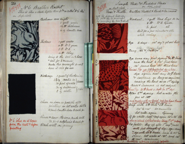
Framed within Morris’s somatic conception of printing, we now need to attend to the particular technical means by which in some instances the blue, and in other the red, were achieved in Brother Rabbit (fig. 5). An important step is to look further at the difference between the dyes known as substantive (first and foremost indigo) and those know as adjective (primarily, for Morris, madder) because this second type of dye needed an additional chemical known as the mordant to get it to take onto the fibre. Why did Morris & Co. produce Brother Rabbit both in blue and in red? One obvious answer is “for the sake of variety in serving the market.” Consumer choice was not irrelevant for his company. Looking at the printed fabrics we register the satisfying depth of colour that is produced where the indigo has soaked deep into the cotton across the piece and where the madder gives the intense background for the trees and creatures. The consumer could find the white (or pale-blue, pale-red) rabbits appealing on either background. But it is a little startling to work out that the pattern might, in the case of red, be made the opposite way from the way it is done with indigo. The white rabbits have to be cut in relief onto printing blocks for the blue colourway. These blocks are used to apply the gum and bleach mixture to bleach away the rabbit motif.
It would be possible to use the same method for red; conceivably, the madder could be mordanted all over to make the dye fasten to the cotton, then dyed in the piece in the madder vat, then over-printed with bleach. With this approach the same wood blocks could be used for the red and for the blue colourway. But the classic way to create a madder pattern was the reverse. Only the areas destined to stay red would be mordanted. The printing blocks for the red colourway in this case would have to show not rabbits in relief but the surround, the red areas, in relief. This would be a more satisfactory method because the cloth would be subject to one less process; no final bleach treatment would be required and it is worth noting that there is a degree of loss and risk involved in the bleaching process. Following the printing of the mordant, the cloth would be dyed in the piece into the madder vat. On washing, the loose red would wash out of all the areas not mordanted. The Morris & Co. dye-books contain recipes for the dyes, and bleaches for this design (fig. 6). The brief notes that constitute the recipes do not give a definitive answer to this question, but my reading of them is that in the case of Brother Rabbit, Morris & Co. did recut all the blocks in reverse.24
Brother Rabbit therefore offers us a conundrum concerning process. Given the challenge of producing first blue and then its alternative, red, the path taken, it seems, was the reverse in the case of red. To shift from blue to red, the design was in fact retraced in the way that the hero’s path is so often retraced in a romance narrative, continuing the quest but journeying back until the return home is achieved.25 Medieval romance, in the form of the quest or the conte or fairy tale may be as important to Morris’s dyeing project as the anti-authoritarian resources of the trickster narrative or fable.
Brother Rabbit is printed as either red or as blue. In due course, experimenting with these processes involving the discharge of areas of colour by means of bleach, Morris was able to develop multicoloured prints like the Strawberry Thief fabric.
We are familiar, perhaps over-familiar, with the motifs in Strawberry Thief (fig. 1). A deep indigo background is the field against which a glorious array of flowers, fruits, stems, leaves and birds take their place. Blonde birds are jauntily perched among blue tulip stems and green strawberry foliage; little violets are tucked in among the greenery, the cloth is dappled with daisies, marigolds, and buttercups. Pairs of birds step out energetically with loaded beaks from the strawberry plant, the other pairs lean back to chirp full-throttle from the stems of anemone-like plants. Their spread beaks and swelling throats are colour matched to the gold-tinged, pink-centred tulip petals which stretch grandly from the blowsy tulip bloom. At the junction between the tails of the chirping birds an acorn seems to have found its way into the tangle of plants; it hangs down, the emerging nut in its characteristic dimpled cupule not yet fully shaped. Strawberry Thief is a tour de force of fabric printing in which an astonishing range of colours and captivating detail is brought to the visual feast. Its intricacy obliges us to attend to the process of making and consider how each subcomponent of the system claims a place within the fabric. It is my contention that the impression of pleasant ornamental variety is subtended by processes associated with loss and violence.
When multi-coloured printing was required, the printing of white spaces with bleach over the first-stage dyeing of indigo was a preliminary to the printing on of reds, yellows, and browns and the creation of greens and blacks.26 The pigments giving these colours would not attach to vegetable fibre such as linen and cotton without the use of (usually) metal-based mordants. The multi-coloured effects of a design such as Strawberry Thief rely on the successful interlocking of areas devoted to the intense blue that the cotton fibre has thirstily soaked up, with areas on which the red or yellow has been snagged by the chemical action of the mordant, sometimes dipped in a fresh dye-bath and washed out as with the maddering described for Brother Rabbit, sometimes applied with the pigment in patches and encouraged to take hold on the fibre by exposure to steam.27 The steaming was understood to force open the substance of the fibre. The technical and artistic challenge for Morris was to bring these two processes together, to get the harmonious and beautiful combination of red and blue that represented the past of his craft and was a correlate of his own being. The difference between substantive and adjective dyes is one that I will align with the two realms of magic and of history.
In multi-colour prints there is a two-way path; the journey starts with the indigo bath and can be said to have come full circle when the cloth has been treated with the red dye. At home again, with the blues and reds complete, the locus is available for the final array of multi-colour printing. Yellows can give bright flashes, or (by overprinting on partially discharged blue) touches of green, or (on pinks) orange. An overall yellow dye bath can give a golden hue to the whole. Walnut or catechu-derived browns and blacks can add definition and pattern.
As we have seen, in Strawberry Thief the feasting birds grasp the stem of the vivid red fruit in their beaks, feet well spread to tug them away. But the motif of the flexible stem hanging over the lower section of beak involves a looping-in of the birds to the tangle of violets, buttercups, tulips and more. Just as strongly as they seem to steal the fruit, the vegetation co-opts them, the flecked stem of the tulip and the lovely maculation of the inner surface of petals, and especially the strongly marked seeds on the strawberries’ surfaces resonate with the markings on the thrush.
The marks break up solid blocks of local colour so that colour in this printed textile is not just saturated and bright and varied in hue, it is also distributed pell-mell across an integrated organic system. These bold birds are cheeky thieves like Brer Rabbit; in such a light they are comic side-players in the epic struggles of history, but more insistently, like the feeding rabbits in the Brother Rabbit textile, they participate in the bounty of a harmonious world.
I propose that we consider the poetics of Morris’s dyeing, bleaching and printing in the light of the last romance written by William Morris, The Water of the Wondrous Isles.28 This prose romance, that he was correcting in 1896, the year of his death, presents the journey of a heroine. The heroine, Birdalone, escapes captivity by voyaging on the river and encounters ladies held captive by enchantment who have been parted from their knights. Her journey takes her to the residence of the knights and she seeks to reunite the couples. Each couple is colour-coded: green, gold and black.29 She directs the knights to the island where the ladies are held. The outcome is complicated by the slaying of one of the knights, when she unnecessarily puts herself into danger, and the estrangement of the affection of one of the other knights who falls in love with Birdalone, leaving his affianced lady lovelorn. Eventually the group of knights and ladies join Birdalone in her forest home. They chose to settle in the birth-town from which she was stolen away as a child and maintain a close link to the forest where she had been captive. The story is governed by two supernatural beings who inhabit the forest, the witch who stole Birdalone as a baby and kept her as a slave, and the benign forest dwelling spirit, the “wood-mother,” who helps her escape. The world of fairy and the ecologically balanced world of the forest are represented by the wood-mother.
I read this romance as an allegory of dyeing and printing. The explicit story references embroidery rather than dyeing, since Birdalone’s mother was an embroiderer and Birdalone becomes a wonderful embroiderer. Nevertheless, the story is built around the waterway that gives passageway between the locations and the journey out and the journey back are primarily by water. This liquid pathway is the defining narrative device. Birdalone herself, lily-white, repeatedly takes off her clothes to swim in the water.30 When she escapes by water she is still naked because the witch has stolen her clothes. She gains garments from each of the three ladies as tokens to their knights. The band of friends that is gathered together through peril and misadventure is a group of colours and the ultimate uniting of them makes a multi-coloured environment presided over by the undefeated wood-mother. If this is indeed an allegory of dyeing and printing, then the white, naked body of Birdalone has to stand for the cotton fibre that is to bear the coloured printing. The primary colours that her body receives are the waters through which she swims and travels on enchanted craft. Every character that Birdalone encounters is drawn to her beauty, mesmerised and comically fawning, or dangerously lustful and rapacious, they seek attachment or penetration.
The cotton or linen cloth that comes to the dyer and printer is made receptive to dye through initial processes of bleaching (or chemicking) with hypochlorites, scouring and boiling. Because indigo enters so readily into cotton fibre there is no need for extensive preparatory bleaching. Morris liked the way that the blue became more and more dark and intense the longer the cloth was left in the dye. He was frustrated by some dyes where it was not possible to intensify the shade with long processing. His assistant’s diary records, in the early days of his dye experiments, note:
W.M. dyed a few silks in cochineal. He says that he cannot get on at all with this dye: he cannot make it out, he is unable to get a deep colour on. It will dye the deepest colour in a few minutes, and after that the colour will not get deeper, no matter how long you keep your goods in the decoction.31
Some weeks earlier the same secretary/assistant said, “he has not yet learnt the real upshot of this dyeing; [namely] it is hard to get the colour on.”32
Indigo was everything Morris wished from a dye. Walter Crum (1796–1867) was a calico printer and Fellow of the Royal Society. In the Journal of the Chemical Society in 1863 he commented on the way that whereas “ordinary hydrostatic capillary force” allowed cotton to soak up salt solution to a standard level very quickly, cotton sucked up indigo in solution continuously;
there is also exercised a power of decomposition and precipitation by which the indigo is gradually attracted to the cotton from the solution around it, so that if the immersion be continued for a quarter of an hour, it becomes loaded with ten times as much indigo as another piece which has been withdrawn immediately after its immersion.33
As the cloth is pulled out of the dye vat the dissolved indigo (yellowish green in colour) held in the fibre reacts to the oxygen in the atmosphere, goes blue and is made into an insoluble state. Crum explains: “it is entrapped within the body of the fibre, or its tissue, and becomes fixed there.”34 Effectively it enters as a liquid through the mechanical force of capillary action, then is trapped as a solid having undergone a chemical transformation. All the technical commentary was preoccupied with the question of whether the processes of dyeing should properly be understood as mechanical or chemical.
Crum’s implication is that cotton’s thirst for indigo is something beyond normal capillary force (he uses the comparator of activated charcoal) but he was not tempted by the idea that there was a chemical union with the cotton fibre. Rather he saw the cotton fibre as a vessel. Under the microscope unripe cotton—which is resistant to dye—was shown by him to have no inner opening. Riper cotton fibre—which takes the colour—is a tube, he shows: an “irregular, partially twisted cylinder, of about 1/1000 of an inch at its greatest diameter.”35 It was shaped like a tapeworm, he explained, the tube narrowing at the furthest extent from the cotton bud.
The “substantive” dye, indigo, was loaded into the cloth with a discernible increase in weight of the dyed article. The technical literature on dyeing and printing was clear about the special nature of indigo. It was only possible to print with indigo by resist (as in Dutch/West African wax prints or tie-dyeing) or by discharge methods (as in the Brother Rabbit example). O’Neill in 1872 regretted that these were the only options. Compared to the (non-available) direct printing of indigo blue, the resist or discharge methods were, he said, “complicated, tedious” and “expensive.” The dye itself was costly and O’Neill points out that, having put it in the cloth, the discharge method then destroyed a significant portion of it as bleach was applied to make the pattern.36 Bleach reacted with the solidified indigo dye, converting it back to a soluble substance so that it could be washed out from the fibres.
The escape and the return of The Water of the Wondrous Isles are not identical journeys, although the route is the same. On the way back Birdalone dresses in masculine fashion as a knight in armour and a helmet until at length, having lost her boat, she strips off and consigns her fate to the currents. The magical islands have undergone a reversal of their character: the desert-like Island of Nothing is being tilled and provides pasture for sheep and sustains a fledgling society of farmer-herders. The corpse-dominated Isle of Kings is peopled by vital young women; the Isle of the Queens, previously home only to women, is peopled only by men; the Isle of the Young and the Old, which was home to elders, is peopled by children; the Isle of Increase Unsought, which was fair meadow-land around the handsome castle imprisoning the three ladies, is now a wasteland. Everything is reversed: the spells that had been cast by the witch and her vile sister have been undone. If the voyage out is the first dip in the dye bath then the voyage home is a dip in a different mixture—I would argue that blue has given way to red.
Red is the colour of horror and violence in the tale. A red potion powers the red-clad witch’s sister. The Red Felons are the ruthless torturers and rapists that work for the wicked Red Knight. One of these, garbed in black, falls in with Birdalone at the switch-point between out and return; she fears rape. However, this black-clad felon is oddly doubled with the virtuous Black Squire, Arthur, who had transferred his allegiance from his own lady love to Birdalone. There are various ways in which her journey back to unite with Arthur and conclude the story is the red route.
When Birdalone and Arthur go to the rescue of her companions, who have been seized by the wicked Red Knight’s men who carry them right into the forests near to Birdalone’s dwelling, a fierce battle ensues which leaves the red foemen sheared through “to the flesh and bone” and “wallowing on the earth.” The wood-mother had offered to bring the companions safely home by magic, but Birdalone and her lover Arthur elect to fight: human motivation of love, regret, duty and honour impel them to armed combat and the flow of blood. The outward journey of Birdalone was governed mainly by spells and magic but the route home is governed to a greater extent by human action. Can we characterise these very generally as the blue route of chemistry and the red route of mechanical force? Northrop Frye’s compelling distinction (1948) between the green of fairy settings and the red and white of chivalric action and human history is pertinent here. He argues for a double coding in Spenser and in Shakespeare whereby the fairy world and the chivalric world, the green and the red-and-white, exist in “contrapuntal intermingling.”37 His green world (related as he says to the original golden age) has something of the indigo and something of the multi-coloured fairy forest that I identify in Morris’s text. His red-and-white world certainly corresponds to the red route of the return journey.
Morris emphasises the martial aspect of the return journey. It is as if gathering together the pigment-ladies and their matching knights puts the biting and forcing elements, the mordants, into action. The metal of knightly equipment (sword and armour) is tantamount to the acetate of lead, the sulphate of iron (known as vitriol of mars for blacks and purples) or acetate of alumina (for red, known as red liquor) used as the dyer’s mordants.38 Moreover, to put the red onto the blue the indigo has to be discharged in a bleaching process, which, as we have seen, involves physical separation of the dye from the cloth. The story of sequestration, imprisonment and discharge of characters in The Water of the Wondrous Isles resonates with the chemical drama of the dye process. Even the changing and annihilation of partners in the love story can be considered as a dramatization of the processes of exchange in the chemical reactions that are detailed in the technical literature read so systematically by Morris.
The multi-coloured coexistence that is the happy conclusion of the tale is a life reminiscent of the golden age: peace, plenty, understanding of the ways of nature as revealed by the wood-wife (her name, Habundia, speaks of abundance) However, this version of abundance is one where loss has been sustained: the slaying of the Golden Knight, the irreversible transfer of affection of the Black Knight.
If the “blue route” of the tale’s commencement is one that offers plenitude, then the “red route” of its completion is more akin to the chivalric battle with sexual violence. Morris is fired up by a vision of the golden age but he cannot offer it up glibly.
Happy, multi-coloured coexistence is presented by Morris in his indigo-discharge printed textiles, and we can look again at Strawberry Thief to assess what kind of future society Morris wishes us to envisage. Here the apparently infinite depth of blue is given in great intensity to show off the nodding, substantial presence of sweet, red strawberries in contrast. The cotton is hyper-charged with blue; the bleach has stolen it away selectively to offer muted blues in a spreading network of soft-edged foliage and to allow for the forcing in of reds, yellows and browns for our pleasure. Our eye moves up and down the textile to see in turn the joyful outstretched carolling of the birds and the gleeful furtiveness of the thieving thrushes. One set is mottled gold and pink like the tulip, one set mottled yellow and pale blue like the strawberry flowers seen from behind. Sheer singing pleasure (or play) and instrumental or tendentious pleasure in taking and having (the work of taking or getting back) are juggled, but never fully conflated, in the textile.
In a fabric print such as Strawberry Thief Morris figures abundance not in terms of flat, infinitely extendable ornament but as a locus marked by contrapuntal intermingling of distinct temporal modes. He does not give, just, a magically self-acting nature, indigo-enchanted and marked by increase, nor, just, a fearsome blood-pulsing human culture marked by loss. He chooses to go beyond a divide of blue chemistry and red hydraulics, blue biology and red history, or blue enchantment and red chivalry. Morris’s textile printing arrives at an adequate response to nature by means of switching between modes; as he switches between substantive and adjective dyestuffs his plant and creature protagonists hop from golden-age joys to trickster moves learnt in deep time, from epic historical engagement, via modern struggles over labour and property, to real future contentment in a conflict-free world.
Photo Credits: figs. 1, 2, 4: Victoria and Albert Museum, London; fig. 5: The Metropolitan Museum of Art/Art Resource/Scala, Florence; fig. 6: The Huntington Library, Art Collections and Botanical Gardens.
I am grateful for assistance and advice from:
Katie Scott, Professor of Art History, The Courtauld Institute of Art; Rebecca Arnold, Senior Lecturer in Dress and Textiles, The Courtauld Institute of Art; Maria Jordan, Textile Conservation Studio Manager, National Trust; Victoria Kelley, Director of Research and Education; Professor in the History of Design and Material Culture, University of the Arts, London; Matthew C. Hunter, Associate Professor, and participants in the 2014 Conference, ‘Liquid Intelligence’, Department of Art History and Communication Studies, McGill University, Montreal; Melinda McCurdy, Associate Curator of British Art, Huntington Library, Art Collections and Botanical Gardens; Nicholas Wilkinson, Conservation Researcher, Department of Geography, Cambridge University; Kate Nichols, Birmingham Fellow, University of Brimingham and participants in the Shows of London interdisciplinary seminar at King’s College London; and Karin Kyburz, Staff Publications Assistant and Picture Researcher, The Courtauld Institute of Art.
Notes

This essay investigates the poetics of indigo discharge printing as it features in William Morris’s projects. William Morris (1834–1896) worked in a great variety of media. One of his strengths was the ability to render process eloquent. Attending to the way that the dyeing and printing processes took on meaning for him, we can assess the way that his printed fabrics offer allegories relating to human life and human history. His dyestuffs and fabrics are not simple vehicles for a predetermined set of effects; materials and making processes participate in the meaning of the finished articles. In this essay I discuss colour and the attachment of dyestuffs to the fibres of the textiles, bringing this discussion to bear on an analysis of the motifs and design features developed by Morris. The essay investigates the signifying role of colour as Morris used it in textile printing and in particular the resonances of multi-colour printing. The essay is centred on the printed cotton Strawberry Thief developed by Morris for Morris & Co. (fig. 1). Morris registered the design in 1883. My argument is that the discursive power of these wares does not reside solely in the motifs selected and arranged by Morris. Drawing on personal associations he had with a printed textile patch, technical manuals from the period accessed by Morris, and on a romance by Morris that can be interpreted as an allegory of dyeing and printing, I argue that Morris was thinking of the chemical events in indigo discharge printing as analogous to the actions of human history. We can understand William Morris’s manipulation of colour in his dyeing and printing experiments as contributory elements in allegories—the allegories relating to violent struggle on one hand and utopian coexistence on the other. The material processes of getting the dye into the fabric are correlated by him to the politics of the world’s struggles and the prospects for a future society. He drew into his art the substance-invading depth of liquid colour along with the variegated yield of nature. By attending holistically to motifs, materials and making we can parse the announcement of the utopian presented in the brightly coloured world of Morris & Co.’s 1880s patterned printed textiles.
Morris & Co. printed fabrics were dyed and printed with rich, saturated colours. The company based at the Merton Abbey works, southwest of London, produced hand-printed silk, linen and cotton. The intricate designs were built up on the fabric with a number of carved pear-wood printing blocks. I contend that in the technical process of dyeing and printing, as in the motif of the design, Morris vested the epic time of history as well as the trance time of the fairy tale. His design is achievable by means of a balance between the losses of history and the gains taken from magical proliferation. Both loss and gain were characteristic of nature; his engagement with the natural world obliged him to find a way to address them both. These themes are evident across the range of his output. Morris practiced as a poet as well as a designer, craftsman and businessman. Much of his poetry summons up periods of bliss but goes on to register the stifling and benumbing nature of relentless pleasure and cavils at its shallowness. In place of everlasting pleasure, he envisages a give and take between pain and pleasure, between loss and restoration. This, rather than the infinite plane of ornament, is where we should identify Morris’s perspective: in the looping patterning of events passing from historic loss to ornamental restitution.1 We should acknowledge that at least two time frames are in play in the shuttle between deprivation and fulfillment that Morris explored: the time frame of history, with its struggle, risk, aspirations and agonies and the time frame of the dream or trance where loss is not known.
The conjunctures of history occur in directional time, arguably the time frame of the second law of thermodynamics where dissipation of energy is inevitable, a timeframe consonant, as the physicist William Thomson (1824–1907) would maintain, with Christian creation and judgement.2 This, for Victorian science, is the temporality of nature just as much as nature is the realm of generation, increase and complexification. This uni-directional time is the narrative time of lived history, vividly depicted in epic. Morris was deeply committed to the powerful stories that related to the deeds and dilemmas of mankind. Fiercely fought battles, gory sword-play and axe strokes, treachery, loyalty and sacrifice, awful vengeful immolation of heroes in burning halls mark the narratives that he worked with. Morris’s The Life and Death of Jason, first published in 1867, his translations and retelling of Icelandic sagas, and his rendition of Beowulf all tell such stories. In collaboration with Eiríkur Magnússon (1833–1913) he translated eleven Icelandic sagas from 1869.3
The grand lineaments of the tales were of appeal to Morris. Atilla the Hun, the invasion of ethnic groups into northern Europe, the battles between the Atilla’s Huns and the Ostrogoths and Visigoths and Burgundians figure as Icelandic battles between, for instance, saga characters Atli, Gunnar and Jormunrek. The historical basis of the sagas has been carefully traced by scholars such as Jesse Byock.4 Not alert to these specific historical corollaries, Morris nonetheless discerned the grand themes of history in the sagas and the decisive potential of human intervention to beneficial or tragic effect. As I understand Morris’s designs, the place of history in the grand curves of the pattern is always in reserve. If we think of the curves as winding around pockets of time we can see that the curves swell to a giant scale as they encounter phases of epic achievement and devastating loss. History is nonetheless in reserve because never explicitly described in the designs. Praxis is not summoned up or activated; it is always discreetly potential. Equally Morris focused on the saga’s episodes of enchantment and infatuation. Magic holds sway; for a period time stands still and the infinitude of sameness is glimpsed. The literary form of the conte or fairy tale might be said to expand this glimpse of enchantment. I will be investigating the way that this aspect of story-time found expression in Morris’s design and manufacture.
In looking closely at the textiles we register the interlinked system of the design in William Morris’s work. Always in his design work, the intricate intertwining can be taken as an allusion to forms of interdependence (actual or possible) in nature and in society.5 In the early 1880s Morris established the works at Merton Abbey, exasperated with the efforts to pursue his dyeing and printing under the tutelage and in collaboration with Thomas Wardle (1831–1909) at Leek.6 It was at this juncture that he had some success with his indigo-based dyeing experiments and in this period he also took on responsibilities as a socialist activist. He had been involved in campaigning politics since the late 1870s, and undertook a systematic course of reading in socialist theory in the early 1880s, including Marx’s Capital. In 1884 he founded the Socialist League and founded and edited its journal Commonweal. The intertwining in his designs of motifs based on natural forms and a readiness to identify the system of the design with the ecosystems of nature and with the co-dependencies of the social world predates his discovery of communist ideas and practice of communist or, as he put it, “collectivist” politics.7 It is as if, in his earlier work in the 1860s and 1870s, he is discovering the networks that hold the world together and in the 1880s he is able to name the networks in explicit political terms. With great vividness he presents various forms of interdependence in his designs. We see deflections, recursive turns, imperfect symmetry, strange contingencies, mutual accommodation, hooking-on spots for fragile shoots, tiny flourishes, hybrid forms, murky depths and semi-obscured, larger vital forms carrying the whole to fresh territory.
The systems featured in Morris’s designs often suggest conflict and attrition at the micro level along with harmony at the grander scale. Within the system of the design, principles of growth relate to his conception of the forces of nature and history. He constructed his designs to mirror and even exceed the powerful generative abilities of nature; he also intended them to be vectors for the energies of history.
Morris includes feeding rabbits in his textile print Brother Rabbit: he gives them as beneficiaries and examples of nature’s plenty (fig. 2). They feed, they grow, they multiply. He referenced natural forms, vegetal and animal, and sought to infuse these natural elements with a sense of life and growth—not for him the deathly display of elements technically “natural” but in some designers’ hands lacking the appearance of life. Like the biologists investigating cell structure and protoplasm he found a commonality in all living things.8 This allowed or obliged him to undo the fence around the domain of the design, to broaden the horizons, to allegorise and to visualise a macro-system. By the 1880s this system relates to history and society understood from the perspective of communist theory. He sought a cohesiveness of design that modelled the interdependency of organisms in nature and individuals in society. Beauty in design was not, for Morris, a conflict-free matter. He did not settle for sweet surface harmony repeated ad infinitum, for all that this might seem the proper zone for ornament. He did draw on the capability of ornament—its ability to set up a repeat that is infinitely extendable—but this is not the sole principle in his design.
The Brother Rabbit design for printed textiles was developed in 1881, at the period when Morris was about to establish the works at Merton, and was registered in 1882. Morris’s colleague Philip Webb may have contributed to the design by depicting the rabbits for Morris to include, as he did frequently in the case of birds.9 The knowing reference of the textile name to the Brer Rabbit stories suggests a primitivist correlation of the immersive, squelching handcraft techniques with what was understood to be authentic folklore of the American South featuring the trickster canniness of the hero, derived in part from African mythology (Morris’s daughter May Morris called them “African stories”) and more recently identified as deriving also in part from native-American traditions.10 It is no coincidence that one of the titles selected for the Kelmscott Press, run by Morris, was William Caxton’s version of Reynard the Fox, dating from 1481, and issued by the Kelmscott Press in 1892. This was another trickster-centred narrative.
Morris named the Brother Rabbit design in tribute to the Brer Rabbit stories which he found hilarious and read aloud in family gatherings around the fire and, on one occasion, at a socialist meeting in Hammersmith.11 The cheeky efforts of the subordinate rabbit protagonist, cavilling at slave status and levels of deprivation, were clearly appealing to him. The stories were written by Joel Chandler Harris in an approximation of dialect, with the first volume of stories, Uncle Remus: His Songs and Sayings, appearing in 1880 (fig. 3). The animal characters give the fiction the character of fable. There is a savage edge to many of the “comic” incidents in this and subsequent Uncle Remus publications. For instance, the successful extraction of buckets of milk by Brer Rabbit and all his rabbit friends from the domineering Miss Cow queasily suggests a gang rape. It is an incident of retributive extraction, shadow of the ferocity of primitive accumulation.
The 1880s textile work of Morris with its patent primitivism, and its inflections of communist politics, resonates in certain ways with the Harris stories. Cotton fields are the setting for the Uncle Remus tales; racial issues and the politics of slavery (and the fight against slavery) translate compellingly to the cotton of Morris’s textile prints and the dark/light of the indigo-colouring process. The politics of racial subordination was equally associated with the indigo fields of Bengal. In the 1880s the use of coercion against peasant smallholders in the Indian subcontinent by European stakeholders in the indigo business was still notorious.12 The black American field-hand or dyed-blue Bengali indigo factory worker answers back with sharp wit, perhaps, in the cotton/indigo substance of the printed rabbit. However, the mismatch between what Morris saw as “the fascinating drolleries” of Brer Rabbit, with its nervy, chaotic and zany atmosphere, and the placid and systematic feeding of the rabbits in Brother Rabbit demands consideration. There is no harum-scarum comedy in Morris’s Brother Rabbit.
The rabbits occupy a highly visible, thick, horizontal band across the textile: their forms wrapped around by the broad surfaces of the lush and springy tulip or acanthus leaf, also showing up as predominantly white. Everything in this band tends to the foursquare, both the big looped X at the tail end and the slimmer X at nose end create stability. The complex fold in the leaf form that occurs under the ear of the rabbit and across his back indicates the compression of this dominant motif, so within the area of stability there is potential energy. The quietness of the nibbling is not an indication of the humility or stasis of the creatures. It is the building up of the potential for growth and expansion. The taking in of nourishment is the prelude for a possible unfolding of the crouched posture in an energetic movement that would match the unfolding of that sizeable leaf. Above is the evenly distributed lacy canopy of the oak tree, along with the tulip stems which are gently depressed by the feet of the chirping birds. The oak trees have their flower and fruit. The flower rises above the raised heads of the birds. The fruit is the acorn, that acts as seed of the tree at the junction of the rabbit noses, and as the fruit of the tree at the top of the trunk. The relay up the white verticals of the design, along the tree trunks, from acorn to acorn, seed to fruit, is the only motif that holds its own against the tight muscularity of the feeding rabbits. Secure, powerful, peaceable, equal, supplied plentifully with fresh shoots and nutritious acorns, they are most unlike the skittish, oppressed, violent and resentful Brer Rabbit.
The germinal power of the acorn is visible in its role as junction point for the oak tree motif and is associated with the storing up of energy in the feeding rabbits in Morris’s design. Acorns were linked to the golden age in lines written by Ovid in his Metamorphoses. Ovid describes an age of virtue and simplicity, devoid of oppression, where property-owning war and crime are unknown and where no toil is required to bring forth the fruits of the earth:
Content with Food, which Nature freely bred,
On Wildings, and on Strawberries they fed;
Cornels and Bramble-berries gave the rest,
And falling Acorns, furnisht out a Feast …
From Veins of Vallies, Milk and Nectar broke;
And Honey sweating through the pores of Oak.13
This points us in a different direction from the wily trickster rabbits evoked by Morris’s title. The lines are recalled in a speech (canonical in nineteenth-century Britain) made by the utterly ingenuous would-be knight of Cervantes’s novel Don Quixote (1605 and 1615).14 Don Quixote rhapsodises about the golden age, standing with a handful of sweet Iberian acorns in his hand:15
Happy age and happy times, those to which the ancients gave the name of “golden.” … those who lived in it were innocent of those two words, thine and mine. In that holy age all things were in common; no man needed, in order to get his ordinary sustenance, to take other trouble than to raise the hand to pluck it from the sturdy oaks, which did freely invite him with their sweet and wholesome fruit.16
He continues at length. Don Quixote’s evocation of simplicity and plenty is hedged around with paradox, as are all his high-minded exploits. His own knight errantry is posed in his speech as the necessary resource to counter the wickedness and rapacity that have taken the place of the virtue and community of the golden age. The book constantly asks whether his vision and his values are obsolete and valueless, whether the banal quotidian world simply rules them out, indeed whether history has eroded the possibilities of magic and abundance. Cervantes gives no simple answer to this question, which, I contend, is posed again by Morris across the range of his own oeuvre.
In Morris’s textile the rabbits surely reference subaltern groups capable of taking pleasure in subversive thievery, but then again Morris envisages them as inhabitants of a golden age, beneficiaries and examples of nature’s plenty. Their multiplication through printing is happily correlated to nature’s (and especially the rabbit’s) own fecundity.
In the 1880s Morris favoured the indigo-discharge printing process, which consisted of a series of stages. The fabric underwent preliminary bleaching and washing after weaving, to remove grease and other impurities such as weavers’ size remaining from the substances used to stiffen the warp threads for weaving. This bleaching and washing rendered the fibre capable of taking up the initial dye evenly. It was first of all dyed blue by immersion in a heated vat of indigo and exposure to air; then printing blocks were used with a bleach paste to bleach out areas establishing the pattern, leaving them mid-blue, pale blue or white (depending on the degree of bleaching). This, with two-colour indigo-discharge patterns such as Brother Rabbit, was sufficient, once further washing (in the waters of the adjacent River Wandle) and drying had been done, to complete the printing process. Morris found that indigo, derived from plants sourced in Southeast Asia and closely related to (indeed, chemically speaking, virtually interchangeable with) the Northern European woad, gave a deeper and more stable colour than the chemical blue dyes that were coming into commercial textile printing in the 1870s.17
When rendering the mythically fertile subject of his Brother Rabbit in dye Morris operated with procedures that he associated with animal reproduction and the maternal body. Morris had, as a reference object which he mentioned to correspondents, a scrap of printed fabric in red and blue that was taken from the bed in which he was born in 1834. The fabric scrap does not survive, but it is possible to see some printed fabrics, which may be comparable, in the patchwork bed coverings for a mid-eighteenth-century bed, preserved at the Victoria and Albert Museum (fig. 4). In these patches indigo and madder dyeing and printing methods are used. The scrap from his mother’s bed he called “my natal print” in a letter to Aglaia Coronio in 1875.18 He explained to Georgiana Burne-Jones, as his indigo dyeing experiments went forward, that the indigo dyeing vat was always referred to as female. “If you are a dyer you must call it her.” “She” was a receptacle big enough to contain a man: six foot by six foot and nine feet deep, set into the ground; indeed in the same letter Morris envisaged being cast into the vat. He said the dye workers might lose patience with him due to his ragged temper: “perhaps they will turn me out tomorrow morning, or put me in the blue-vat.” The liquids of his craft were, it seems, identified with the feminine, with the breaking blue waters and gushing scarlet blood of the delivery bed.19
Let us specify what is implied by this reference to his two-colour natal print. First there is a reaching back into time to find the most powerful instance of the art he was pursuing: this recursive move is a defining aspect of his primitivism and is familiar from his revival of archaic artisanal techniques in many departments: stained-glass making, weaving and book printing, to name but a few. His study of dyeing was characteristically energetic and thorough. He assembled an array of dyeing and printing manuals from classical texts, through renaissance, early modern and modern handbooks. He mentions titles in his lectures, in correspondence with his collaborator Thomas Wardle, and lists a number of titles in an 1883 notebook: his resources ranging from Pliny; Roseta of the sixteenth century; renaissance herbals and materia medica publications; at least six authors from the eighteenth century; and in the nineteenth century, Koechlin, Hommasel, Napier, Chaptal, Persoz, Thompson, Chevreul and that prolific English author of the 1860s and 1870s, Charles O’Neill, editor of The Textile Colourist, established in 1876.20 All the nineteenth-century sources that Morris worked with made extensive reference to the French chemist and colour theorist M. E. Chevreul (1786–1889) and his findings in the analysis of organic compounds.21 Morris was not averse to the use of the synthetically created compound alizarin which was widely substituted for madder.22 Morris’s experimentation in dyeing was based on the knowledge he developed in reading these works from the birth of textile printing up until the modern day, trying the methods recorded and consulting with practitioners who continued to use some of the traditional methods for dyeing and block printing along with some modern materials and processes.
Secondly there is a reaching back to his own point of origin. The maternal dye vat, imagined by him, brought forth a person, namely his own self, William Morris. In this imaginary birth, he, William Morris, is a textile item pulled out of the dye bath, emerging, chequered or flowered with the colours of the amniotic and sanguinary fluids. He allows us to picture him as a sort of burly, bi-coloured Venus, born from the blue and red waves. To be successful in the art, to generate such vivid patterning in his own practice, he has to replicate this birthing, not as imprinted boy-baby but as printing man-mother.23
Framed within Morris’s somatic conception of printing, we now need to attend to the particular technical means by which in some instances the blue, and in other the red, were achieved in Brother Rabbit (fig. 5). An important step is to look further at the difference between the dyes known as substantive (first and foremost indigo) and those know as adjective (primarily, for Morris, madder) because this second type of dye needed an additional chemical known as the mordant to get it to take onto the fibre. Why did Morris & Co. produce Brother Rabbit both in blue and in red? One obvious answer is “for the sake of variety in serving the market.” Consumer choice was not irrelevant for his company. Looking at the printed fabrics we register the satisfying depth of colour that is produced where the indigo has soaked deep into the cotton across the piece and where the madder gives the intense background for the trees and creatures. The consumer could find the white (or pale-blue, pale-red) rabbits appealing on either background. But it is a little startling to work out that the pattern might, in the case of red, be made the opposite way from the way it is done with indigo. The white rabbits have to be cut in relief onto printing blocks for the blue colourway. These blocks are used to apply the gum and bleach mixture to bleach away the rabbit motif.
It would be possible to use the same method for red; conceivably, the madder could be mordanted all over to make the dye fasten to the cotton, then dyed in the piece in the madder vat, then over-printed with bleach. With this approach the same wood blocks could be used for the red and for the blue colourway. But the classic way to create a madder pattern was the reverse. Only the areas destined to stay red would be mordanted. The printing blocks for the red colourway in this case would have to show not rabbits in relief but the surround, the red areas, in relief. This would be a more satisfactory method because the cloth would be subject to one less process; no final bleach treatment would be required and it is worth noting that there is a degree of loss and risk involved in the bleaching process. Following the printing of the mordant, the cloth would be dyed in the piece into the madder vat. On washing, the loose red would wash out of all the areas not mordanted. The Morris & Co. dye-books contain recipes for the dyes, and bleaches for this design (fig. 6). The brief notes that constitute the recipes do not give a definitive answer to this question, but my reading of them is that in the case of Brother Rabbit, Morris & Co. did recut all the blocks in reverse.24
Brother Rabbit therefore offers us a conundrum concerning process. Given the challenge of producing first blue and then its alternative, red, the path taken, it seems, was the reverse in the case of red. To shift from blue to red, the design was in fact retraced in the way that the hero’s path is so often retraced in a romance narrative, continuing the quest but journeying back until the return home is achieved.25 Medieval romance, in the form of the quest or the conte or fairy tale may be as important to Morris’s dyeing project as the anti-authoritarian resources of the trickster narrative or fable.
Brother Rabbit is printed as either red or as blue. In due course, experimenting with these processes involving the discharge of areas of colour by means of bleach, Morris was able to develop multicoloured prints like the Strawberry Thief fabric.
We are familiar, perhaps over-familiar, with the motifs in Strawberry Thief (fig. 1). A deep indigo background is the field against which a glorious array of flowers, fruits, stems, leaves and birds take their place. Blonde birds are jauntily perched among blue tulip stems and green strawberry foliage; little violets are tucked in among the greenery, the cloth is dappled with daisies, marigolds, and buttercups. Pairs of birds step out energetically with loaded beaks from the strawberry plant, the other pairs lean back to chirp full-throttle from the stems of anemone-like plants. Their spread beaks and swelling throats are colour matched to the gold-tinged, pink-centred tulip petals which stretch grandly from the blowsy tulip bloom. At the junction between the tails of the chirping birds an acorn seems to have found its way into the tangle of plants; it hangs down, the emerging nut in its characteristic dimpled cupule not yet fully shaped. Strawberry Thief is a tour de force of fabric printing in which an astonishing range of colours and captivating detail is brought to the visual feast. Its intricacy obliges us to attend to the process of making and consider how each subcomponent of the system claims a place within the fabric. It is my contention that the impression of pleasant ornamental variety is subtended by processes associated with loss and violence.
When multi-coloured printing was required, the printing of white spaces with bleach over the first-stage dyeing of indigo was a preliminary to the printing on of reds, yellows, and browns and the creation of greens and blacks.26 The pigments giving these colours would not attach to vegetable fibre such as linen and cotton without the use of (usually) metal-based mordants. The multi-coloured effects of a design such as Strawberry Thief rely on the successful interlocking of areas devoted to the intense blue that the cotton fibre has thirstily soaked up, with areas on which the red or yellow has been snagged by the chemical action of the mordant, sometimes dipped in a fresh dye-bath and washed out as with the maddering described for Brother Rabbit, sometimes applied with the pigment in patches and encouraged to take hold on the fibre by exposure to steam.27 The steaming was understood to force open the substance of the fibre. The technical and artistic challenge for Morris was to bring these two processes together, to get the harmonious and beautiful combination of red and blue that represented the past of his craft and was a correlate of his own being. The difference between substantive and adjective dyes is one that I will align with the two realms of magic and of history.
In multi-colour prints there is a two-way path; the journey starts with the indigo bath and can be said to have come full circle when the cloth has been treated with the red dye. At home again, with the blues and reds complete, the locus is available for the final array of multi-colour printing. Yellows can give bright flashes, or (by overprinting on partially discharged blue) touches of green, or (on pinks) orange. An overall yellow dye bath can give a golden hue to the whole. Walnut or catechu-derived browns and blacks can add definition and pattern.
As we have seen, in Strawberry Thief the feasting birds grasp the stem of the vivid red fruit in their beaks, feet well spread to tug them away. But the motif of the flexible stem hanging over the lower section of beak involves a looping-in of the birds to the tangle of violets, buttercups, tulips and more. Just as strongly as they seem to steal the fruit, the vegetation co-opts them, the flecked stem of the tulip and the lovely maculation of the inner surface of petals, and especially the strongly marked seeds on the strawberries’ surfaces resonate with the markings on the thrush.
The marks break up solid blocks of local colour so that colour in this printed textile is not just saturated and bright and varied in hue, it is also distributed pell-mell across an integrated organic system. These bold birds are cheeky thieves like Brer Rabbit; in such a light they are comic side-players in the epic struggles of history, but more insistently, like the feeding rabbits in the Brother Rabbit textile, they participate in the bounty of a harmonious world.
I propose that we consider the poetics of Morris’s dyeing, bleaching and printing in the light of the last romance written by William Morris, The Water of the Wondrous Isles.28 This prose romance, that he was correcting in 1896, the year of his death, presents the journey of a heroine. The heroine, Birdalone, escapes captivity by voyaging on the river and encounters ladies held captive by enchantment who have been parted from their knights. Her journey takes her to the residence of the knights and she seeks to reunite the couples. Each couple is colour-coded: green, gold and black.29 She directs the knights to the island where the ladies are held. The outcome is complicated by the slaying of one of the knights, when she unnecessarily puts herself into danger, and the estrangement of the affection of one of the other knights who falls in love with Birdalone, leaving his affianced lady lovelorn. Eventually the group of knights and ladies join Birdalone in her forest home. They chose to settle in the birth-town from which she was stolen away as a child and maintain a close link to the forest where she had been captive. The story is governed by two supernatural beings who inhabit the forest, the witch who stole Birdalone as a baby and kept her as a slave, and the benign forest dwelling spirit, the “wood-mother,” who helps her escape. The world of fairy and the ecologically balanced world of the forest are represented by the wood-mother.
I read this romance as an allegory of dyeing and printing. The explicit story references embroidery rather than dyeing, since Birdalone’s mother was an embroiderer and Birdalone becomes a wonderful embroiderer. Nevertheless, the story is built around the waterway that gives passageway between the locations and the journey out and the journey back are primarily by water. This liquid pathway is the defining narrative device. Birdalone herself, lily-white, repeatedly takes off her clothes to swim in the water.30 When she escapes by water she is still naked because the witch has stolen her clothes. She gains garments from each of the three ladies as tokens to their knights. The band of friends that is gathered together through peril and misadventure is a group of colours and the ultimate uniting of them makes a multi-coloured environment presided over by the undefeated wood-mother. If this is indeed an allegory of dyeing and printing, then the white, naked body of Birdalone has to stand for the cotton fibre that is to bear the coloured printing. The primary colours that her body receives are the waters through which she swims and travels on enchanted craft. Every character that Birdalone encounters is drawn to her beauty, mesmerised and comically fawning, or dangerously lustful and rapacious, they seek attachment or penetration.
The cotton or linen cloth that comes to the dyer and printer is made receptive to dye through initial processes of bleaching (or chemicking) with hypochlorites, scouring and boiling. Because indigo enters so readily into cotton fibre there is no need for extensive preparatory bleaching. Morris liked the way that the blue became more and more dark and intense the longer the cloth was left in the dye. He was frustrated by some dyes where it was not possible to intensify the shade with long processing. His assistant’s diary records, in the early days of his dye experiments, note:
W.M. dyed a few silks in cochineal. He says that he cannot get on at all with this dye: he cannot make it out, he is unable to get a deep colour on. It will dye the deepest colour in a few minutes, and after that the colour will not get deeper, no matter how long you keep your goods in the decoction.31
Some weeks earlier the same secretary/assistant said, “he has not yet learnt the real upshot of this dyeing; [namely] it is hard to get the colour on.”32
Indigo was everything Morris wished from a dye. Walter Crum (1796–1867) was a calico printer and Fellow of the Royal Society. In the Journal of the Chemical Society in 1863 he commented on the way that whereas “ordinary hydrostatic capillary force” allowed cotton to soak up salt solution to a standard level very quickly, cotton sucked up indigo in solution continuously;
there is also exercised a power of decomposition and precipitation by which the indigo is gradually attracted to the cotton from the solution around it, so that if the immersion be continued for a quarter of an hour, it becomes loaded with ten times as much indigo as another piece which has been withdrawn immediately after its immersion.33
As the cloth is pulled out of the dye vat the dissolved indigo (yellowish green in colour) held in the fibre reacts to the oxygen in the atmosphere, goes blue and is made into an insoluble state. Crum explains: “it is entrapped within the body of the fibre, or its tissue, and becomes fixed there.”34 Effectively it enters as a liquid through the mechanical force of capillary action, then is trapped as a solid having undergone a chemical transformation. All the technical commentary was preoccupied with the question of whether the processes of dyeing should properly be understood as mechanical or chemical.
Crum’s implication is that cotton’s thirst for indigo is something beyond normal capillary force (he uses the comparator of activated charcoal) but he was not tempted by the idea that there was a chemical union with the cotton fibre. Rather he saw the cotton fibre as a vessel. Under the microscope unripe cotton—which is resistant to dye—was shown by him to have no inner opening. Riper cotton fibre—which takes the colour—is a tube, he shows: an “irregular, partially twisted cylinder, of about 1/1000 of an inch at its greatest diameter.”35 It was shaped like a tapeworm, he explained, the tube narrowing at the furthest extent from the cotton bud.
The “substantive” dye, indigo, was loaded into the cloth with a discernible increase in weight of the dyed article. The technical literature on dyeing and printing was clear about the special nature of indigo. It was only possible to print with indigo by resist (as in Dutch/West African wax prints or tie-dyeing) or by discharge methods (as in the Brother Rabbit example). O’Neill in 1872 regretted that these were the only options. Compared to the (non-available) direct printing of indigo blue, the resist or discharge methods were, he said, “complicated, tedious” and “expensive.” The dye itself was costly and O’Neill points out that, having put it in the cloth, the discharge method then destroyed a significant portion of it as bleach was applied to make the pattern.36 Bleach reacted with the solidified indigo dye, converting it back to a soluble substance so that it could be washed out from the fibres.
The escape and the return of The Water of the Wondrous Isles are not identical journeys, although the route is the same. On the way back Birdalone dresses in masculine fashion as a knight in armour and a helmet until at length, having lost her boat, she strips off and consigns her fate to the currents. The magical islands have undergone a reversal of their character: the desert-like Island of Nothing is being tilled and provides pasture for sheep and sustains a fledgling society of farmer-herders. The corpse-dominated Isle of Kings is peopled by vital young women; the Isle of the Queens, previously home only to women, is peopled only by men; the Isle of the Young and the Old, which was home to elders, is peopled by children; the Isle of Increase Unsought, which was fair meadow-land around the handsome castle imprisoning the three ladies, is now a wasteland. Everything is reversed: the spells that had been cast by the witch and her vile sister have been undone. If the voyage out is the first dip in the dye bath then the voyage home is a dip in a different mixture—I would argue that blue has given way to red.
Red is the colour of horror and violence in the tale. A red potion powers the red-clad witch’s sister. The Red Felons are the ruthless torturers and rapists that work for the wicked Red Knight. One of these, garbed in black, falls in with Birdalone at the switch-point between out and return; she fears rape. However, this black-clad felon is oddly doubled with the virtuous Black Squire, Arthur, who had transferred his allegiance from his own lady love to Birdalone. There are various ways in which her journey back to unite with Arthur and conclude the story is the red route.
When Birdalone and Arthur go to the rescue of her companions, who have been seized by the wicked Red Knight’s men who carry them right into the forests near to Birdalone’s dwelling, a fierce battle ensues which leaves the red foemen sheared through “to the flesh and bone” and “wallowing on the earth.” The wood-mother had offered to bring the companions safely home by magic, but Birdalone and her lover Arthur elect to fight: human motivation of love, regret, duty and honour impel them to armed combat and the flow of blood. The outward journey of Birdalone was governed mainly by spells and magic but the route home is governed to a greater extent by human action. Can we characterise these very generally as the blue route of chemistry and the red route of mechanical force? Northrop Frye’s compelling distinction (1948) between the green of fairy settings and the red and white of chivalric action and human history is pertinent here. He argues for a double coding in Spenser and in Shakespeare whereby the fairy world and the chivalric world, the green and the red-and-white, exist in “contrapuntal intermingling.”37 His green world (related as he says to the original golden age) has something of the indigo and something of the multi-coloured fairy forest that I identify in Morris’s text. His red-and-white world certainly corresponds to the red route of the return journey.
Morris emphasises the martial aspect of the return journey. It is as if gathering together the pigment-ladies and their matching knights puts the biting and forcing elements, the mordants, into action. The metal of knightly equipment (sword and armour) is tantamount to the acetate of lead, the sulphate of iron (known as vitriol of mars for blacks and purples) or acetate of alumina (for red, known as red liquor) used as the dyer’s mordants.38 Moreover, to put the red onto the blue the indigo has to be discharged in a bleaching process, which, as we have seen, involves physical separation of the dye from the cloth. The story of sequestration, imprisonment and discharge of characters in The Water of the Wondrous Isles resonates with the chemical drama of the dye process. Even the changing and annihilation of partners in the love story can be considered as a dramatization of the processes of exchange in the chemical reactions that are detailed in the technical literature read so systematically by Morris.
The multi-coloured coexistence that is the happy conclusion of the tale is a life reminiscent of the golden age: peace, plenty, understanding of the ways of nature as revealed by the wood-wife (her name, Habundia, speaks of abundance) However, this version of abundance is one where loss has been sustained: the slaying of the Golden Knight, the irreversible transfer of affection of the Black Knight.
If the “blue route” of the tale’s commencement is one that offers plenitude, then the “red route” of its completion is more akin to the chivalric battle with sexual violence. Morris is fired up by a vision of the golden age but he cannot offer it up glibly.
Happy, multi-coloured coexistence is presented by Morris in his indigo-discharge printed textiles, and we can look again at Strawberry Thief to assess what kind of future society Morris wishes us to envisage. Here the apparently infinite depth of blue is given in great intensity to show off the nodding, substantial presence of sweet, red strawberries in contrast. The cotton is hyper-charged with blue; the bleach has stolen it away selectively to offer muted blues in a spreading network of soft-edged foliage and to allow for the forcing in of reds, yellows and browns for our pleasure. Our eye moves up and down the textile to see in turn the joyful outstretched carolling of the birds and the gleeful furtiveness of the thieving thrushes. One set is mottled gold and pink like the tulip, one set mottled yellow and pale blue like the strawberry flowers seen from behind. Sheer singing pleasure (or play) and instrumental or tendentious pleasure in taking and having (the work of taking or getting back) are juggled, but never fully conflated, in the textile.
In a fabric print such as Strawberry Thief Morris figures abundance not in terms of flat, infinitely extendable ornament but as a locus marked by contrapuntal intermingling of distinct temporal modes. He does not give, just, a magically self-acting nature, indigo-enchanted and marked by increase, nor, just, a fearsome blood-pulsing human culture marked by loss. He chooses to go beyond a divide of blue chemistry and red hydraulics, blue biology and red history, or blue enchantment and red chivalry. Morris’s textile printing arrives at an adequate response to nature by means of switching between modes; as he switches between substantive and adjective dyestuffs his plant and creature protagonists hop from golden-age joys to trickster moves learnt in deep time, from epic historical engagement, via modern struggles over labour and property, to real future contentment in a conflict-free world.
Photo Credits: figs. 1, 2, 4: Victoria and Albert Museum, London; fig. 5: The Metropolitan Museum of Art/Art Resource/Scala, Florence; fig. 6: The Huntington Library, Art Collections and Botanical Gardens.
I am grateful for assistance and advice from:
Katie Scott, Professor of Art History, The Courtauld Institute of Art; Rebecca Arnold, Senior Lecturer in Dress and Textiles, The Courtauld Institute of Art; Maria Jordan, Textile Conservation Studio Manager, National Trust; Victoria Kelley, Director of Research and Education; Professor in the History of Design and Material Culture, University of the Arts, London; Matthew C. Hunter, Associate Professor, and participants in the 2014 Conference, ‘Liquid Intelligence’, Department of Art History and Communication Studies, McGill University, Montreal; Melinda McCurdy, Associate Curator of British Art, Huntington Library, Art Collections and Botanical Gardens; Nicholas Wilkinson, Conservation Researcher, Department of Geography, Cambridge University; Kate Nichols, Birmingham Fellow, University of Brimingham and participants in the Shows of London interdisciplinary seminar at King’s College London; and Karin Kyburz, Staff Publications Assistant and Picture Researcher, The Courtauld Institute of Art.
Notes