Mid-twentieth century architecture reached a broad audience primarily through photographs, and photographers became essential early interpreters of the modern movement. In the United States, two major architectural photographers, Julius Shulman (1910–2009) and Ezra Stoller (1915–2004) demonstrated a sensitivity to architectural ideas, which quickly made them popular among architects. Los Angeles-based Shulman and New York-based Stoller took many of the defining images of notable mid-century buildings. Although an increasing number of contemporary studies rightly consider these images as works of art, little attention has been paid to how Shulman and Stoller approached photography as an artistic medium, an approach that needs to be understood in light of the larger relation between art and objecthood.
Artwork and Endless Object
The terms “art” and “object” are inseparable from the critical discourse of the late 1960s, particularly Michael Fried’s critique of minimalism in “Art and Objecthood.” Minimalists strove for a new art defined by what sculptor Robert Morris described as “the feel and look of openness, extendibility, accessibility, publicness, repeatability, equanimity, directness, immediacy,”1 while Fried argued that these qualities prevent minimalist sculptures from being works of art (the minimalists largely agreed). Literalist objects, as Fried called them, are “concerned with the actual circumstances in which the beholder encounters literalist work. … Whereas in previous art ‘what is to be had from the work is located strictly within [it],’ the experience of literalist art is of an object in a situation—one that, virtually by definition, includes the beholder.”2 Fried identifies this beholder-containing condition as theater, and “theater is now the negation of art” (AO 153). The theatrical exists for and depends upon an audience, so the literalist object “extorts” a “special complicity … from the beholder” (AO 155) and “is incomplete without him” (AO 163). As Fried later argued, not only is a minimalist object “incomplete” without the viewer, it is defined by the viewer’s experience. In modernist art, by contrast, “what is to be had” remains “strictly within” the work. These widely-rehearsed arguments boil down to a debate about the role of limits, borders, edges, or frames in the work of art. Fried argued that limits, the confines that create an “inside” containing “what is to be had” from the work, are the definitive feature of art, while minimalists aimed to dissolve the conceptual force of limits and make their objects effectively open or continuous with the viewer’s ongoing experience in the world.
Fried calls this open quality the “endlessness” of minimalist objects:
Endlessness, being able to go on and on, even having to go on and on, is central both to the concept of interest and to that of objecthood. In fact, it seems to be the experience that most deeply excites literalist sensibility, and that literalist artists seek to objectify in their work—for example, by the repetition of identical units ([Donald] Judd’s “one thing after another”), which carries the implication that the units in question could be multiplied ad infinitum. … Similarly, Morris’s claim that in the best new work the beholder is made aware that “he himself is establishing relationships as he apprehends the object from various positions and under varying conditions of light and spatial context” amounts to the claim that the beholder is made aware of the endlessness and inexhaustibility if not of the object itself at any rate of his experience of it. (AO 166)
Endlessness is the foundation of minimalism: minimalist artists courted the look of infinite extension through repetition, among other strategies, so that they could “objectify” the kind of encounter their objects solicit. (These objects are conceptually infinite, although literally finite; similarly, the literal limits of modernist works are less important than their being conceptually finite.) The minimalist object has no beginning and no end; it merely exists as “one thing after another,” and encountering this kind of sculptural object is in principle no different from any other experiential encounter.
This late 1960s discourse signaled a significant break in the arts, yet this period actually marks the culmination of decades of artistic exploration into the nature of the work of art. In the years before “art work” and “endless object” became codified as fundamentally opposed conditions, “openness” was already seen as an important quality of many canonical works of modern art, and it was widely engaged by modernist artists. Crucial issues were explored by artists in the years prior to Fried defining art and object against one another, and artists pursued a range of means to open their works to the world without losing the frame. There was, in other words, a strong move toward “open” works prior to the rise of minimalism. The term “open” work was explicitly, but not exclusively, described by Umberto Eco in 1959 to characterize a range of mid-twentieth century art.3
Although openness is a quality of some historical works, Eco argued that works of his moment increasingly projected qualities of openness: the artist “subsumes it into a positive aspect of his production, recasting the work so as to expose it to the maximum possible ‘opening’” (OW 5). In the modern “open” work, openness is thematized or featured, and further, the viewer “collaborates with the composer in making the composition,” which is left incomplete and awaiting the viewer’s participation (OW 12). Eco’s “open” work sounds a lot like Morris’s minimalist object because of its emphasis on viewer participation, but as it turns out, Eco is proposing something entirely different—a work that is open to the viewer’s participation but only within the limits of artistic intention, not a work that is entirely unbounded or endless. Eco writes:
The possibilities which the work’s openness makes available always work within a given field of relations. As in the Einsteinian universe [where God is not working at random, but is following predictable laws] in the “work in movement” [a kind of “open” work] we may well deny that there is a single prescribed point of view. But this does not mean complete chaos in its internal relations. What it does imply is an organizing rule which governs these relations. Therefore, to sum up, we can say that the “work in movement” is the possibility of numerous different personal interventions, but it is not an amorphous invitation to indiscriminate participation. The invitation offers the performer the opportunity for an oriented insertion into something which always remains the world intended by the author. (OW 19)
“Open” works offer the possibility for “oriented” viewer participation, not “indiscriminate participation,” because participation is possible only within the artist’s framework. The work “always remains the world intended by the author,” so its “mutability” “is always deployed within the specific limits of a given taste, or of predetermined formal tendencies, and is authorized by the concrete pliability of the material offered for the performer’s manipulation” (OW 19–20). An “open” work is defined by its “concrete pliability,” where it can be productively engaged by the viewer only within the limits of the “material offered” by the artist and shaped by his or her intentions. Shulman and Stoller developed their own conceptions of the “open” photograph along these lines, and there was a particular urgency to negotiate this problem because it had long been a guiding concern of their subject, architecture.
The “open” work had particular force in architectural discourse in the years before the advent of minimalism because architecture has had a perennially ambiguous relationship to the idea of an “inside” and an “outside.” Demarcating what “counts” as part of the architectural work may not be as simple as labeling the outer wall of a building the framing edge. Buildings exist in a series of relationships with other entities both within (e.g., furniture or paint colors) and without (e.g., landscaping, siting, the town or development)—so where does the work stop? Further, unlike work in other media, architecture is centrally defined by the “participation” of its viewer or audience, who might even live inside the work and interact with it quite closely. Although this kind of openness is endemic to architecture, literal openness became a core characteristic of modern architecture and the discourse around it with the “international style.”4 MoMA’s Henry-Russell Hitchcock and Philip Johnson, as well as Elizabeth Mock, came to describe openness in the international style as an attempt to achieve the effect of unbounded continuity between building and environment, as endlessness.5 They were not alone in taking this view, and European critics advanced similar arguments about a range of related architects.
Sigfried Giedion argued that the modern world and its cultural index, architecture, were operating under a new concept of space. According to Giedion, “The essence of space as it is conceived today is its many-sidedness, the infinite potentiality for relations within it.” Giedion suggests that a building and its audience exist in one many-sided space from which an infinite number of relations can be drawn. Therefore, the audience is always already embedded in this totalizing space, and one must “project himself through” it to truly comprehend “the continuous interpenetration of outer and inner space” that the new buildings enact.6 Gideon’s reference to “continuous interpenetration” is critical. This phrase became common parlance in discussions of modern architecture, and at first it seems to evoke an architectural barrier that permits visual and literal crossings between inside and out. Yet Gideon intends something stronger: he is not suggesting that architectural barriers are newly open to boundary crossings so much as he is describing the effective dissolution of the boundary itself. If space is one continuous entity with many facets, it has no borders or limits, and the concept of an “inside” and an “outside” no longer has any force. A continuous, simultaneous grasp of numerous spatial facets as the audience “projects” through space describes an experience of space, and experiences occur over time, what Giedion’s calls “space-time.”
One of the most significant early descriptions of endlessness was in a 1951 speech by British architect Richard Llewelyn Davies, published in The Architectural Association Journal, entitled “Endless Architecture.” For Davies, endlessness was a central problem for modern architecture, and he took Mies van der Rohe’s work at the Illinois Institute of Technology as an example:
There are no stop-ends, nor any dominating feature limiting the extension of any particular plane, or concentrating interest at any point in the plane. I think that a wall is conceived by van der Rohe as a portion cut from a plane, extending infinitely into space, and that this quality, which could be called endlessness, is at the bottom of his approach to design.7
If every wall is but an arbitrary cut from an endless plane, meant to imply its own continued extension, we have an architecture with an “interest in the infinite, or limitless” (EA 108). One way that endless architecture achieves the effect of limitlessness is through the interpenetration of inner and outer space. Davies cites Giedion on this point, comparing the spatial effect Giedion describes to the novels of James Joyce, which have no beginning, middle, or end but are “a sort of documentary chopped out of the centre of a sequence in time” (EA 108). Much like the diffuse boundaries of interpenetrating spaces suggest space’s existence before and continuation beyond the one chance fragment that is experienced, the life of Stephen Dedalus seems to have existed before and will exist after the reader arbitrarily encounters him.
However, despite Davies’s seemingly strong sense of what endless architecture is, and despite how neatly these concepts map onto Fried’s notion of the minimalist object, his case also serves as an important reminder that a divide between endless object and “open” work was not clear in the early to mid-twentieth century. In fact, Davies advocates not for a fully endless architecture but for a hybrid model. Le Corbusier exemplifies this approach as an architect who seeks “the link between an endless or repetitive architecture and the older principles of finite composition” (EA 112). Without bringing back the Renaissance conception of buildings as “self-contained, closed, ‘things in themselves’” (EA 111), Le Corbusier “hopes to bridge the gap between endless building and traditional design.” Even Mies, in Davies’s account, uses the ever-classicizing notion of symmetry as a check on “infinite repetition” in his architecture (EA 112). Whether or not Davies has come up with a convincing example of something that is open without being endless—whether his account of endlessness aligns with Eco’s “open” work—is beyond the scope of this argument. More to the point is the shifting nature of the terminology for talking about openness and endlessness in the 1950s, that is, the moment prior to its theoretical and artistic codification with the minimalists.
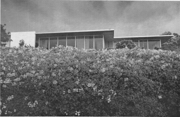
Photography plays a critical role in the conversation about architectural openness and endlessness. Davies illustrated the work of Richard Neutra in “Endlessness” with a photograph by Shulman of the Beckstrand house in Palos Verdes (fig. 1). In Shulman’s image of the Beckstrand house, a low camera angle and an outsized focus on the foliage gives the impression that Neutra’s design is sliding into continuity with its environment. Certainly, this depiction suggests architectural endlessness—an idea grounded in Neutra’s own practice8 —but is the photograph itself meant to be understood as endless? Even though it is not typically stated in these terms, the standard view of photography since the 1960s has been that it is endless. In photographic discourse, this is called the “indexicality” of photography—the irreducible fact that photographs are mechanically-generated trace images of reality.9 In this argument photographs are so separate from an artist’s hand that they are considered the ultimate literalist art, and this makes the intersection of architecture and photography especially significant: both media were (and are) construed as opposed to modernist art practice.
A book like Claire Zimmerman’s 2014 Photographic Architecture in the Twentieth Century exemplifies this trend, interpreting both photography and architecture as the kind of viewer-driven practices that the post-sixties literature described. Zimmerman takes a truism—two-dimensional photographs of buildings are not the same as the three-dimensional buildings themselves—and construes it as a contentious idea. For Zimmerman, this fact of medial translation causes a sea change in subject matter: architectural photographs “effected profound alterations to their contents” and produced perceptions of space that “differed profoundly from spatial perception on-site.”10 Zimmerman considers the effect of photography on architecture to be largely negative, because photography imposes itself on the embodied medium of architecture. “Architectural photographs privileged visual perception over other sensory modes, imposing a viewing regimen that subtracted many of architecture’s specific attributes” (PA 123). The inherent vice of architectural photography is that it cannot duplicate the experience of a “richly embodied multisensory environment” (PA 14). It is true that photographs are not the same as what they are of, but many architectural photographers believed that photographs, through the translation of architecture to another medium, could compensate for the lack of full experiential continuity with their subjects. Zimmerman summarizes these defenses of the medium:
Recurrent themes from literature on architectural photography relate to rhetorical tropes: early twentieth-century writers mentioned the need to deploy approximation, exaggeration, and visual intensification as tools for crafting successful architectural photographs, precisely to compensate for their deficiencies in relation to constructed objects. The photograph might not represent, but it might approximate. It might exaggerate certain properties (in the photograph) in an attempt to relay different but related qualities of architecture, since those were beyond the reach of the two-dimensional image. It might compensate the viewer for one sort of deficiency by enhancing and intensifying visual experience itself. (PA 134)
In defense of their medium photographers have often stressed that they can communicate experiential qualities of architecture through a kind of visual intensification.
For Zimmerman visual intensification fails to solve the problem of architectural photography, and she provides as an example Neutra’s endorsement of the medium. Neutra argues that two-dimensional images can “hint” at something of three-dimensional architecture: “Technically, mechanically, chemically limited, [a photograph], naturally, can never be the same as the life object but it can approximate.”11 The problem with Neutra’s argument, according to Zimmerman, is that it fails to connect the dots between “intensified optical experience” and “bodily experience,” offering no “clear anchors or relays between these two affects.” She finds this inadequacy to be far from unique to Neutra:
The correlation between intense opticality and haptic experience remains an interpretive matter, apparently not intended to attain any greater degree of specificity than that outlined by Neutra, or Shulman or Stoller or Joseph Molitor or Schmidt, or any others in their descriptions of their practice. It exists at the level of suggestion … And in this we seem not to have advanced from the same critiques made during the 1920s. (PA 228)
It seems as though Zimmerman could be convinced that photographs can “hint” at architectural experience if only they provided the missing “anchors.” But that is not the point, as Zimmerman finds an ontological incompatibility between the kind of “optical experience” one has viewing a photograph and the “bodily experience” one has when encountering architecture. There is, she says, “a basic schism between two forms of representation” (PA 111) or “a difference in kind” (PA 114); in fact, she feels “the effect[s] of seeing buildings in photographs” and during “site visits” “can be described independently because they function more or less independently—one as optical, the other as embodied experience” (PA 232). Photography provides only “a set of tools that appeared to be inherently inadequate to communication about space and form” (PA 298), tools that are so inadequate that the photographic medium’s sheen of veracity begins to look like a “thoroughgoing deception. … Photographs were evidence, yet they were unreliable, duplicitous, misleading, and deceptive” (PA 133). Leaving aside the assertion that the eye is separable from the body, a point that was critiqued by phenomenologists, Zimmerman makes a hard distinction between media that does not allow for any overlap in effect and seems to suggest that the problem with architectural photography is that it is not endless enough—it cannot mime the experiential continuity that is present at an architectural site.
Zimmerman’s book is still an account of endless photography. Although she argues that photography cannot duplicate the embodied experience of architecture, she thinks of photographs as another kind of open-ended experience, an optical one, and anything that is conceived of as a mere prompt for experience is not a finite work but an endless object. Her effort to emphatically separate what architecture offers from what photography offers threatens to mask the fact that both media are conceived as experiential in her terms. Zimmerman describes photographs as flexible, able to change each time they are experienced in a new context. She goes to great lengths to refute any suspicion that photographs could accurately interpret architecture: “[Photographs] engender meanings that are hinged to the original construction but float free from that construction”; “Changing interpretations over time also make the mutability of the architectural photograph evident” (PA 143); “photographs of architecture are not in the business of making meaning”; “The value of the photograph was its endless flexibility” (PA 144); “Architectural photography opens up a space in which meaning can be construed according to predispositions of the perceiver in a manner that differs from the way in which we interpret buildings individually upon experiencing them in space” (PA 204). Photographs, in other words, are mutable, context-dependent objects just like their architectural referents.
One might wonder why Zimmerman insists on a total disconnect between the two kinds of experience that she identifies (architectural and photographic)—is it not possible that seeing a flame could “hint” at something of the haptic experience of heat to an embodied being who is able to sense both? (Phenomenologist Merleau-Ponty illustrated “Eye and Mind” with line drawings, making the point that embodied sensations are often evoked by minimal visual information.) This is not the question Zimmerman is asking. She is not interested in the possibility that something of an experience could be communicated via another mode, what she insists on is that the experience of seeing a flame cannot be the experience of heat. Communication always requires translation and degrees of opacity, and Zimmerman is not willing to allow the losses this entails. And if the insufficiency of any and all translations is accepted as a premise, it would be right to say that there is an unbridgeable gap between architecture and its two-dimensional representations; it is the gap that exists between any two experiences, since experiences are fundamentally unique and unrepeatable. This conception of endless photography insists that photographs are fundamentally unable to communicate anything about the experience of architecture.
In this Zimmerman is at odds with the way Shulman and Stoller wrote about their work: both photographers considered the interpretation of architecture to be not only possible, but paramount. And yet Zimmerman’s issue was theirs as well, and they grappled with the difficulties inherent in approaching a fully embodied, three-dimensional medium through a two-dimensional medium.
Photography as Communication
When discussing the purpose of architectural photography, statements by Shulman and Stoller are often indistinguishable. Both believed a photographer should craft an interpretation of architecture that communicates something essential about the architect’s intent. Shulman states this flatly in his 1962 book: “it is of the utmost importance that the photographer accept responsibility for conveying the design concept.”12 He also notes that architectural photography is a “means of communication” and its purpose is “carrying a message” (PAI 1). The photographer needs a willingness “to subjugate his photograph to the design” because “he is performing the difficult and serious task of re-creating on a two-dimensional piece of paper the intrinsic qualities of a three-dimensional design” (PAI 2). Thus, the “fundamental requirement” for the architectural photographer “is sensitivity to the thinking and intention of the creative designer. This does not imply a literal reproduction of design elements on photographic film. It implies, rather, an interpretive approach to the photography of structure so that its visual appeal will be positive” (PAI 126). Shulman acknowledges that the dimensional translation inherent in architectural photography means that the “intrinsic qualities” of architecture will have to be suggested through an “interpretive approach,” but unlike Zimmerman, he sees promise in his medium’s potential for communicating complex architectural meaning.
In 1963, Stoller wrote about his practice in nearly identical terms. “The true architectural photograph,” he argues, “is primarily an instrument of communication between the architect and his audience.”13 Stoller claims that the architect who has successfully solved a problem creates not just a building but “an idea,” and “it is the obligation of the photographer to communicate this idea” (LA 43). An architectural photograph “can be judged only by the information it conveys, how forcefully and clearly it is projected,” and such a photograph has “a message, as formulated by the photographer” (LA 44). Recognizing the fact of dimensional translation in architectural photography, Stoller stresses one approach for capturing a more complete interpretation: “Architecture, being a time and space phenomenon, can only have limited aspects when shown in two dimensions. The explanation of a work of architecture with any degree of understanding requires a series of carefully considered and related views—related not only to each other but also to the plan” (LA 44). Working in series was also essential to Shulman. He writes, “Intricate design calls for a clear analysis of the architect’s concept and more than one view may be necessary for understanding of the form and purpose of the structure” (PAI 48). Or, “A photographer cannot photograph only one side or feature of any area; in order to be clearly discernable to the reader the photographs must portray all the major elements and relationships so that the plan is clear” (PAI 114). Perhaps most importantly, Shulman and Stoller are in agreement when they assess how architectural photography practiced on these terms communicates.
One of Zimmerman’s foundational assertions is that twentieth-century architectural photography’s distortions are a form of subterfuge: “Unlike new architectural discoveries and new tools, photography was used covertly, not boldly declared” (PA 2). It is difficult to see, however, what a bold declaration of the difference between the experiential quality of a built structure and a photograph of that structure would be. Both photographers were very upfront about the differences between their works and architecture. In Shulman’s account, the architectural photograph “prepares for the actual experience of being at or in a building. It substitutes for that experience until it occurs, if it ever does. And it ‘freezes’ the design, thus providing a quality of experience never to be found in being in the building itself” (PAI 1–2). Stoller similarly posits that the intended audience for an architectural photograph is one “lacking the opportunity to experience the work in question first hand” (LA 43). Precisely reproducing the experience of architecture was not the photographer’s goal, but suggesting something of that experience is entirely possible. Stoller argues, “While there is no real substitute for experiencing a work of architecture, once this limitation is accepted there seems to be no substitute for photography in aiding the perception of what is essentially a visual experience” (LA 43). Here Stoller emphasizes the photograph’s capacity as an “aid”; the photograph, if approached with “appreciation, understanding, and required imagination,” can use visual language to communicate about architectural experience. When done successfully, it is “possible that [the photographic viewer] might experience the personal, first-hand pleasure of perceiving an [architectural] idea” (LA 44). Shulman has a similar focus: “Although architectural photography can be defined as a physical recording of the image of design, the photographer can develop an ability to transcend the mere physical recording. The photograph can then become instrumental in evoking empathy with the design” (PAI 2). Both photographers suggest that their images communicate certain experiential qualities by connecting the viewer affectively to the architectural work through the photographic work or, in other words, by creating a photograph that “opens” to the viewer.
Despite the overlap in how Shulman and Stoller conceptualize their practices, the critical consensus about each body of work in the contemporary literature diverges widely. While the consensus view does not accurately grasp what is distinct about the work of these two photographers, it does begin to hint at something significant. Although it has not previously been construed in these terms, the critical consensus points to two different approaches to the “open” work. While critics tend to take Stoller at his word when he says he aimed to convey design intent, Shulman’s statements to the same effect are often ignored or directly contradicted.
The best-known image from Shulman’s oeuvre is his evening image of Pierre Koenig’s Case Study House no. 22 (1960) in the Hollywood Hills (fig. 2). Shulman stood outside on a terrace beside the pool and shot through a precariously cantilevered, glass-enclosed corner of the residence. The glass corner is fully transparent, revealing a living room sparsely decorated with modern furniture and occupied by two well-dressed women, lounging and chatting. They are nonchalant about the stunning view of Los Angeles at night outside, which Shulman captures as a dotted sea of artificial lights, giving a somewhat gridded form to the dark landscape. Inside the living room glowing overhead lamps cast deep shadows; these orbs are also reflected in the plate glass, so they appear to form a line that extends beyond the house itself. Shulman has angled the residence so that the viewer’s eye is drawn along the side of the house as it plunges deep into space at a diagonal, an effect accentuated by the wide, dramatically lit, looming roof overhang above the photographer that takes up about a third of the composition’s vertical space. The left-hand side of the photograph seems to arbitrarily crop a potted plant, but on the right-hand side the perspectival rush into space continues unbroken. Shulman also captures part of the terrace on which he is standing, including a bright white, striated outdoor lounge chair that presses, somewhat insistently, against the photograph’s bottom edge.
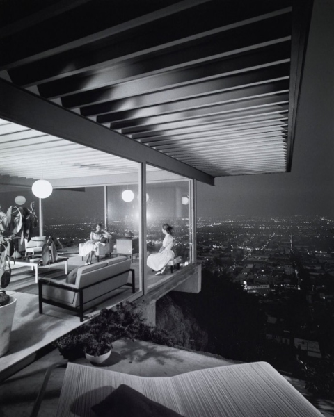
This is an image critics have in mind when they suggest that Shulman’s photographs stray from architectural intent and aim instead to project a mid-century California lifestyle (assuming that the architect did not intend to create this kind of image). Notorious for his careful arrangement of lighting and furniture, as well as camera angles that extend small spaces, Shulman’s photographs are discussed as though they are stills from a Hollywood film set, connected to all the ideological trappings—wealth, glamour, drama—that such a notion carries. In A Constructed View (which uses the evening shot of Case Study House no. 22 on its cover), the author argues that Shulman photographs embody “a lifestyle that has become equated in the minds of Americans and Europeans alike with the essence of the West Coast.”14 Another text describes Shulman’s photographs as “film stills that hint at the story of a house,” noting Shulman’s “exposure was perfect and the staging dramatic—like in a Hollywood movie.”15 Or: “Shulman’s precise compositions and splendid worlds seem somehow beyond truth, harkening to notions of glamour and the ideal.”16 Shulman’s “aspirational” images “sell a California lifestyle of improbable vistas and turquoise swimming pools.”17 His two most famous photographs, of Case Study House no. 22 and of Richard Neutra’s Kaufmann House (1946), are “icons of post-war life in California.”18 The evening photograph of Koenig’s design “does not necessarily document the house but reflects an image of the postwar lifestyle”;19 this photograph is also called a depiction of an affluent “postwar utopia,” a “pictorial prompt for a set of associations … to an entire lifestyle, one inhabited by the white, clean, well-dressed, upper-middle class-occupants.”20 In the twilight image of the Kaufmann House in Palm Springs, Shulman “presents less a building than the ambience of an imagined way of life”;21 another critic analyzes a 1949 Life publication of this photograph to conclude: “The use of modifiers such as ‘glamourized’ and ‘dramatic’ in the text begin to fix the reading of Shulman’s photograph and establish its iconic authority in relation to Hollywood and the film industry.”22
References to glamour, drama, and Hollywood films abound in discussions of Shulman’s work, but the consensus around Stoller’s points in a different direction. Scholars tend to observe how informative his photographs are, how committed he was to depicting the essence of architecture. Pierluigi Serraino, in a recent monograph on Stoller, observes that Philip Johnson, whose work Stoller photographed extensively, used Stoller’s name as a verb to describe the act of clarifying a design pictorially: “When architecture is ‘Stollerized,’ as Philip Johnson pointed out, it undergoes a process of unification, in which one photographic signature gives a sense of cohesiveness to the work of a designer.”23 One Stoller image of Johnson’s Leonhardt House on Long Island (1956) has a similar subject to Shulman’s shot of Case Study House no. 22: a view thorough the suspended, glass-enclosed corner of a residence (fig. 3). This image seems to support the distinction made in most accounts of the two photographers, as Stoller’s image lacks the “dramatic” elements of Shulman’s and does seem resolutely informative.
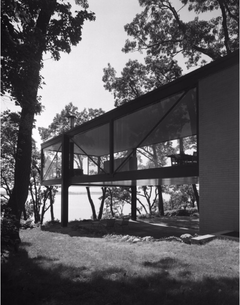
Johnson’s design includes a glass box of a room at second-floor height that extends away from the main brick structure of the residence. The room is not entirely cantilevered, but it is suspended over a largely open space with minimal points of support. Despite its suspension, the room is photographed to appear emphatically rooted to the ground by two beams—beams that stand out, dark and rigid, even among the surrounding trees—and a massive brick wall, which anchors the room along the photograph’s right-hand side. Along the photograph’s left, the wall has a counterpart in a large, backlit tree; together the two sturdy forms serve as enclosing bookends to the scene. The room extends into space along a gentle diagonal, and its edges are clearly articulated, with each beam legible. Stoller’s camera angle is low enough to capture a good deal of the underside of this space, as well as most of the interior ceiling, which gives a sense of the thickness of Johnson’s flat roof and of the materials that were used. The partially visible furniture inside suggests the space is a living room, but individual pieces are hard to identify since the glass is not entirely transparent and reflects back the surrounding trees. Between the semi-opacity of the glass and the low camera angle, the interior does not seem accessible. (At one far corner of the room is a telescope—an instrument for enhancing sight—which is ironically situated at a point where the glass reads as especially opaque.) The space under this room is in shadow but has still evidently been domesticated; the presence of tables and chairs suggest it is used as a deck. The screen of surrounding trees cuts the view off from a body of water beyond. It seems as though the room extends, not into deep space or toward the water, but to nestle within the trees.
Stoller’s photograph is a legible interpretation of this part of the residence, offering information about materials, the relationship between building and site, and potential use. It also lucidly communicates something of Johnson’s design with particular attention to the spatial relationships created by various elements of this structure—there are no distracting distortions or trick camera angles in evidence. Positioned a short distance from the photographer, the living room fills Stoller’s frame without pressing against it, and it seems possible to judge the scale of various aspects of the space using, say, one of the depicted deck chairs for a point of reference. Returning to Shulman’s image of Case Study House no. 22, this kind of information is lacking. How large is this portion of the house? How far does the cantilever extend over the hillside? Is the roof overhang that wide, or is this an effect of the camera angle and photographer’s placement? How far away is the (seemingly massive) outdoor lounge chair from the women inside?
Critics claim Stoller possessed “an unrelenting determination to find an essence, if not the essence, every time he studied a building through the lens,” and for Stoller “the physical essence of the architecture … is primarily space and the relationships of spaces.”24 Stoller’s daughter agrees that his photography was meant to communicate essential facets of architecture, writing that her father “believed in the honest ability of photography to reveal the structure, function, and material qualities of a building.”25 In contrast to the literature on Shulman, Stoller’s honesty in treating residential architecture is singled out for praise. Unlike Shulman’s glamorized vehicles for a California lifestyle, Stoller’s homes are “without drama or intrusion”26 because “Stoller’s vérité presents the modern home as attainable.”27 Beyond simply being truthful or informative, the information offered also reflects the intentions behind these structures, since Stoller “helped us to understand the aspirations of their architects.”28 As someone who was “particularly sympathetic to and understanding of the aims of the Modern architects whose work he photographed,” Stoller was able to convey “the distinctive vocabulary of each architect’s style.”29 For MoMA’s Arthur Drexler, Stoller photographs are so enlightening they are akin to “missionary tracts,” endowing their subjects with a particular “sanctification” and “spreading the good word” about modern architecture.30 As the quote from Drexler demonstrates, but as many writers acknowledge, Stoller’s fidelity to structure, space, and architectural intention is coupled with his aim (as a commercial photographer) to capture buildings in a favorable light; these critics argue that Stoller photographs are faithful to the architectural idea as it is most successfully realized.
Texts on Stoller support his statements, but they do not offer a convincing account of why Stoller favored balanced, legible compositions as a means to communicate, any more than Shulman’s critics have convincingly explained his inclination to use unusual angles and striking compositional choices. What is missing from these accounts is an explanation of why two photographers with such similar stated aims arrived at two very different approaches to photographing architecture.
The “Open” Photograph
Two similar photographic series from the 1950s, depicting chapels designed by Eero Saarinen, effectively demonstrate these different approaches.31 In 1957 Shulman photographed Saarinen’s chapel on the campus of Stephens College, a small women’s college in Columbia, Missouri. In the series, Shulman repeated several key technical and compositional choices. An exterior image (fig. 4) was taken using one of Shulman’s favorite photographic techniques, infrared film. As Shulman described the technique:
A much neglected technique, the use of infra red film, offers many surprising and dramatic rewards to the inquisitive. An otherwise dull landscape scene or a hazy atmospheric background can spring into powerfully dynamic contrast with its use. Clouds barely seen by the eye or panchromatic film are vividly rendered, and foliage becomes a lacy white. (PAI 34–37)
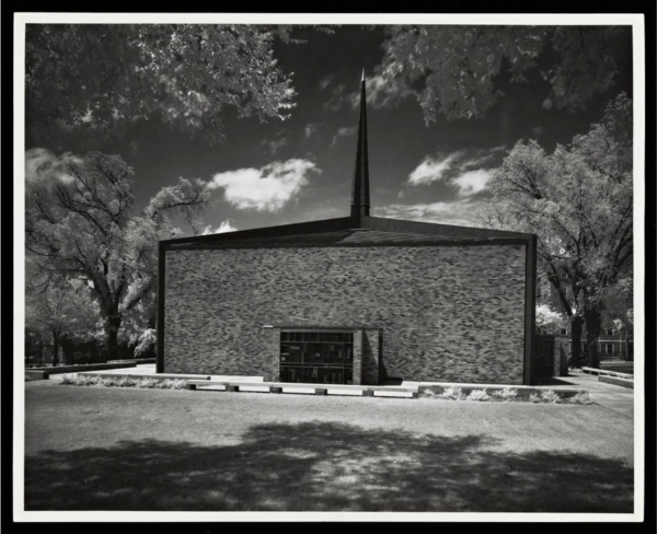
“Vividly rendered” clouds and “lacy white” foliage are evident in the Stephens image. Infrared film enhanced the effect of texture, populating the entire photograph with areas of visual interest and integrating the chapel into this detailed, meticulous scene, as if to suggest a connection between the building and its setting. The infrared film allowed Shulman to clearly delineate not just Saarinen’s choice of materials for the chapel—particularly the textured bricks—but the various landscaping elements, from the clouds and trees to the shadow in the foreground. The emphatic differentiation of landscaping elements, which others might think of as a background to the architectural main event, seems to weave the chapel into a total environment.
Inside the chapel, Shulman continued to articulate minute details and put an equal emphasis on various aspects of the scene. As he often did in interior shots, Shulman accomplished this effect with supplemental lighting. He wrote of this technique: “For most interior shots … natural or existing artificial lighting is either unsuitable or insufficient and anyone wishing to take a truly effective interior picture will almost invariably have to provide supplemental lighting” (PAI 61–62). In a 1962 article for Interiors magazine, Shulman includes an extensive caption describing how he arranged the lighting for an included photograph of the altar at Stephens Chapel (fig. 5):
In this church interior designed by Eero Saarinen, the lighting was keyed to the emphasis of form and materials. The existing overhead spotlighting of the altar area was turned on and then supplemented by additional spotlights off camera range, which also served to show up the foreground benches. Floodlights were placed to glance off the rear wall, thus revealing the texture and at the same time separating the wall from the grillework screen in front of it.32
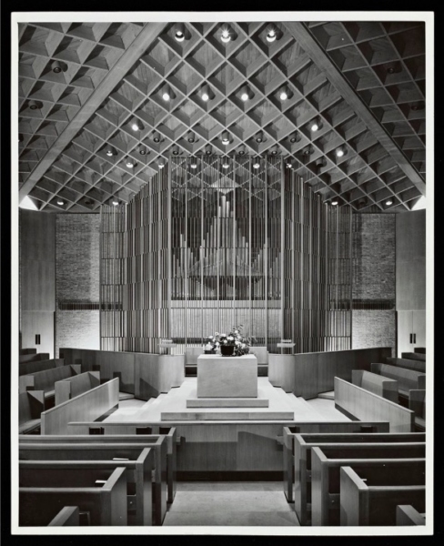
Shulman describes what he hopes to achieve though his lighting—to convey “the emphasis of form and materials” in the chapel—and explains how this guided his placement of each light source. As he details the lighting effects, it becomes clear that his aim is to capture the interior with the same kind of delineation he achieved with infrared film in the exterior view. The altar, benches, rear wall, and “grillework screen” were lit to show not just their general forms, but their materials and textures. Shulman’s image is full of material details: the wood grain of the coffers, rear panels, and benches; the joins between pieces of gently marbled stone in the floor tiles and on the altar; the translucency created by the play of light on the delicate slats of the screen; and the variations in tone between bricks on the rear wall. Shulman does not even highlight the altar, ostensibly the functional center of a chapel, and instead renders the interior as a richly textured whole with an even focus on various parts.
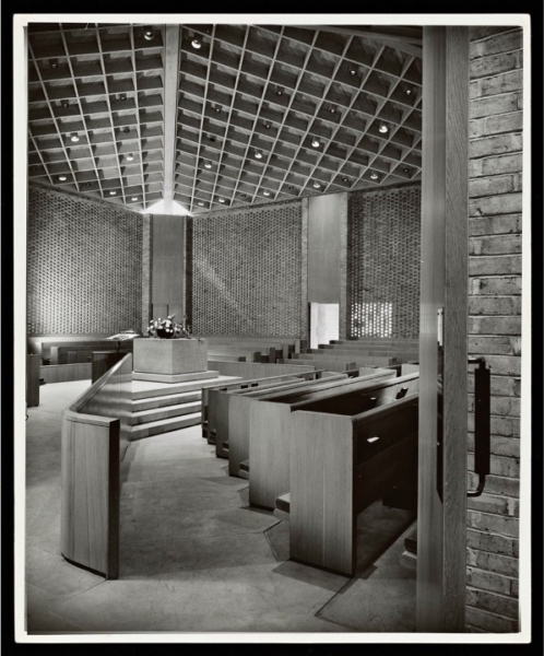
In a large number of images, Shulman includes foreground elements quite close to the imagined space of the viewer, as if they are pressing against the picture plane. In other cases, he centers planar elements of little apparent visual interest, like a blank column or wall, to give them unusual visual weight. These compositional techniques also appear in the Stephens Chapel series. In one image (fig. 6), Shulman shot from the ambulatory into the chapel, and included the inner edge of an open door in the frame. The door runs, cropped on its top and bottom, across the entire vertical stretch of the image on its right-hand side. Especially because it has no visible top or bottom, the door creates a flat visual band across the image, one that seems to pull away from the deep space view into the chapel and press insistently against the picture plane. The image as a whole depicts the spatial layout of the chapel interior, but the door seems to serve no purpose other than to draw attention to the surface of the photograph.
These techniques—infrared film, supplemental lighting, and unusual angles and points of view—are frequently used throughout Shulman’s body of work. When various areas in a scene, even those that would be considered background matter in other hands (a sky or a floor tile, for instance) are crisply delineated and shown as textured, the overall effect is to give weight to the entire depicted environment in the frame. A Shulman environment might be read as an arbitrary cut from a world that continues beyond the photograph’s borders. Shulman’s interest in diagonals plunging into deep space and the extensive effect of reflections in mirrors, pools, and plate glass also contributes to this sense that his photographs depict a kind of endlessness. Although there are not any highly reflective materials used in Stephens Chapel, Shulman does capture a characteristically extensive view, almost as if in one-point perspective, down the ambulatory (fig. 7). Although the ambulatory ends in a wall, there is an ethereal quality to the light at the end of the view that gives a certain transcendence to this sweeping plunge, as if continuation towards the unseen vanishing point is somehow, mystically, possible.
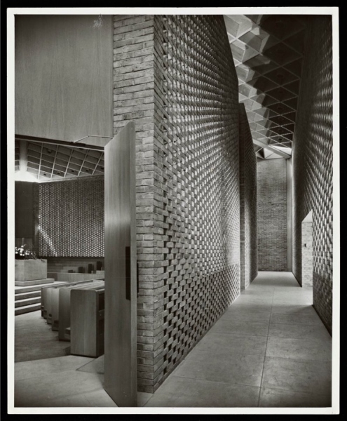
However, Shulman’s work invites this reading only to ultimately refute it. The same qualities of Shulman’s work that evoke endlessness can also be read as evidence of the “hand” of the photographer, deliberate attempts to foreground the artist’s compositional work. Rather than letting the viewer imagine that the photograph is a window onto the world, Shulman’s images draw emphatic attention to photographic medium. It is difficult to forget that a photograph is a constructed composition when the image includes the edge of a door insistently pressing against the picture plane, or is taken with a film type that makes trees look unnaturally white, or when even the most cursory study of the image makes numerous added light sources apparent. These qualities—the very ones that give a Shulman photograph an extensive effect—are really indications of the “open” work. Although they contribute to an all-over, cut-from-the-world quality or emphasize the continuation of forms, they also enforce the limits of the photograph by reminding the viewer of the photographer’s decisive framing act. Shulman deliberately captures striking reminders that a photograph is an interpretation of the architect’s work, not the work itself, and emphasizes that there is no way to see the photograph without being directed by the photographer:
The importance of composition in a photograph cannot be over-emphasized. In all the illustrations in this book observe carefully the beginning and end of each photograph. Notice that the eye is not allowed to wander, that each area shown has a specific point of interest, and that the viewer’s eyes are literally controlled. This is possible to achieve with lighting emphasis as well as by selection of structural and decorative elements. (PAI 105)
Shulman’s frequent insistence that the goal of his work is the faithful interpretation of architecture takes on a new valence here. He establishes where your eye starts and stops and how it moves through each “point of interest” in between. He uses lighting and structural and decorative elements to convey a specific set of architectural ideas through his medium.
Openness in Shulman’s work is localized to aspects of the viewer’s experience. Shulman creates images that appear to suggest a continuous world, but once the viewer has imaginatively entered this “open” space, it turns out the world is not continuous at all, but carefully cropped, organized, and framed.
Stoller does not approach the “open” work in the same way. Unlike Shulman, Stoller reserves a significant role for the viewer in his understanding of photographic interpretation. Observing that the camera “has not the capacity to perceive and correct that the human brain has,” Stoller insists “it is the duty of the viewer to understand and make allowances” when reading a photograph (LA 44). Where Shulman emphasized his own careful direction of the viewer’s eyes, Stoller assumes “the viewer is possessed of his own intelligence and faculties, and would like only some undistorted information on which to base his own conclusions” (LA 44). And, in what is perhaps Stoller’s most significant statement about the viewer:
Of the three elements that produce the effective architectural photograph, we now come to the ultimate one, the viewer, inasmuch as he is the reason for the whole thing in the first place. As is the case with any communicative effort, it comes to nought without some participation at both ends of the channel. In my original definition, I made it plain that the audience was assumed to be an intelligent one, with a desire to know; and the desire to know presupposes an active participation on the part of the viewer. (LA 44)
While Shulman directs the viewer, Stoller reserves a role for the viewer. Stoller’s is a different understanding of the “open” work—one in which it is of primary importance that the viewer is centered as an “active” participant. Stoller is teetering on the edge of photographic endlessness, where the viewer participates in order to construct one of many experiential “meanings.” Yet recall Stoller’s insistence that the effective architect is one who “solve[s] his problem within the framework of his own philosophy and aesthetic. The result … is more than just a building: it is an idea,” and “it is the obligation of the photographer to communicate this idea” (LA 43). Stoller’s “open” work asks for active viewer participation in a different way than Shulman’s, but the photograph is still the act of communicating an architectural idea.
The privileging of active viewer participation when reading Stoller’s “open” works gives them a significantly different character from Shulman’s because Stoller does not give his viewers such an overt interpretive framework. This is clear from a Stoller series that has some affinity to Shulman’s Stephens College work—Stoller’s 1955 photographs of the Eero Saarinen-designed chapel on the campus of the Massachusetts Institute of Technology (MIT) in Cambridge, Massachusetts. Stoller captured the chapel (and the neighboring Saarinen-designed auditorium) in a series of ten photographs, which support his 1989 claim that he never felt the need to “tilt a camera or use infrared film or do extra dramatic things.”33 To Stoller, a good architectural photograph provides “information, unfiltered and unadulterated” (LA 44), which may make it sound as though the erasure of his own hand was the goal, to produce endless images arbitrarily cut from the larger scene. This idea is undermined, however, by how emphatically organized the composition is in Stoller photographs.
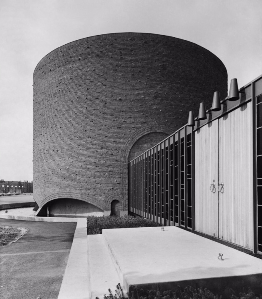
In an exterior shot of the MIT chapel (fig. 8), Stoller’s commitment to an informational view is apparent, but it is not the entire story. The chapel is shown slightly off center, with a small sliver of the moat cut off on the left and the edge of a neighboring building included on the right. The daylight highlights the rough brick exterior without casting excessive shadows. The sky is streaked with fluffy white clouds and a few pedestrians have wandered near the chapel, providing a sense of scale. Stoller’s view is head-on and none of the chapel’s features appear overtly exaggerated or distorted. Yet how “unadulterated” is this information? Stoller has gone to great lengths to set up a composition that allows the viewer to make assessments about scale, materials, and setting, but he also went beyond what was required to simply take an informational photograph—or even to take an informational photograph that casts its subject in the best possible light.
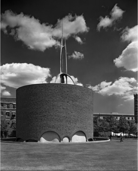
The MIT chapel could be presented in a way that is “unfiltered” and flattering without the extreme care for creating a sense of pictorial depth that is evident in this photograph, which marks the photograph as an “open” work, not an endless object. A Stoller image appears to be “natural” and does not force a particular reading on its viewer, yet these photographs are meticulously framed by Stoller as he visually arranged space into distinct layers. In the exterior image at MIT, Stoller’s camera angle is vital for defining the parameters of this space. The shadow on the left edge of the cylindrical chapel highlights the chapel as a volume, which Stoller also emphasizes by positioning the camera to capture the curving top edge of the cylinder and the curve of the moat’s edge as it wraps around to the chapel’s unseen side. The spire is carefully positioned against clouds in places where the greatest articulation is needed, and the angle Stoller uses gives depth to the spire by showing a clear separation between its downturned U-shaped front “legs” and the supports that are behind them. The background buildings, far from being arbitrary, add another layer of depth to the scene, particularly the one on the right-hand edge, which is set behind the circle of trees that borders the chapel. Even the apron of seemingly empty space—it is a lawn—that Stoller captures in the foreground helps set up a distinct spatial quality, as if Stoller is holding the image’s main subject at a distance so the viewer can approach it slowly. Stoller had a stated inspiration for this interest in spatial articulation: “for getting a sense of space, there’s nobody like Atget.”34
This is a particular view of Eugène Atget, one that considers his formal choices apart from his subject, the vanishing life of old Paris. Atget’s images often feature the apron of space that Stoller includes in the photograph at MIT, and many of his photographs use oblique angles to allow the scene to unfold in layers as the eye moves back through space. Stoller’s preference for taking head-on views is widely noted (for William Saunders, this image type is most representative of Stoller’s “artistic spirit”35), but Stoller still brings Atget’s sense of layered space to frontally-oriented images of his subjects. When Stoller does use oblique angles, such as in another image that captures the narthex’s radial orientation on the chapel exterior (fig. 9), he avoids suggesting the kind of dizzying rush into perspectival space that Shulman favors.36 The image is grounded and anchored in the massive volume of the chapel, and although the narthex clearly recedes into space, it does not seem distorted or as though it was meant to loom over the viewer. Stoller is careful to capture another layer of space beyond the chapel by once again including, on the left-hand edge, the curving moat and, in the background, other buildings and a row of lampposts with large white bulbs. The lampposts are positioned at a gentle diagonal of their own, carrying the eye back into the environment beyond the chapel. While these spatial constructs are not as emphatically present in the work as Shulman’s bold assertions of his own hand, an interest in constructing careful examinations of depth is a decisive quality of a Stoller photograph and belies the photographer’s suggestions that his is an “unadulterated” view.
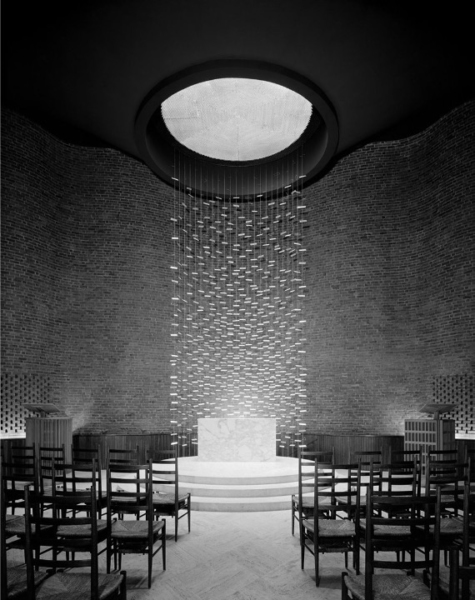
Inside the chapel, Stoller continues to focus on conveying depth, but his resistance to supplemental lighting creates some limitations. A head-on photograph of the altar was virtually obligatory for this space (fig. 10), yet this photograph characteristically refuses to offer a strong point of view that directs the viewer’s apprehension of the space. Stoller’s hand is evident in the choice to shoot down the aisle, indicating the general spatial layout of the chapel, and he made an effective choice in not using a wide-angle lens, as many photographers do in this chapel, because this distorts the viewer’s impression of the interior and ruins its sense of quiet intimacy. Stoller’s lens choice preserves as much of an “unadulterated” view as possible, as does his refusal of supplemental lighting. Without supplemental lighting, however, the image is too dark to draw the eye to the chapel’s undulating brick wall, which is instead rendered virtually flat and smooth. In fact, the architecture recedes from the viewer’s attention to such a degree that the overall effect of the photograph is not of an enclosed space for intimate contemplation, but of a backdrop for the metal screen behind the altar, designed by sculptor Harry Bertoia. Bertoia’s glittering screen catches the light from the oculus above the altar and sets the tone for the image as a whole. One could argue that Stoller is not advancing an assertion about the architecture here but is attempting to create a prompt for felt experience, much like the seemingly endless glittering effects generated by Bertoia’s hanging. Although it is clear from Stoller’s broader body of work and from his writings that he did not intend to create affect-driven objects, because he asserted his hand in such subtle ways, his “open” works can occasionally be dominated by certain qualities of his subjects that obscure other architectural ideas in play.
Shulman’s and Stoller’s approaches to the “open” photograph run different risks—Shulman’s means of framing a scene can look (melo)dramatic or sensationalized, and Stoller’s choices leave some of his works available to strictly affective response. But as I have argued, this is far from the whole picture of their aims. Rather than just interpreters of the modern movement, these photographers engaged with, and struggled to answer, the period’s defining questions. Mid-century photographs were more than mere interpretations of the work of others; they advanced their own arguments about the nature of art itself.
Notes
Abrams, Inc., 1990), 7–8, 11.
Mid-twentieth century architecture reached a broad audience primarily through photographs, and photographers became essential early interpreters of the modern movement. In the United States, two major architectural photographers, Julius Shulman (1910–2009) and Ezra Stoller (1915–2004) demonstrated a sensitivity to architectural ideas, which quickly made them popular among architects. Los Angeles-based Shulman and New York-based Stoller took many of the defining images of notable mid-century buildings. Although an increasing number of contemporary studies rightly consider these images as works of art, little attention has been paid to how Shulman and Stoller approached photography as an artistic medium, an approach that needs to be understood in light of the larger relation between art and objecthood.
Artwork and Endless Object
The terms “art” and “object” are inseparable from the critical discourse of the late 1960s, particularly Michael Fried’s critique of minimalism in “Art and Objecthood.” Minimalists strove for a new art defined by what sculptor Robert Morris described as “the feel and look of openness, extendibility, accessibility, publicness, repeatability, equanimity, directness, immediacy,”1 while Fried argued that these qualities prevent minimalist sculptures from being works of art (the minimalists largely agreed). Literalist objects, as Fried called them, are “concerned with the actual circumstances in which the beholder encounters literalist work. … Whereas in previous art ‘what is to be had from the work is located strictly within [it],’ the experience of literalist art is of an object in a situation—one that, virtually by definition, includes the beholder.”2 Fried identifies this beholder-containing condition as theater, and “theater is now the negation of art” (AO 153). The theatrical exists for and depends upon an audience, so the literalist object “extorts” a “special complicity … from the beholder” (AO 155) and “is incomplete without him” (AO 163). As Fried later argued, not only is a minimalist object “incomplete” without the viewer, it is defined by the viewer’s experience. In modernist art, by contrast, “what is to be had” remains “strictly within” the work. These widely-rehearsed arguments boil down to a debate about the role of limits, borders, edges, or frames in the work of art. Fried argued that limits, the confines that create an “inside” containing “what is to be had” from the work, are the definitive feature of art, while minimalists aimed to dissolve the conceptual force of limits and make their objects effectively open or continuous with the viewer’s ongoing experience in the world.
Fried calls this open quality the “endlessness” of minimalist objects:
Endlessness, being able to go on and on, even having to go on and on, is central both to the concept of interest and to that of objecthood. In fact, it seems to be the experience that most deeply excites literalist sensibility, and that literalist artists seek to objectify in their work—for example, by the repetition of identical units ([Donald] Judd’s “one thing after another”), which carries the implication that the units in question could be multiplied ad infinitum. … Similarly, Morris’s claim that in the best new work the beholder is made aware that “he himself is establishing relationships as he apprehends the object from various positions and under varying conditions of light and spatial context” amounts to the claim that the beholder is made aware of the endlessness and inexhaustibility if not of the object itself at any rate of his experience of it. (AO 166)
Endlessness is the foundation of minimalism: minimalist artists courted the look of infinite extension through repetition, among other strategies, so that they could “objectify” the kind of encounter their objects solicit. (These objects are conceptually infinite, although literally finite; similarly, the literal limits of modernist works are less important than their being conceptually finite.) The minimalist object has no beginning and no end; it merely exists as “one thing after another,” and encountering this kind of sculptural object is in principle no different from any other experiential encounter.
This late 1960s discourse signaled a significant break in the arts, yet this period actually marks the culmination of decades of artistic exploration into the nature of the work of art. In the years before “art work” and “endless object” became codified as fundamentally opposed conditions, “openness” was already seen as an important quality of many canonical works of modern art, and it was widely engaged by modernist artists. Crucial issues were explored by artists in the years prior to Fried defining art and object against one another, and artists pursued a range of means to open their works to the world without losing the frame. There was, in other words, a strong move toward “open” works prior to the rise of minimalism. The term “open” work was explicitly, but not exclusively, described by Umberto Eco in 1959 to characterize a range of mid-twentieth century art.3
Although openness is a quality of some historical works, Eco argued that works of his moment increasingly projected qualities of openness: the artist “subsumes it into a positive aspect of his production, recasting the work so as to expose it to the maximum possible ‘opening’” (OW 5). In the modern “open” work, openness is thematized or featured, and further, the viewer “collaborates with the composer in making the composition,” which is left incomplete and awaiting the viewer’s participation (OW 12). Eco’s “open” work sounds a lot like Morris’s minimalist object because of its emphasis on viewer participation, but as it turns out, Eco is proposing something entirely different—a work that is open to the viewer’s participation but only within the limits of artistic intention, not a work that is entirely unbounded or endless. Eco writes:
The possibilities which the work’s openness makes available always work within a given field of relations. As in the Einsteinian universe [where God is not working at random, but is following predictable laws] in the “work in movement” [a kind of “open” work] we may well deny that there is a single prescribed point of view. But this does not mean complete chaos in its internal relations. What it does imply is an organizing rule which governs these relations. Therefore, to sum up, we can say that the “work in movement” is the possibility of numerous different personal interventions, but it is not an amorphous invitation to indiscriminate participation. The invitation offers the performer the opportunity for an oriented insertion into something which always remains the world intended by the author. (OW 19)
“Open” works offer the possibility for “oriented” viewer participation, not “indiscriminate participation,” because participation is possible only within the artist’s framework. The work “always remains the world intended by the author,” so its “mutability” “is always deployed within the specific limits of a given taste, or of predetermined formal tendencies, and is authorized by the concrete pliability of the material offered for the performer’s manipulation” (OW 19–20). An “open” work is defined by its “concrete pliability,” where it can be productively engaged by the viewer only within the limits of the “material offered” by the artist and shaped by his or her intentions. Shulman and Stoller developed their own conceptions of the “open” photograph along these lines, and there was a particular urgency to negotiate this problem because it had long been a guiding concern of their subject, architecture.
The “open” work had particular force in architectural discourse in the years before the advent of minimalism because architecture has had a perennially ambiguous relationship to the idea of an “inside” and an “outside.” Demarcating what “counts” as part of the architectural work may not be as simple as labeling the outer wall of a building the framing edge. Buildings exist in a series of relationships with other entities both within (e.g., furniture or paint colors) and without (e.g., landscaping, siting, the town or development)—so where does the work stop? Further, unlike work in other media, architecture is centrally defined by the “participation” of its viewer or audience, who might even live inside the work and interact with it quite closely. Although this kind of openness is endemic to architecture, literal openness became a core characteristic of modern architecture and the discourse around it with the “international style.”4 MoMA’s Henry-Russell Hitchcock and Philip Johnson, as well as Elizabeth Mock, came to describe openness in the international style as an attempt to achieve the effect of unbounded continuity between building and environment, as endlessness.5 They were not alone in taking this view, and European critics advanced similar arguments about a range of related architects.
Sigfried Giedion argued that the modern world and its cultural index, architecture, were operating under a new concept of space. According to Giedion, “The essence of space as it is conceived today is its many-sidedness, the infinite potentiality for relations within it.” Giedion suggests that a building and its audience exist in one many-sided space from which an infinite number of relations can be drawn. Therefore, the audience is always already embedded in this totalizing space, and one must “project himself through” it to truly comprehend “the continuous interpenetration of outer and inner space” that the new buildings enact.6 Gideon’s reference to “continuous interpenetration” is critical. This phrase became common parlance in discussions of modern architecture, and at first it seems to evoke an architectural barrier that permits visual and literal crossings between inside and out. Yet Gideon intends something stronger: he is not suggesting that architectural barriers are newly open to boundary crossings so much as he is describing the effective dissolution of the boundary itself. If space is one continuous entity with many facets, it has no borders or limits, and the concept of an “inside” and an “outside” no longer has any force. A continuous, simultaneous grasp of numerous spatial facets as the audience “projects” through space describes an experience of space, and experiences occur over time, what Giedion’s calls “space-time.”
One of the most significant early descriptions of endlessness was in a 1951 speech by British architect Richard Llewelyn Davies, published in The Architectural Association Journal, entitled “Endless Architecture.” For Davies, endlessness was a central problem for modern architecture, and he took Mies van der Rohe’s work at the Illinois Institute of Technology as an example:
There are no stop-ends, nor any dominating feature limiting the extension of any particular plane, or concentrating interest at any point in the plane. I think that a wall is conceived by van der Rohe as a portion cut from a plane, extending infinitely into space, and that this quality, which could be called endlessness, is at the bottom of his approach to design.7
If every wall is but an arbitrary cut from an endless plane, meant to imply its own continued extension, we have an architecture with an “interest in the infinite, or limitless” (EA 108). One way that endless architecture achieves the effect of limitlessness is through the interpenetration of inner and outer space. Davies cites Giedion on this point, comparing the spatial effect Giedion describes to the novels of James Joyce, which have no beginning, middle, or end but are “a sort of documentary chopped out of the centre of a sequence in time” (EA 108). Much like the diffuse boundaries of interpenetrating spaces suggest space’s existence before and continuation beyond the one chance fragment that is experienced, the life of Stephen Dedalus seems to have existed before and will exist after the reader arbitrarily encounters him.
However, despite Davies’s seemingly strong sense of what endless architecture is, and despite how neatly these concepts map onto Fried’s notion of the minimalist object, his case also serves as an important reminder that a divide between endless object and “open” work was not clear in the early to mid-twentieth century. In fact, Davies advocates not for a fully endless architecture but for a hybrid model. Le Corbusier exemplifies this approach as an architect who seeks “the link between an endless or repetitive architecture and the older principles of finite composition” (EA 112). Without bringing back the Renaissance conception of buildings as “self-contained, closed, ‘things in themselves’” (EA 111), Le Corbusier “hopes to bridge the gap between endless building and traditional design.” Even Mies, in Davies’s account, uses the ever-classicizing notion of symmetry as a check on “infinite repetition” in his architecture (EA 112). Whether or not Davies has come up with a convincing example of something that is open without being endless—whether his account of endlessness aligns with Eco’s “open” work—is beyond the scope of this argument. More to the point is the shifting nature of the terminology for talking about openness and endlessness in the 1950s, that is, the moment prior to its theoretical and artistic codification with the minimalists.
Photography plays a critical role in the conversation about architectural openness and endlessness. Davies illustrated the work of Richard Neutra in “Endlessness” with a photograph by Shulman of the Beckstrand house in Palos Verdes (fig. 1). In Shulman’s image of the Beckstrand house, a low camera angle and an outsized focus on the foliage gives the impression that Neutra’s design is sliding into continuity with its environment. Certainly, this depiction suggests architectural endlessness—an idea grounded in Neutra’s own practice8 —but is the photograph itself meant to be understood as endless? Even though it is not typically stated in these terms, the standard view of photography since the 1960s has been that it is endless. In photographic discourse, this is called the “indexicality” of photography—the irreducible fact that photographs are mechanically-generated trace images of reality.9 In this argument photographs are so separate from an artist’s hand that they are considered the ultimate literalist art, and this makes the intersection of architecture and photography especially significant: both media were (and are) construed as opposed to modernist art practice.

A book like Claire Zimmerman’s 2014 Photographic Architecture in the Twentieth Century exemplifies this trend, interpreting both photography and architecture as the kind of viewer-driven practices that the post-sixties literature described. Zimmerman takes a truism—two-dimensional photographs of buildings are not the same as the three-dimensional buildings themselves—and construes it as a contentious idea. For Zimmerman, this fact of medial translation causes a sea change in subject matter: architectural photographs “effected profound alterations to their contents” and produced perceptions of space that “differed profoundly from spatial perception on-site.”10 Zimmerman considers the effect of photography on architecture to be largely negative, because photography imposes itself on the embodied medium of architecture. “Architectural photographs privileged visual perception over other sensory modes, imposing a viewing regimen that subtracted many of architecture’s specific attributes” (PA 123). The inherent vice of architectural photography is that it cannot duplicate the experience of a “richly embodied multisensory environment” (PA 14). It is true that photographs are not the same as what they are of, but many architectural photographers believed that photographs, through the translation of architecture to another medium, could compensate for the lack of full experiential continuity with their subjects. Zimmerman summarizes these defenses of the medium:
Recurrent themes from literature on architectural photography relate to rhetorical tropes: early twentieth-century writers mentioned the need to deploy approximation, exaggeration, and visual intensification as tools for crafting successful architectural photographs, precisely to compensate for their deficiencies in relation to constructed objects. The photograph might not represent, but it might approximate. It might exaggerate certain properties (in the photograph) in an attempt to relay different but related qualities of architecture, since those were beyond the reach of the two-dimensional image. It might compensate the viewer for one sort of deficiency by enhancing and intensifying visual experience itself. (PA 134)
In defense of their medium photographers have often stressed that they can communicate experiential qualities of architecture through a kind of visual intensification.
For Zimmerman visual intensification fails to solve the problem of architectural photography, and she provides as an example Neutra’s endorsement of the medium. Neutra argues that two-dimensional images can “hint” at something of three-dimensional architecture: “Technically, mechanically, chemically limited, [a photograph], naturally, can never be the same as the life object but it can approximate.”11 The problem with Neutra’s argument, according to Zimmerman, is that it fails to connect the dots between “intensified optical experience” and “bodily experience,” offering no “clear anchors or relays between these two affects.” She finds this inadequacy to be far from unique to Neutra:
The correlation between intense opticality and haptic experience remains an interpretive matter, apparently not intended to attain any greater degree of specificity than that outlined by Neutra, or Shulman or Stoller or Joseph Molitor or Schmidt, or any others in their descriptions of their practice. It exists at the level of suggestion … And in this we seem not to have advanced from the same critiques made during the 1920s. (PA 228)
It seems as though Zimmerman could be convinced that photographs can “hint” at architectural experience if only they provided the missing “anchors.” But that is not the point, as Zimmerman finds an ontological incompatibility between the kind of “optical experience” one has viewing a photograph and the “bodily experience” one has when encountering architecture. There is, she says, “a basic schism between two forms of representation” (PA 111) or “a difference in kind” (PA 114); in fact, she feels “the effect[s] of seeing buildings in photographs” and during “site visits” “can be described independently because they function more or less independently—one as optical, the other as embodied experience” (PA 232). Photography provides only “a set of tools that appeared to be inherently inadequate to communication about space and form” (PA 298), tools that are so inadequate that the photographic medium’s sheen of veracity begins to look like a “thoroughgoing deception. … Photographs were evidence, yet they were unreliable, duplicitous, misleading, and deceptive” (PA 133). Leaving aside the assertion that the eye is separable from the body, a point that was critiqued by phenomenologists, Zimmerman makes a hard distinction between media that does not allow for any overlap in effect and seems to suggest that the problem with architectural photography is that it is not endless enough—it cannot mime the experiential continuity that is present at an architectural site.
Zimmerman’s book is still an account of endless photography. Although she argues that photography cannot duplicate the embodied experience of architecture, she thinks of photographs as another kind of open-ended experience, an optical one, and anything that is conceived of as a mere prompt for experience is not a finite work but an endless object. Her effort to emphatically separate what architecture offers from what photography offers threatens to mask the fact that both media are conceived as experiential in her terms. Zimmerman describes photographs as flexible, able to change each time they are experienced in a new context. She goes to great lengths to refute any suspicion that photographs could accurately interpret architecture: “[Photographs] engender meanings that are hinged to the original construction but float free from that construction”; “Changing interpretations over time also make the mutability of the architectural photograph evident” (PA 143); “photographs of architecture are not in the business of making meaning”; “The value of the photograph was its endless flexibility” (PA 144); “Architectural photography opens up a space in which meaning can be construed according to predispositions of the perceiver in a manner that differs from the way in which we interpret buildings individually upon experiencing them in space” (PA 204). Photographs, in other words, are mutable, context-dependent objects just like their architectural referents.
One might wonder why Zimmerman insists on a total disconnect between the two kinds of experience that she identifies (architectural and photographic)—is it not possible that seeing a flame could “hint” at something of the haptic experience of heat to an embodied being who is able to sense both? (Phenomenologist Merleau-Ponty illustrated “Eye and Mind” with line drawings, making the point that embodied sensations are often evoked by minimal visual information.) This is not the question Zimmerman is asking. She is not interested in the possibility that something of an experience could be communicated via another mode, what she insists on is that the experience of seeing a flame cannot be the experience of heat. Communication always requires translation and degrees of opacity, and Zimmerman is not willing to allow the losses this entails. And if the insufficiency of any and all translations is accepted as a premise, it would be right to say that there is an unbridgeable gap between architecture and its two-dimensional representations; it is the gap that exists between any two experiences, since experiences are fundamentally unique and unrepeatable. This conception of endless photography insists that photographs are fundamentally unable to communicate anything about the experience of architecture.
In this Zimmerman is at odds with the way Shulman and Stoller wrote about their work: both photographers considered the interpretation of architecture to be not only possible, but paramount. And yet Zimmerman’s issue was theirs as well, and they grappled with the difficulties inherent in approaching a fully embodied, three-dimensional medium through a two-dimensional medium.
Photography as Communication
When discussing the purpose of architectural photography, statements by Shulman and Stoller are often indistinguishable. Both believed a photographer should craft an interpretation of architecture that communicates something essential about the architect’s intent. Shulman states this flatly in his 1962 book: “it is of the utmost importance that the photographer accept responsibility for conveying the design concept.”12 He also notes that architectural photography is a “means of communication” and its purpose is “carrying a message” (PAI 1). The photographer needs a willingness “to subjugate his photograph to the design” because “he is performing the difficult and serious task of re-creating on a two-dimensional piece of paper the intrinsic qualities of a three-dimensional design” (PAI 2). Thus, the “fundamental requirement” for the architectural photographer “is sensitivity to the thinking and intention of the creative designer. This does not imply a literal reproduction of design elements on photographic film. It implies, rather, an interpretive approach to the photography of structure so that its visual appeal will be positive” (PAI 126). Shulman acknowledges that the dimensional translation inherent in architectural photography means that the “intrinsic qualities” of architecture will have to be suggested through an “interpretive approach,” but unlike Zimmerman, he sees promise in his medium’s potential for communicating complex architectural meaning.
In 1963, Stoller wrote about his practice in nearly identical terms. “The true architectural photograph,” he argues, “is primarily an instrument of communication between the architect and his audience.”13 Stoller claims that the architect who has successfully solved a problem creates not just a building but “an idea,” and “it is the obligation of the photographer to communicate this idea” (LA 43). An architectural photograph “can be judged only by the information it conveys, how forcefully and clearly it is projected,” and such a photograph has “a message, as formulated by the photographer” (LA 44). Recognizing the fact of dimensional translation in architectural photography, Stoller stresses one approach for capturing a more complete interpretation: “Architecture, being a time and space phenomenon, can only have limited aspects when shown in two dimensions. The explanation of a work of architecture with any degree of understanding requires a series of carefully considered and related views—related not only to each other but also to the plan” (LA 44). Working in series was also essential to Shulman. He writes, “Intricate design calls for a clear analysis of the architect’s concept and more than one view may be necessary for understanding of the form and purpose of the structure” (PAI 48). Or, “A photographer cannot photograph only one side or feature of any area; in order to be clearly discernable to the reader the photographs must portray all the major elements and relationships so that the plan is clear” (PAI 114). Perhaps most importantly, Shulman and Stoller are in agreement when they assess how architectural photography practiced on these terms communicates.
One of Zimmerman’s foundational assertions is that twentieth-century architectural photography’s distortions are a form of subterfuge: “Unlike new architectural discoveries and new tools, photography was used covertly, not boldly declared” (PA 2). It is difficult to see, however, what a bold declaration of the difference between the experiential quality of a built structure and a photograph of that structure would be. Both photographers were very upfront about the differences between their works and architecture. In Shulman’s account, the architectural photograph “prepares for the actual experience of being at or in a building. It substitutes for that experience until it occurs, if it ever does. And it ‘freezes’ the design, thus providing a quality of experience never to be found in being in the building itself” (PAI 1–2). Stoller similarly posits that the intended audience for an architectural photograph is one “lacking the opportunity to experience the work in question first hand” (LA 43). Precisely reproducing the experience of architecture was not the photographer’s goal, but suggesting something of that experience is entirely possible. Stoller argues, “While there is no real substitute for experiencing a work of architecture, once this limitation is accepted there seems to be no substitute for photography in aiding the perception of what is essentially a visual experience” (LA 43). Here Stoller emphasizes the photograph’s capacity as an “aid”; the photograph, if approached with “appreciation, understanding, and required imagination,” can use visual language to communicate about architectural experience. When done successfully, it is “possible that [the photographic viewer] might experience the personal, first-hand pleasure of perceiving an [architectural] idea” (LA 44). Shulman has a similar focus: “Although architectural photography can be defined as a physical recording of the image of design, the photographer can develop an ability to transcend the mere physical recording. The photograph can then become instrumental in evoking empathy with the design” (PAI 2). Both photographers suggest that their images communicate certain experiential qualities by connecting the viewer affectively to the architectural work through the photographic work or, in other words, by creating a photograph that “opens” to the viewer.
Despite the overlap in how Shulman and Stoller conceptualize their practices, the critical consensus about each body of work in the contemporary literature diverges widely. While the consensus view does not accurately grasp what is distinct about the work of these two photographers, it does begin to hint at something significant. Although it has not previously been construed in these terms, the critical consensus points to two different approaches to the “open” work. While critics tend to take Stoller at his word when he says he aimed to convey design intent, Shulman’s statements to the same effect are often ignored or directly contradicted.
The best-known image from Shulman’s oeuvre is his evening image of Pierre Koenig’s Case Study House no. 22 (1960) in the Hollywood Hills (fig. 2). Shulman stood outside on a terrace beside the pool and shot through a precariously cantilevered, glass-enclosed corner of the residence. The glass corner is fully transparent, revealing a living room sparsely decorated with modern furniture and occupied by two well-dressed women, lounging and chatting. They are nonchalant about the stunning view of Los Angeles at night outside, which Shulman captures as a dotted sea of artificial lights, giving a somewhat gridded form to the dark landscape. Inside the living room glowing overhead lamps cast deep shadows; these orbs are also reflected in the plate glass, so they appear to form a line that extends beyond the house itself. Shulman has angled the residence so that the viewer’s eye is drawn along the side of the house as it plunges deep into space at a diagonal, an effect accentuated by the wide, dramatically lit, looming roof overhang above the photographer that takes up about a third of the composition’s vertical space. The left-hand side of the photograph seems to arbitrarily crop a potted plant, but on the right-hand side the perspectival rush into space continues unbroken. Shulman also captures part of the terrace on which he is standing, including a bright white, striated outdoor lounge chair that presses, somewhat insistently, against the photograph’s bottom edge.

This is an image critics have in mind when they suggest that Shulman’s photographs stray from architectural intent and aim instead to project a mid-century California lifestyle (assuming that the architect did not intend to create this kind of image). Notorious for his careful arrangement of lighting and furniture, as well as camera angles that extend small spaces, Shulman’s photographs are discussed as though they are stills from a Hollywood film set, connected to all the ideological trappings—wealth, glamour, drama—that such a notion carries. In A Constructed View (which uses the evening shot of Case Study House no. 22 on its cover), the author argues that Shulman photographs embody “a lifestyle that has become equated in the minds of Americans and Europeans alike with the essence of the West Coast.”14 Another text describes Shulman’s photographs as “film stills that hint at the story of a house,” noting Shulman’s “exposure was perfect and the staging dramatic—like in a Hollywood movie.”15 Or: “Shulman’s precise compositions and splendid worlds seem somehow beyond truth, harkening to notions of glamour and the ideal.”16 Shulman’s “aspirational” images “sell a California lifestyle of improbable vistas and turquoise swimming pools.”17 His two most famous photographs, of Case Study House no. 22 and of Richard Neutra’s Kaufmann House (1946), are “icons of post-war life in California.”18 The evening photograph of Koenig’s design “does not necessarily document the house but reflects an image of the postwar lifestyle”;19 this photograph is also called a depiction of an affluent “postwar utopia,” a “pictorial prompt for a set of associations … to an entire lifestyle, one inhabited by the white, clean, well-dressed, upper-middle class-occupants.”20 In the twilight image of the Kaufmann House in Palm Springs, Shulman “presents less a building than the ambience of an imagined way of life”;21 another critic analyzes a 1949 Life publication of this photograph to conclude: “The use of modifiers such as ‘glamourized’ and ‘dramatic’ in the text begin to fix the reading of Shulman’s photograph and establish its iconic authority in relation to Hollywood and the film industry.”22
References to glamour, drama, and Hollywood films abound in discussions of Shulman’s work, but the consensus around Stoller’s points in a different direction. Scholars tend to observe how informative his photographs are, how committed he was to depicting the essence of architecture. Pierluigi Serraino, in a recent monograph on Stoller, observes that Philip Johnson, whose work Stoller photographed extensively, used Stoller’s name as a verb to describe the act of clarifying a design pictorially: “When architecture is ‘Stollerized,’ as Philip Johnson pointed out, it undergoes a process of unification, in which one photographic signature gives a sense of cohesiveness to the work of a designer.”23 One Stoller image of Johnson’s Leonhardt House on Long Island (1956) has a similar subject to Shulman’s shot of Case Study House no. 22: a view thorough the suspended, glass-enclosed corner of a residence (fig. 3). This image seems to support the distinction made in most accounts of the two photographers, as Stoller’s image lacks the “dramatic” elements of Shulman’s and does seem resolutely informative.

Johnson’s design includes a glass box of a room at second-floor height that extends away from the main brick structure of the residence. The room is not entirely cantilevered, but it is suspended over a largely open space with minimal points of support. Despite its suspension, the room is photographed to appear emphatically rooted to the ground by two beams—beams that stand out, dark and rigid, even among the surrounding trees—and a massive brick wall, which anchors the room along the photograph’s right-hand side. Along the photograph’s left, the wall has a counterpart in a large, backlit tree; together the two sturdy forms serve as enclosing bookends to the scene. The room extends into space along a gentle diagonal, and its edges are clearly articulated, with each beam legible. Stoller’s camera angle is low enough to capture a good deal of the underside of this space, as well as most of the interior ceiling, which gives a sense of the thickness of Johnson’s flat roof and of the materials that were used. The partially visible furniture inside suggests the space is a living room, but individual pieces are hard to identify since the glass is not entirely transparent and reflects back the surrounding trees. Between the semi-opacity of the glass and the low camera angle, the interior does not seem accessible. (At one far corner of the room is a telescope—an instrument for enhancing sight—which is ironically situated at a point where the glass reads as especially opaque.) The space under this room is in shadow but has still evidently been domesticated; the presence of tables and chairs suggest it is used as a deck. The screen of surrounding trees cuts the view off from a body of water beyond. It seems as though the room extends, not into deep space or toward the water, but to nestle within the trees.
Stoller’s photograph is a legible interpretation of this part of the residence, offering information about materials, the relationship between building and site, and potential use. It also lucidly communicates something of Johnson’s design with particular attention to the spatial relationships created by various elements of this structure—there are no distracting distortions or trick camera angles in evidence. Positioned a short distance from the photographer, the living room fills Stoller’s frame without pressing against it, and it seems possible to judge the scale of various aspects of the space using, say, one of the depicted deck chairs for a point of reference. Returning to Shulman’s image of Case Study House no. 22, this kind of information is lacking. How large is this portion of the house? How far does the cantilever extend over the hillside? Is the roof overhang that wide, or is this an effect of the camera angle and photographer’s placement? How far away is the (seemingly massive) outdoor lounge chair from the women inside?
Critics claim Stoller possessed “an unrelenting determination to find an essence, if not the essence, every time he studied a building through the lens,” and for Stoller “the physical essence of the architecture … is primarily space and the relationships of spaces.”24 Stoller’s daughter agrees that his photography was meant to communicate essential facets of architecture, writing that her father “believed in the honest ability of photography to reveal the structure, function, and material qualities of a building.”25 In contrast to the literature on Shulman, Stoller’s honesty in treating residential architecture is singled out for praise. Unlike Shulman’s glamorized vehicles for a California lifestyle, Stoller’s homes are “without drama or intrusion”26 because “Stoller’s vérité presents the modern home as attainable.”27 Beyond simply being truthful or informative, the information offered also reflects the intentions behind these structures, since Stoller “helped us to understand the aspirations of their architects.”28 As someone who was “particularly sympathetic to and understanding of the aims of the Modern architects whose work he photographed,” Stoller was able to convey “the distinctive vocabulary of each architect’s style.”29 For MoMA’s Arthur Drexler, Stoller photographs are so enlightening they are akin to “missionary tracts,” endowing their subjects with a particular “sanctification” and “spreading the good word” about modern architecture.30 As the quote from Drexler demonstrates, but as many writers acknowledge, Stoller’s fidelity to structure, space, and architectural intention is coupled with his aim (as a commercial photographer) to capture buildings in a favorable light; these critics argue that Stoller photographs are faithful to the architectural idea as it is most successfully realized.
Texts on Stoller support his statements, but they do not offer a convincing account of why Stoller favored balanced, legible compositions as a means to communicate, any more than Shulman’s critics have convincingly explained his inclination to use unusual angles and striking compositional choices. What is missing from these accounts is an explanation of why two photographers with such similar stated aims arrived at two very different approaches to photographing architecture.
The “Open” Photograph
Two similar photographic series from the 1950s, depicting chapels designed by Eero Saarinen, effectively demonstrate these different approaches.31 In 1957 Shulman photographed Saarinen’s chapel on the campus of Stephens College, a small women’s college in Columbia, Missouri. In the series, Shulman repeated several key technical and compositional choices. An exterior image (fig. 4) was taken using one of Shulman’s favorite photographic techniques, infrared film. As Shulman described the technique:
A much neglected technique, the use of infra red film, offers many surprising and dramatic rewards to the inquisitive. An otherwise dull landscape scene or a hazy atmospheric background can spring into powerfully dynamic contrast with its use. Clouds barely seen by the eye or panchromatic film are vividly rendered, and foliage becomes a lacy white. (PAI 34–37)

“Vividly rendered” clouds and “lacy white” foliage are evident in the Stephens image. Infrared film enhanced the effect of texture, populating the entire photograph with areas of visual interest and integrating the chapel into this detailed, meticulous scene, as if to suggest a connection between the building and its setting. The infrared film allowed Shulman to clearly delineate not just Saarinen’s choice of materials for the chapel—particularly the textured bricks—but the various landscaping elements, from the clouds and trees to the shadow in the foreground. The emphatic differentiation of landscaping elements, which others might think of as a background to the architectural main event, seems to weave the chapel into a total environment.
Inside the chapel, Shulman continued to articulate minute details and put an equal emphasis on various aspects of the scene. As he often did in interior shots, Shulman accomplished this effect with supplemental lighting. He wrote of this technique: “For most interior shots … natural or existing artificial lighting is either unsuitable or insufficient and anyone wishing to take a truly effective interior picture will almost invariably have to provide supplemental lighting” (PAI 61–62). In a 1962 article for Interiors magazine, Shulman includes an extensive caption describing how he arranged the lighting for an included photograph of the altar at Stephens Chapel (fig. 5):
In this church interior designed by Eero Saarinen, the lighting was keyed to the emphasis of form and materials. The existing overhead spotlighting of the altar area was turned on and then supplemented by additional spotlights off camera range, which also served to show up the foreground benches. Floodlights were placed to glance off the rear wall, thus revealing the texture and at the same time separating the wall from the grillework screen in front of it.32

Shulman describes what he hopes to achieve though his lighting—to convey “the emphasis of form and materials” in the chapel—and explains how this guided his placement of each light source. As he details the lighting effects, it becomes clear that his aim is to capture the interior with the same kind of delineation he achieved with infrared film in the exterior view. The altar, benches, rear wall, and “grillework screen” were lit to show not just their general forms, but their materials and textures. Shulman’s image is full of material details: the wood grain of the coffers, rear panels, and benches; the joins between pieces of gently marbled stone in the floor tiles and on the altar; the translucency created by the play of light on the delicate slats of the screen; and the variations in tone between bricks on the rear wall. Shulman does not even highlight the altar, ostensibly the functional center of a chapel, and instead renders the interior as a richly textured whole with an even focus on various parts.
In a large number of images, Shulman includes foreground elements quite close to the imagined space of the viewer, as if they are pressing against the picture plane. In other cases, he centers planar elements of little apparent visual interest, like a blank column or wall, to give them unusual visual weight. These compositional techniques also appear in the Stephens Chapel series. In one image (fig. 6), Shulman shot from the ambulatory into the chapel, and included the inner edge of an open door in the frame. The door runs, cropped on its top and bottom, across the entire vertical stretch of the image on its right-hand side. Especially because it has no visible top or bottom, the door creates a flat visual band across the image, one that seems to pull away from the deep space view into the chapel and press insistently against the picture plane. The image as a whole depicts the spatial layout of the chapel interior, but the door seems to serve no purpose other than to draw attention to the surface of the photograph.

These techniques—infrared film, supplemental lighting, and unusual angles and points of view—are frequently used throughout Shulman’s body of work. When various areas in a scene, even those that would be considered background matter in other hands (a sky or a floor tile, for instance) are crisply delineated and shown as textured, the overall effect is to give weight to the entire depicted environment in the frame. A Shulman environment might be read as an arbitrary cut from a world that continues beyond the photograph’s borders. Shulman’s interest in diagonals plunging into deep space and the extensive effect of reflections in mirrors, pools, and plate glass also contributes to this sense that his photographs depict a kind of endlessness. Although there are not any highly reflective materials used in Stephens Chapel, Shulman does capture a characteristically extensive view, almost as if in one-point perspective, down the ambulatory (fig. 7). Although the ambulatory ends in a wall, there is an ethereal quality to the light at the end of the view that gives a certain transcendence to this sweeping plunge, as if continuation towards the unseen vanishing point is somehow, mystically, possible.

However, Shulman’s work invites this reading only to ultimately refute it. The same qualities of Shulman’s work that evoke endlessness can also be read as evidence of the “hand” of the photographer, deliberate attempts to foreground the artist’s compositional work. Rather than letting the viewer imagine that the photograph is a window onto the world, Shulman’s images draw emphatic attention to photographic medium. It is difficult to forget that a photograph is a constructed composition when the image includes the edge of a door insistently pressing against the picture plane, or is taken with a film type that makes trees look unnaturally white, or when even the most cursory study of the image makes numerous added light sources apparent. These qualities—the very ones that give a Shulman photograph an extensive effect—are really indications of the “open” work. Although they contribute to an all-over, cut-from-the-world quality or emphasize the continuation of forms, they also enforce the limits of the photograph by reminding the viewer of the photographer’s decisive framing act. Shulman deliberately captures striking reminders that a photograph is an interpretation of the architect’s work, not the work itself, and emphasizes that there is no way to see the photograph without being directed by the photographer:
The importance of composition in a photograph cannot be over-emphasized. In all the illustrations in this book observe carefully the beginning and end of each photograph. Notice that the eye is not allowed to wander, that each area shown has a specific point of interest, and that the viewer’s eyes are literally controlled. This is possible to achieve with lighting emphasis as well as by selection of structural and decorative elements. (PAI 105)
Shulman’s frequent insistence that the goal of his work is the faithful interpretation of architecture takes on a new valence here. He establishes where your eye starts and stops and how it moves through each “point of interest” in between. He uses lighting and structural and decorative elements to convey a specific set of architectural ideas through his medium.
Openness in Shulman’s work is localized to aspects of the viewer’s experience. Shulman creates images that appear to suggest a continuous world, but once the viewer has imaginatively entered this “open” space, it turns out the world is not continuous at all, but carefully cropped, organized, and framed.
Stoller does not approach the “open” work in the same way. Unlike Shulman, Stoller reserves a significant role for the viewer in his understanding of photographic interpretation. Observing that the camera “has not the capacity to perceive and correct that the human brain has,” Stoller insists “it is the duty of the viewer to understand and make allowances” when reading a photograph (LA 44). Where Shulman emphasized his own careful direction of the viewer’s eyes, Stoller assumes “the viewer is possessed of his own intelligence and faculties, and would like only some undistorted information on which to base his own conclusions” (LA 44). And, in what is perhaps Stoller’s most significant statement about the viewer:
Of the three elements that produce the effective architectural photograph, we now come to the ultimate one, the viewer, inasmuch as he is the reason for the whole thing in the first place. As is the case with any communicative effort, it comes to nought without some participation at both ends of the channel. In my original definition, I made it plain that the audience was assumed to be an intelligent one, with a desire to know; and the desire to know presupposes an active participation on the part of the viewer. (LA 44)
While Shulman directs the viewer, Stoller reserves a role for the viewer. Stoller’s is a different understanding of the “open” work—one in which it is of primary importance that the viewer is centered as an “active” participant. Stoller is teetering on the edge of photographic endlessness, where the viewer participates in order to construct one of many experiential “meanings.” Yet recall Stoller’s insistence that the effective architect is one who “solve[s] his problem within the framework of his own philosophy and aesthetic. The result … is more than just a building: it is an idea,” and “it is the obligation of the photographer to communicate this idea” (LA 43). Stoller’s “open” work asks for active viewer participation in a different way than Shulman’s, but the photograph is still the act of communicating an architectural idea.
The privileging of active viewer participation when reading Stoller’s “open” works gives them a significantly different character from Shulman’s because Stoller does not give his viewers such an overt interpretive framework. This is clear from a Stoller series that has some affinity to Shulman’s Stephens College work—Stoller’s 1955 photographs of the Eero Saarinen-designed chapel on the campus of the Massachusetts Institute of Technology (MIT) in Cambridge, Massachusetts. Stoller captured the chapel (and the neighboring Saarinen-designed auditorium) in a series of ten photographs, which support his 1989 claim that he never felt the need to “tilt a camera or use infrared film or do extra dramatic things.”33 To Stoller, a good architectural photograph provides “information, unfiltered and unadulterated” (LA 44), which may make it sound as though the erasure of his own hand was the goal, to produce endless images arbitrarily cut from the larger scene. This idea is undermined, however, by how emphatically organized the composition is in Stoller photographs.
In an exterior shot of the MIT chapel (fig. 8), Stoller’s commitment to an informational view is apparent, but it is not the entire story. The chapel is shown slightly off center, with a small sliver of the moat cut off on the left and the edge of a neighboring building included on the right. The daylight highlights the rough brick exterior without casting excessive shadows. The sky is streaked with fluffy white clouds and a few pedestrians have wandered near the chapel, providing a sense of scale. Stoller’s view is head-on and none of the chapel’s features appear overtly exaggerated or distorted. Yet how “unadulterated” is this information? Stoller has gone to great lengths to set up a composition that allows the viewer to make assessments about scale, materials, and setting, but he also went beyond what was required to simply take an informational photograph—or even to take an informational photograph that casts its subject in the best possible light.

The MIT chapel could be presented in a way that is “unfiltered” and flattering without the extreme care for creating a sense of pictorial depth that is evident in this photograph, which marks the photograph as an “open” work, not an endless object. A Stoller image appears to be “natural” and does not force a particular reading on its viewer, yet these photographs are meticulously framed by Stoller as he visually arranged space into distinct layers. In the exterior image at MIT, Stoller’s camera angle is vital for defining the parameters of this space. The shadow on the left edge of the cylindrical chapel highlights the chapel as a volume, which Stoller also emphasizes by positioning the camera to capture the curving top edge of the cylinder and the curve of the moat’s edge as it wraps around to the chapel’s unseen side. The spire is carefully positioned against clouds in places where the greatest articulation is needed, and the angle Stoller uses gives depth to the spire by showing a clear separation between its downturned U-shaped front “legs” and the supports that are behind them. The background buildings, far from being arbitrary, add another layer of depth to the scene, particularly the one on the right-hand edge, which is set behind the circle of trees that borders the chapel. Even the apron of seemingly empty space—it is a lawn—that Stoller captures in the foreground helps set up a distinct spatial quality, as if Stoller is holding the image’s main subject at a distance so the viewer can approach it slowly. Stoller had a stated inspiration for this interest in spatial articulation: “for getting a sense of space, there’s nobody like Atget.”34
This is a particular view of Eugène Atget, one that considers his formal choices apart from his subject, the vanishing life of old Paris. Atget’s images often feature the apron of space that Stoller includes in the photograph at MIT, and many of his photographs use oblique angles to allow the scene to unfold in layers as the eye moves back through space. Stoller’s preference for taking head-on views is widely noted (for William Saunders, this image type is most representative of Stoller’s “artistic spirit”35), but Stoller still brings Atget’s sense of layered space to frontally-oriented images of his subjects. When Stoller does use oblique angles, such as in another image that captures the narthex’s radial orientation on the chapel exterior (fig. 9), he avoids suggesting the kind of dizzying rush into perspectival space that Shulman favors.36 The image is grounded and anchored in the massive volume of the chapel, and although the narthex clearly recedes into space, it does not seem distorted or as though it was meant to loom over the viewer. Stoller is careful to capture another layer of space beyond the chapel by once again including, on the left-hand edge, the curving moat and, in the background, other buildings and a row of lampposts with large white bulbs. The lampposts are positioned at a gentle diagonal of their own, carrying the eye back into the environment beyond the chapel. While these spatial constructs are not as emphatically present in the work as Shulman’s bold assertions of his own hand, an interest in constructing careful examinations of depth is a decisive quality of a Stoller photograph and belies the photographer’s suggestions that his is an “unadulterated” view.

Inside the chapel, Stoller continues to focus on conveying depth, but his resistance to supplemental lighting creates some limitations. A head-on photograph of the altar was virtually obligatory for this space (fig. 10), yet this photograph characteristically refuses to offer a strong point of view that directs the viewer’s apprehension of the space. Stoller’s hand is evident in the choice to shoot down the aisle, indicating the general spatial layout of the chapel, and he made an effective choice in not using a wide-angle lens, as many photographers do in this chapel, because this distorts the viewer’s impression of the interior and ruins its sense of quiet intimacy. Stoller’s lens choice preserves as much of an “unadulterated” view as possible, as does his refusal of supplemental lighting. Without supplemental lighting, however, the image is too dark to draw the eye to the chapel’s undulating brick wall, which is instead rendered virtually flat and smooth. In fact, the architecture recedes from the viewer’s attention to such a degree that the overall effect of the photograph is not of an enclosed space for intimate contemplation, but of a backdrop for the metal screen behind the altar, designed by sculptor Harry Bertoia. Bertoia’s glittering screen catches the light from the oculus above the altar and sets the tone for the image as a whole. One could argue that Stoller is not advancing an assertion about the architecture here but is attempting to create a prompt for felt experience, much like the seemingly endless glittering effects generated by Bertoia’s hanging. Although it is clear from Stoller’s broader body of work and from his writings that he did not intend to create affect-driven objects, because he asserted his hand in such subtle ways, his “open” works can occasionally be dominated by certain qualities of his subjects that obscure other architectural ideas in play.

Shulman’s and Stoller’s approaches to the “open” photograph run different risks—Shulman’s means of framing a scene can look (melo)dramatic or sensationalized, and Stoller’s choices leave some of his works available to strictly affective response. But as I have argued, this is far from the whole picture of their aims. Rather than just interpreters of the modern movement, these photographers engaged with, and struggled to answer, the period’s defining questions. Mid-century photographs were more than mere interpretations of the work of others; they advanced their own arguments about the nature of art itself.
Notes
Abrams, Inc., 1990), 7–8, 11.